What or who is the biggest influence on your work? I’m not sure if I can give a coherent answer to that question. I rarely try to deliberately emulate the work of another artist. If I do, it is largely for self-instruction. This one, for example, is called Shalimar. It was an examination of the Ocean Park paintings of Richard Diebenkorn.
Shalimar – monotype print made with acrylic on paper
Beyond that, it gets a bit more tenuous. I look at a lot of art books – and the real thing too when I get the chance. I don’t see explicit direct influences in my work, but I suppose others more distant from it might. There are many things I explicitly avoid, too. There’s a very strong generic look around at the moment. Look on Instagram or Pinterest to find many examples, with patches of colour against neutrals or greys, coupled with curved shapes in black or white.
Recently I came across a wonderfully eclectic list of influences, cited by the artist John Hoyland in a talk he gave at the Tate in 1980.
“shields, masks, tools, Avebury Circle, swimming underwater, views from planes, volcanoes, mountains, waterfalls, graffiti, the cosmos inside the human body, food, drink, music, dancing, relenting rhythm, the Caribbean, the tropical light, the northern light, the oceanic light. Borges the metaphysical, dawn, sunsets, fish eyes, flowers, seas, atolls. The Book of Imaginary Beings, the Dictionary of Angels, heraldry, Rio de Janeiro, Montego Bay”.
John Hoyland 1980
That’s a great list. It is probably closer to the way most of us absorb influence in any field, not just art. One of the things that struck me is that there are no artists in the list. The sort of ‘copycat’ work that abounds on Instagram and Pinterest doesn’t stem from this sort of list.
Somewhere in one of my notebooks is a list I made, not of influences, but just headed as ‘Things I Like’. From memory, it included:
stone circles, standing stones, hill figures, neolithic carvings, NASA/Hubble photographs, collections of similar objects, cave paintings, Nazca lines, shadows, Native American art, city plans, layers, mid-century graphics, Miles Davis, Duke Ellington, Science Fiction, Martian landscapes, Misssissippi maps, valley sections, Northern landscapes.
Shadow on the High Level Bridge
Do you have a list you are willing to share? Let me know in the comments.
My last post talked about creative play as an essential part of the artistic process. I don’t have much to add to that, other than to post some examples of outcomes. These are the vertical panoramas I referred to in that post. Several are in the shop already, but the full set so far are posted below. I’m sure there will be more while I have problems working in my studio.
I find also that playing digitally is a source of inspiration for the inky fingers type of printmaking. I can try out broad compositions very quickly and ‘back out’ of them equally quickly if they don’t work. Digital files also provide useful sources for stencils. I cut these from Mylar with a digital cutter. The model I use is a Cricut Maker, but there are several other brands
I took the decision to issue these as limited editions. This is something I still don’t feel entirely happy with, especially given the nature of digital images, but it seems to be expected by buyers. I do however print all my own work. No one else is involved. Please let me know what you think about the issue in the comments.
Chromius – panoramic digital abstract printPrytanisImbrios – vertical format digital print
For me setting aside time for play is a key part of creativity. It’s a way to get past my inner censor. It allows me to fail. That’s important because without failure there is no measure of success.
It’s almost a month since I spent time in my studio. Initially I took a break to think, because I found myself repeating the same thing. The work looked superficially different, but the process was the same, and so less and less enjoyable. Some health issues then intervened, so my time away from the studio became even more protracted.
I’ve already blogged about making digital prints. They are where I came from as a printmaker, so an important part of my practice. Going back to them while not in the studio was still a form of play. It gave me the freedom to think about ideas of shape and form and composition without investing too much time. Or money for that matter, since decent paper is not cheap. In the end, even though I was ‘only playing’ the outcomes were very satisfying, and I ended up with two ‘suites’ of prints. One is a set of square prints which relate quite strongly to the monotypes I have been making all year. The second set are panoramic in format, but oriented vertically. I wanted to avoid any landscape references and make these wholly abstract.
Aksinto – digital abstract print
This isn’t the first time I’ve used play to generate work. Back in 2014 I made a set of what I later called Tinies. I was painting then and very bad at judging how much paint to put on my palette. Rather than waste the leftovers I took, as I realised later, what were monotypes from the palette using some heavy mixed media paper I had to hand. Later I cut these down into small squares, each about 25-30 mm on a side. My original intention was to reassemble them into a collage.
I never made any progress, although I did play around with the pieces for a while. I kept the pieces though, then later still, mounted a selection of these to fit into a 6” x 6” frame (150 mm). When I took these to an ‘art boot sale’, to my surprise they sold very well. Many were sold before I decided to number the rest into a series – Tiny 2014.
The next year I acquired a number of pieces of mount board, originally samples of different colours. I used these to make a set of collagraph plates, experimenting with materials like tile cement. Printing these allowed me to play gain, experimenting with colour combinations, trying out the effects of overprinting colours. These became Tiny 2015.
Tiny 2019 No 12 – collagraph
Tiny 2017, was another set of ‘found images’, this time cut from failed monotypes made with oil based inks, while Tiny 2019 was a return to the small collagraph plates. So far there have been no more.
Now though, I’m itching to get back to physical printing. I find it immensely satisfying to see an image gradually emerge out of the clutter of bits of paper, stencils and general rubbish I use to make my monotype prints. How I do that will be covered in another post.
I hope though that I can still retain the freedom from the last few weeks of ‘playtime’.
I’ve posted before about using my monotype prints as source imagery for digital prints. I’ve started adding some of these prints to the shop. You can find them here, but I’ve added a few tasters below. I’ve bitten the bullet and made them limited edition (they will all be in editions of 50}. I don’t like doing it, but every time I ask others, they seem to prefer a limited edition to open. They will be in a mat sized for a 50 cm x 50 cm frame, so will fit readily available commercial frames, or you can have one made.
I’m thinking about offering some of them in a portfolio form, perhaps with some additional material. I don’t know what the market would be for something like that, so any observations or views would be welcome. When I have a better idea of what I want to do, I’ll put up a form so you can register an interest.
This isn’t the post I intended for today, which I’m still writing. Instead, here is a YouTube video about a wonderful artist book I came across only this week. It is by Pepe Gimeno and is described as “a book about writing without a single word.” Watch the video, and you will see how apt that description is.
I haven’t finished cutting the stencils from the previous post, so I’ve been playing with combining the files digitally. The results were quite interesting in themselves, but also triggered some ideas about combining these stencils with dry points also made from digitally cut plates. I will be parking those for now, but it is definitely something I want to explore at a later date. In this post, I want to concentrate on using these separation files in digital printmaking.
As I said in my previous post, Paint Shop Pro (PSP) can create colour separation files, but these are too ‘busy’ to use directly for cutting. Once cleaned up and simplified, the new files can be recombined in the same fashion as the originals. This is the start point for this post. I’m using images made by gel printing, but you can of course use any digital image, including photographs.
This is “Waterloo Sunrise”. Like those in my previous post, it is a monotype made with acrylic on paper. You can buy it here.
These are the grey scale images from the Cyan, Magenta, Yellow and blacK channels.
CyanMagentaYellowBlackCYMK channels
It is worth noting here that PSP can also make RGB separations, i.e. Red, Green, Blue, which can be cleaned up and simplified in the same way. This is what you get from those separations.
RedGreenBlueRGB channels
Creating combinations
These greyscale separation files can be used in various ways to extend your digital printmaking and allow you to try out ‘digital proofs’ before you start on the physical print. I’ve provided numerous examples below.
Here for example is the image made using the simplified CMYK files.
Image made from simplified CMYK files
Here is the image made from the simplified RGB files
Image made using simplified RGB files
Mixing things up
But what happens when you swap the Cyan file out for the Green?
Image from Green, Magenta, Yellow and Black
Or replace the Magenta with Red?
Image from Cyan, Red, Yellow and Black
Or indeed Blue with Magenta
Image made using Red, Green, Magenta
You don’t have to use the simplified files. The original separations can be recombined in this way too. It is off-topic for this post, but try doing this with photographs. The effect ranges from slightly ‘off’ to wildly surreal.
Other effects are possible if the colours are juggled around as say YCKM or KCMY.
Image made as YCKM
Image made from KCMY
You can of course combine the different separations and juggle them.
Image made as MCGR
It is possible to use the same file more than once
Image made using cyan twice as CMCK
The duplicated file can also be rotated (if square) or flipped/mirrored otherwise. In this one, Cyan is mirrored horizontally, with this version replacing Yellow. You can see that the green bar – a mixture of cyan and yellow on screen, is now shown as the two separate colours with a tiny slice of green where they overlap.
Image made using cyan twice but second copy mirrored.
Taking it further
By now, it should be obvious that the original content is irrelevant. We are using these files simply as abstract shapes. With the seven possible files from the original image, you have over 800 possible combination if you treat them as CMYK. (That’s 7x6x5x combinations.) It would be many more if you allow the same file to be used more than once. Throw in a second image and the number of permutations mushrooms to over 24000! (14x13x12x11)
There are obviously a lot of choices available, although as you try them out you will start to get a feel for what is likely to work best for you. While It is almost miraculous how colours appear as if from nowhere, the prosaic explanation is simply that whatever file is used in, for example the ‘C’ location, the computer thinks it represents Cyan and treats it accordingly when the file is displayed.
EDIT: Since I wrote this, we’ve seen the rise of AI art, which raises all sort of questions about originality, but also offers yet another way to edit and modify scanned gel prints, by for example taking them into the AI app, then exporting again to combine digitally with other image, to split into channels for silk screen printing or Risograph printing. I’m still mentally processing this, but you can read the first of a series of posts on AI and AI art here. The others in the series are linked from there.
‘Real World’ parallels
There are ‘real world’ parallels. In the later years of their lives, both Bert Irvin and Wilhelmina Barns-Graham made large numbers of screen prints. Independently they both seemed to create a ‘library’ of screens from painted marks which were then combined in various ways to produce their prints.
Even if you never print any of these digital recombinations, the process I’ve described can be used as a kind of digital proofing, to get a sense of how shapes work together before you ever apply ink or paint to paper or canvas. If you want to try digital printmaking, this approach gives you a useful entry point. Give it a try. I would love to see what you come up with. If I get enough responses, I’ll put them together in a post.
This is the first of a planned series of posts about making stencils for gel printing using a digital cutter. In my case it is a Cricut Maker, but the principles are general.
These stencils came out of some thoughts I had about making silk screen versions of my gel prints. I was hoping to use colour separations. This is the process by which original full-colour digital files are separated into individual colour components for four-colour process printing. Every element in the file is printed in a combination of four colours: cyan, magenta, yellow, and black. This is known as CMYK in the world of commercial printing and in silk screen printing. This isn’t an original idea, of course. Anyone familiar with Matisse will almost certainly be aware of his stunning cutouts, but may not be aware that they were also published in silk screen versions.
I began with a scan from one of my prints. I created the CMYK colour separations with Paint Shop Pro (from now on PSP). Unfortunately, I no longer have access to screen beds, so this is currently not an option. In practice, I don’t think I’m fit enough any more, to spend several hours pulling ink through the screens. However, having already used scans of pen drawings to make stencils, I decided to experiment with these separations. The print I’m using here is called ‘Area 52’, available from my shop.
The image below is an example of one of the colour separations. This is from the magenta colour channel. In this form, it clearly can’t be used directly to make a stencil suitable for gel printing.
Magenta colour separation from original image file
Simplifying the file
To create a version that can be cut as a stencil, it needs to be much simplified. I did this using various tools in PSP, which led to this. (More details of the process by which I did this, will be in later posts. If you can’t wait though, get in touch and I’ll try to help.)
Simplified Magenta channel
PSP allows me to digitally recombine these simplified images, which led in turn to this image. This is closer to what you would get with screen printing, but is useful to visualise the outcome.
Digital image created from recombined and simplified channels
Be flexible
However, just because a file is called magenta, doesn’t mean that it has to be used that way. PSP allows me to digitally recombine the image files in any order. With four files to combine, there are 24 possible combinations, so this one below is just one. It helps to make a point though. When the stencils are cut and used to make gel prints, you have complete freedom in the colour you use.
Image created by recombining channels in different order.
In the real, as opposed to the digital world, there are other variables. Varying the opacity of the paint used, and varying the order in which you use the stencil, will also give different results.
Finally, just as an experiment, here is a combination image using CYMK files from two different images. I’ve included it just to make the point that once you have the stencil you have complete freedom in their use.
Electric Avenue – limited edition digital print
In many ways, this last image is analogous to making a collagraph print from multiple plates. I have experimented with this many times in the past.
I’ve only recently discovered the work of the wonderful Gee’s Bend Quiltmakers (also here and here). These quilts have been created by generations of women in the isolated African-American hamlet of Gee’s Bend, in rural South West Alabama. The earliest identified quilt maker was Dinah Miller in 1859. Throughout the post-civil war years and into the 20th century, the women of Gee’s Bend made their quilts from scrap materials such as old shirts, overalls, aprons and dress bottoms. They did this from necessity not art. Even now the average income is less than $10,000 and these quilts were needed to keep themselves and their children warm in unheated shacks that lacked running water, telephones and electricity.
Gee’s Bend and the Civil Rights Movement
Gee’s Bend is very isolated. Until the 1960s there was a primitive ferry which reduced the journey time significantly. However, when black residents of Gee’s Bend began taking the ferry to the county seat at Camden to try to register to vote the local authorities reacted by closing the ferry service.
The shutdown of the 15-minute ferry ride forced the residents of Gee’s Bend to drive, if indeed they had a car, 40 miles over narrow rural roads to get to the county courthouse in Camden, then 40 miles back. They would be without a ferry service for over forty years. Even when federal funding was agreed in the 1990s it still took until 2006 before it reopened. Such enforced isolation made already hard times even harder.
Recognition
From the 1960s onward, the opening of the Freedom Quilting Bee in nearby Alberta, which had many from Gee’s Bend as members, began to generate increased attention, although the aim of the Quilting Bee was to meet commercial contracts for the likes of Sears, not sell the work of individual quilters. It took until the late 1990s to generate real interest after art collector, historian, and curator William Arnett began to buy quilts from Gee’s Bend makers.
Arnett organized an exhibition called, “The Quilts of Gee’s Bend” at the Museum of Fine Arts in Houston. This later travelled to a dozen other locations across the USA. The exhibition featured sixty quilts created by forty-five artists. When it reached New York, one critic rather gushingly described the quilts as “some of the most miraculous works of modern art America has produced. Imagine Matisse and Klee (if you think I’m wildly exaggerating, see the show), arising not from rarefied Europe, but from the caramel soil of the rural South.” In 2006, the US Post Office issued a set of stamps to commemorate their work, but without giving individual credits.
While this exhibition brought fame to the quilts, Arnett’s relationship with the quilters was troubled and in 2007, two of them filed lawsuits alleging they had been cheated out of thousands of dollars from the sales of their quilts. The lawsuit was resolved and dismissed without comment from lawyers on either side in 2008. From the outside it is hard to work out what really happened, but it seems that the issue is in part the nature of the art market, where pieces travel from dealer to dealer at ever inflated prices.
The future
Despite the controversy, the Souls Grown Deep Foundation, created by Arnett, continues to collect and organize exhibitions for Gees Bend Quilts. It is also managing multiple campaigns to support the quiltmakers and African-American artists in general. They aim to provide documentation, marketing, and fund-raising, as well as education and opportunity for quiltmakers. The foundation is also involved in a multi-year campaign with the Artists Rights Society to protect intellectual property rights for the artists of Gee’s Bend. Some of the quilters have been selling on Etsy for a while, but from February they are creating their own brand presence. Sadly, but not unexpectedly, the site is however already overrun with knockoffs and attempts to cash in on the name. The domain name geesbendquilts[dot]com appears to have been hijacked by someone in Indonesia.
The work of the women of Gee’s Bend raises many questions about the nature of art, challenging as it does the mainstream view that art is made by people who call themselves artists. The utilitarian nature of these quilts is married with a real aesthetic sense that has created objects of great beauty which are indeed art. In achieving that state, they need no validation by comparisons to Klee or Matisse or any other artists. Nor are they ‘outsider art’ except from the perspective of those who wish to control the cultural narrative. They are not ‘naïve’ or ‘folk’ art – their artistic decisions are just as sophisticated as those of the artists with which they are compared.
The artists
The community of Gee’s Bend are just as much an artistic community as places like St Ives. Even more so perhaps, since their art genuinely springs from the community and continues through the generations. Reading various interviews with the quilters it looks as if they are finally being recognised as individual artists and the money generated is finally beginning to have an impact locally. The Gee’s Bend Quilting Collective currently has 50 members, working as ever to make each quilt unique. Two members (China and Mary Ann Pettway) now run quilting retreats, passing on their skills to quilters and makers across America.
I would love to list all the artist’s names, but I haven’t been able to find a definitive list. The list of quilters on the Souls Grown Deep website numbers 120 but over the generations there must have been many more whose names are now lost to us. The list below is drawn from the Foundation website and is based on the works acquired by Arnett and then held by the Souls Grown Deep Foundation.
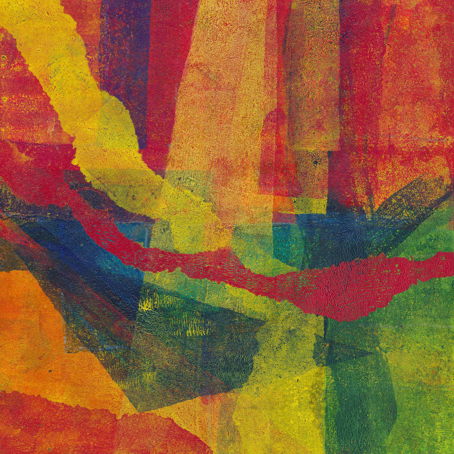
As I continue to add new items to the shop, I’ve taken to including in the item description a brief explanation of the title. In connection with the ‘Lockdown Series’ of monotypes this is sometimes difficult. Naming a piece of abstract art is never easy and may well end up saying more about the artist than the art! Humans appear to have strong pattern matching instincts. We see shapes and can’t help trying to make sense of them. There is even a scientific term for it – pareidolia. It isn’t surprising then that abstract paintings and prints fall victim to the same tendency. Any meaning in abstract art has to be put there – usually by the viewer, not the artist.
Several things spring to mind from this.
First, just because you see something in an abstract image, that doesn’t mean it is the result of deliberate intent.
Second, just because you see something in an abstract image that doesn’t mean others will also see it. Equally, if you can’t see anything, it doesn’t mean others cannot.
Third, just because an artist gives an abstract image a title suggestive of something in the real world, that doesn’t mean it is actually in the picture.
For example take one of my favourite artists, Gillian Ayres. Many of her paintings only got a title after she finished it. Sometimes she even asked friends to suggest titles. These titles almost never describe what the painting is about. Instead, they seem to reflect how the artwork made her feel and what that reminded her of. Gillian Ayres said you don’t need to understand her art to like it. She just wanted you to look at it. I found many similar quotes from Mark Rothko.
There is a wider point here. There is no meaning in abstract art. It does not require understanding. It just is. A Renaissance painting, with its richly symbolic visual language has much more intrinsic meaning than say a painting by Jackson Pollock. If an artist attaches personal meanings to the shapes and colours of an abstract painting, they must either share those meanings or accept that others will attach their own and, going back to our starting point, see different things.
I’ve tried to record the process of making one of my gel prints several times, but without success. This is because my working methods mean I am usually working on perhaps a dozen prints at once, jumping between them. I build up each image over time by adding layer after layer of colour and texture. The closest I have come is a series of photographs of different stages. This post tries to fill some of that gap.
Applying the paint
All gel prints start with paint on the plate. This is the first big variable. I apply the paint with a brush, a roller and even my fingers. Rollers give the most even effect. Even then as the roller loses paint to the plate in one place it can start picking it up elsewhere. The basic aim is to create variations in the thickness of the paint sitting on the plate. This helps to create variations in colour and visual texture in the eventual gel print.
How much variation you want is a matter of choice. For me, early layers tend to have more or less complete coverage using a limited palette. For later layers I may only cover part of the plate, perhaps using a mask or stencil. On any layer, I can create textural variation by applying anything with texture to the paint as it sits on the plate. I use pill packets, bits of card, pieces of scrap plastic with interesting textures or just crumpled paper. I often remove paint completely with cotton buds.
How this will print depends on a range of factors – what colour is it going over, on the use of opaque or transparent paints and on how much is left in the thinnest areas. Using more than one colour at a time on the brush or roller also creates variations and colour blends. Adding acrylic medium also alters things.
Layering
I don’t clean down the plate between every layer. Because the transfer from plate to paper is not always 100% this can leave patches of paint behind. Rolling fresh colour over these patches often picks them up and transfers them to the print, adding texture.
Using transparent paints in a layer will shift the colour underneath depending on the two colours used. If the upper layer is partial this will leave the underlying colour untouched in some areas. Removing part of a layer also allows the underlying colour to come through. The effect will vary between transparent and opaque colours.
I also restrict the area to which I’m applying the paint using masks or stencils. I usually cut or tear these from newsprint. Opaque paint will obscure what is underneath. I do this to simplify messy areas or perhaps to combine separate blocks of colour. Using transparent or semi-transparent paint can subdue contrast between adjacent areas or shift colours by mixing through layering. Acrylic medium can create translucent effects if you mix it with opaque colours.
Eventually the build up of paint on a plate makes the transfer of paint to the print too unpredictable. This is my cue it needs cleaning. The paint left on the plate won’t be wasted however, even if it has dried completely. Start by rolling out an even coat of colour over everything. Then start to take the print as normal, but leave the paper on the plate longer than usual before you lift it. If everything goes well the last layer has bonded with the residue on the plate and most of it will transfer to the paper. You are unlikely to get a print this way that stand in its own right. The idea is just to use it as the first layer for a subsequent gel print.
As the layers of paint build up I look for the happy accidents and try to reinforce them. It is the way that successive layers show through that creates the subtle colours and textures which I think are the defining characteristic of gel prints. Some paints are opaque, other transparent. It is very rare for me to plan out an image. Even when I do that plan is often quickly abandoned when I see something unanticipated but which works! Eventually I get to a point where, as I look at an image it says Stop! That is something I can’t define. IT seems to be a combination of visual balance in terms of shapes and colours and overall cohesion/balance of the image as a whole.
Composition
Building up the image in layer after layer makes adhering to a specific composition difficult. I rarely have a fully planned composition in mind. Even when I do, that can be derailed when something unexpected happens which I like. The closest I usually come is the use of very simple structures like this crib sheet of mine. The artist Bob Burridge produces a rather more refined version you can buy.
Set of compositional diagrams
A final thought on colour
As you add layers to your gel prints, you need to consider not just the area to be printed but the colour you will use. Careful thought here will give you more control over the final image. The first thing to do is to get a colour wheel. If your first layer is pretty much all cadmium yellows, look on the wheel at the colours either side of yellow. Using these colours for subsequent layers will give you a final image which is harmonious and balanced.
Alternatively look on the wheel at the colour opposite yellow – the complementary colours. Don’t just look at the direct complementary, look at the colours on either side of it which form the so-called split complementary. Some wheels also include markings for colour triads and for four colours. Try them. Using these colours will add drama and intensity to your work.
Don’t make the assumption that you need equal areas of complementary colours. Sometimes a large area of a relatively low-key colour can be balanced by a small intense area of its complementary. Think also about the effects of using transparent layers of one colour over its complementary. Think about how the effect differs from using opaques colours side by side. This can have an impact on your composition too.
Examples of my gel prints
There are lots of examples in the shop in the Lockdown Series 2020 and many more in my Instagram feed.