Digital processes and techniques have always been a part of my practice as I move from analogue to digital and back to analogue.
Digital Prints
The transition from analogue to digital sometimes places these techniques well to the forefront, as in the digital images I was making when I started printmaking. These used photo-manipulation, filters and plugins, graphics tablets and digital collage to generate the image. Some examples are shown below.


Inky Fingers – Analogue
My first steps into traditional, ‘inky fingers’ printmaking were with collagraph and entirely analogue.


Dales Memories was selected for the Bath Society of Arts Open, while Sarsen Stones was in the Oexmann Open at Devizes Museum.
My one and only venture into screen print reintroduced digital elements. Several of the stencils I used to make the screens for this image were created by digital processes.
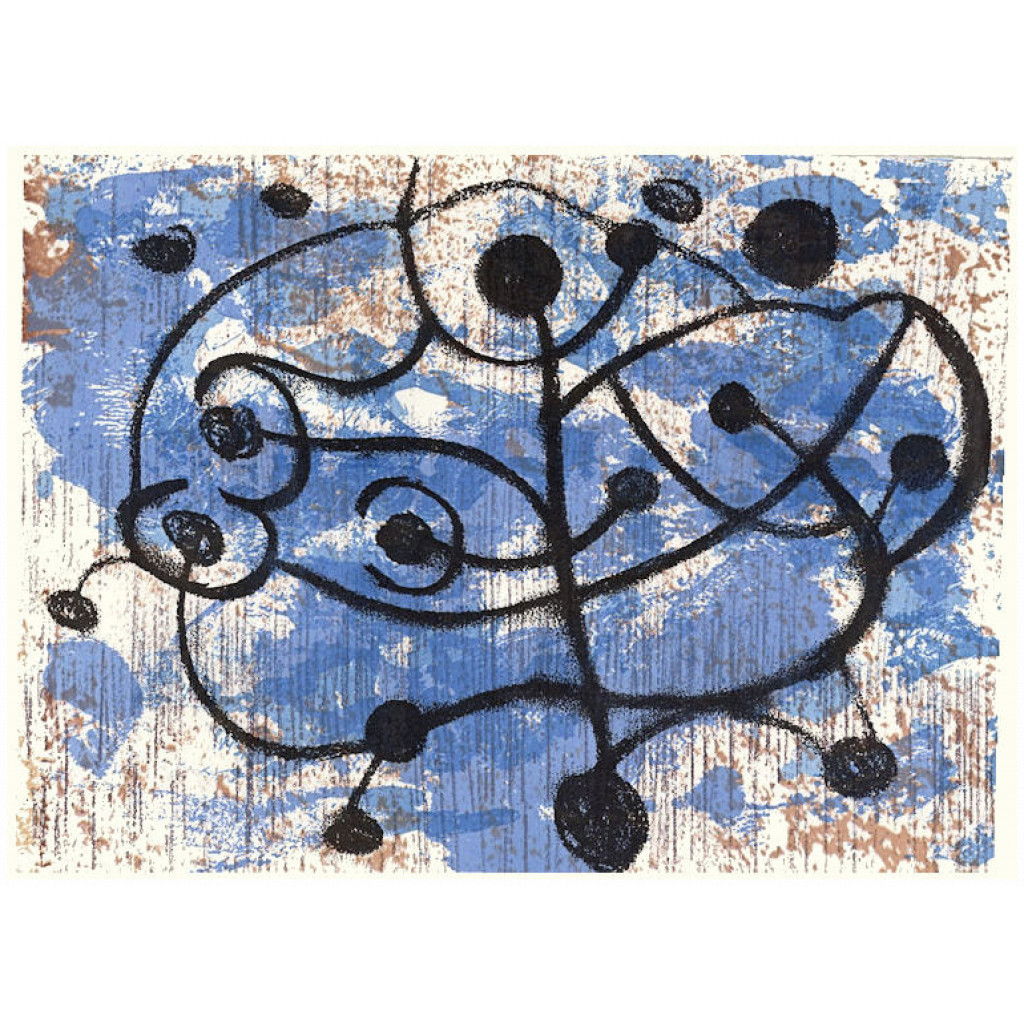
At different times I also made monoprints, drypoint and collage


Mixing things up – analogue and digital
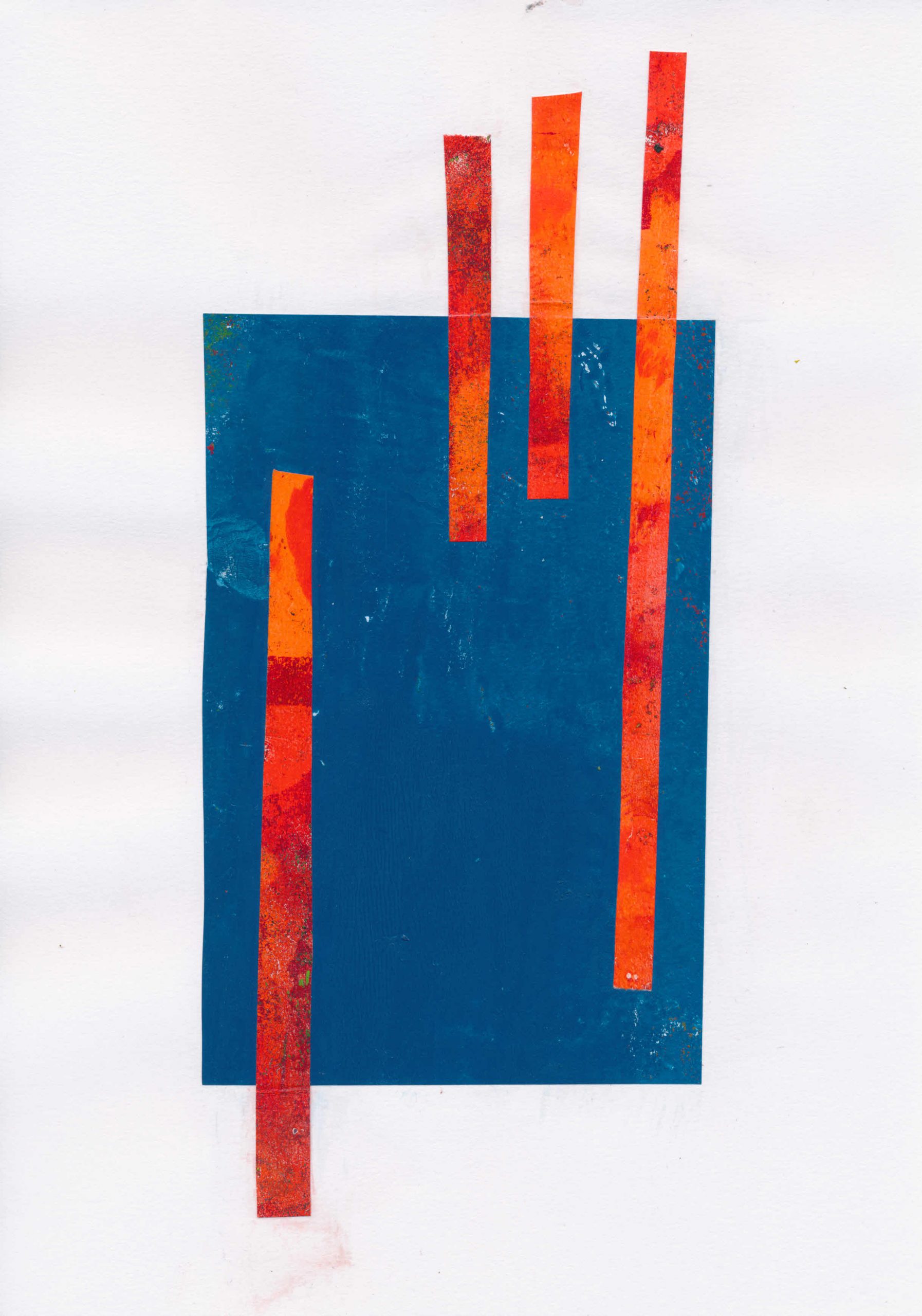
Around this time I began to have health issues which limited the time I could stand at the press. Screen printing especially was very stressful. Searching for something I could do seated, I eventually stumbled on gel printing.
At an early stage I began using digital processes to create stencils for gel printing, using a Cricut digital cutter. I began by using rough drawings in a process described in this post. Another post looked at ways to generate abstract shapes to be used as stencils.
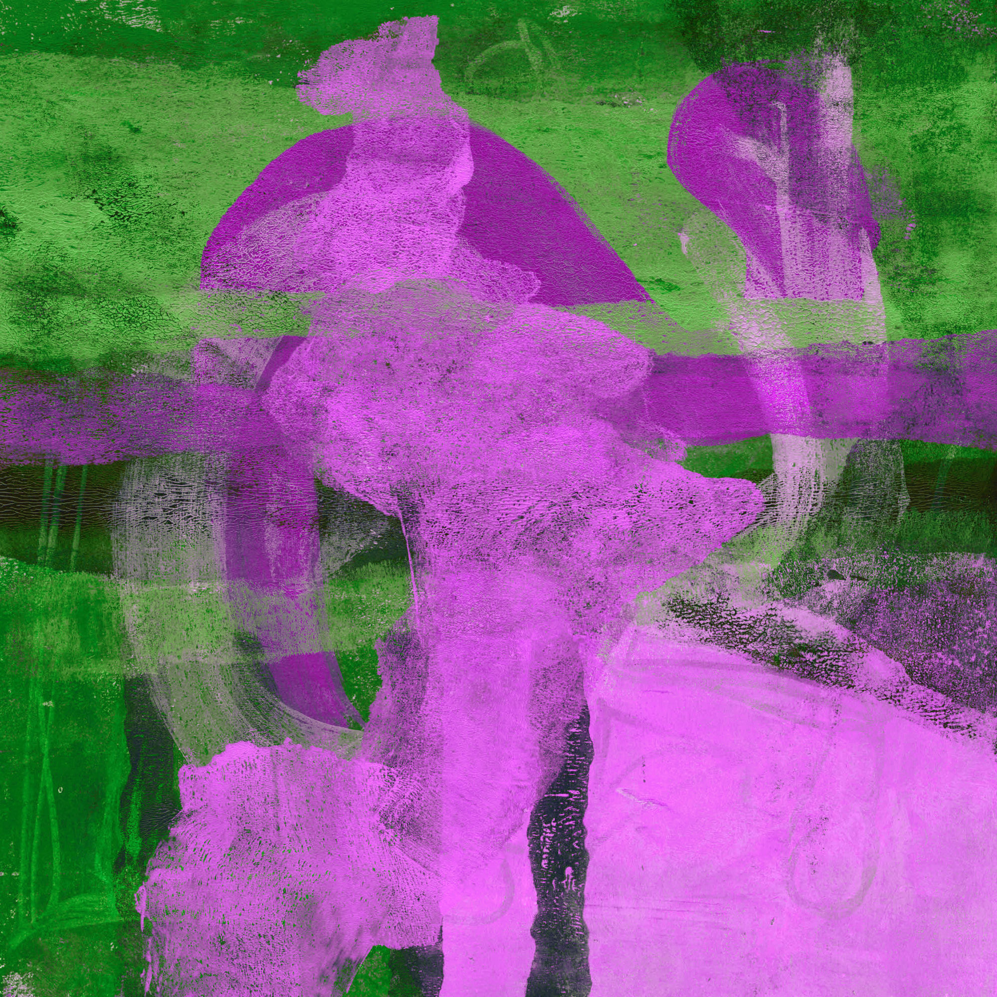
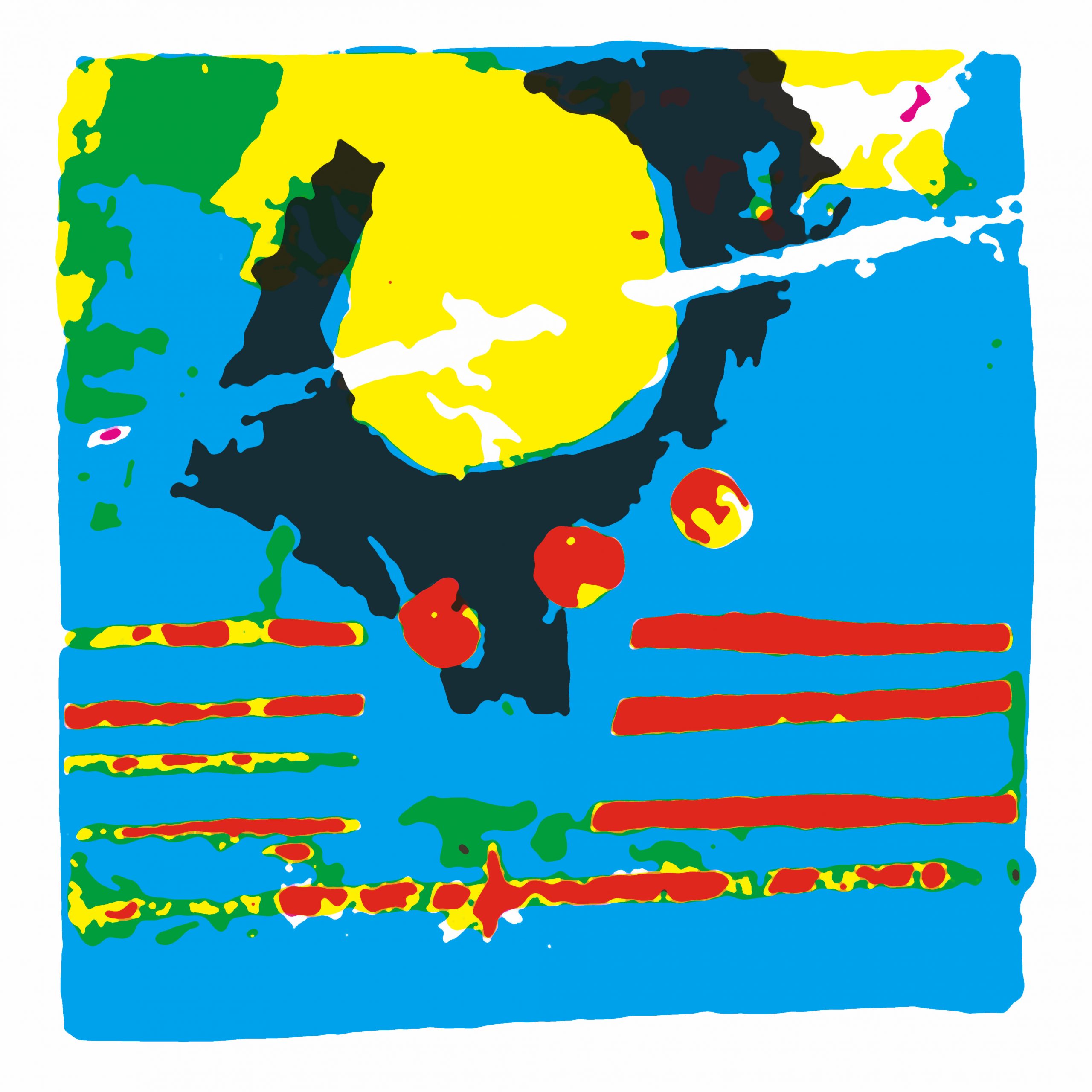
Another bout of ill health kept me out of the studio entirely so I returned to digital printmaking. I began to explore ways to use my existing monotypes, not as images, but as data to create new digital prints. I described this process in here.
In an extension of the process used to create digital prints, I have now produced some Risograph prints. Even these are not straight reproductions, since process colours (CMYK) are not available for RISO printers. I will cover that process in another post to follow.