Stone circles, hill figures and rock art generally have fascinated me for years. That’s why I was so drawn to the drone photographs of these artefacts, taken by David Abram, when they began to appear on Instagram. I’ve just received my copy of his Aerial Atlas of Ancient Britain. It doesn’t disappoint. The photography is stunning.
Each picture is stitched together from multiple drone photos into a single high resolution image. The image below, drawn from his website, is a good example. It shows White Sheet Hill, part of the Stourhead estate, in southern Wiltshire. On the hill there is a neolithiccauseway camp and barrows, an Iron Agehill fort, and it is traversed by a Roman road.
Without these photographs, the only way to see the full extent of these ancient places is via maps and plans. The simplification inherent in their production creates a strong graphic image, which I find appealing. On the ground, they don’t reveal themselves in the same way. The attraction of the images, for me anyway, comes from the way they put these bold, graphic shapes back in their landscape settings, with all the rich and subtle colours that implies. In addition, many of these are in remote places, inaccessible to a 76-year-old with mobility problems, so they offer a vicarious experience to complement the data in reference books.
I’ve used references to neolithic art in my own work many times, and I think the Aerial Atlas will be a source of inspiration for some time.
Examples in my work
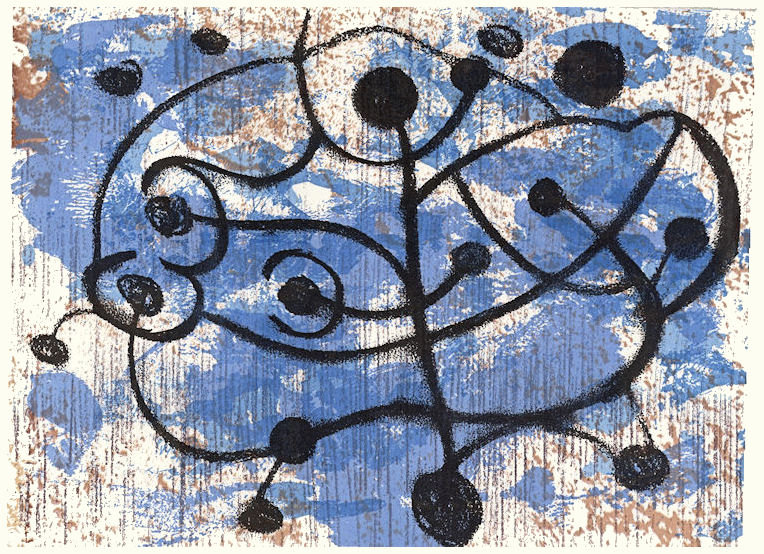
These tiny collagraphs draw on the idea of stone circles, for example.
These draw on hill figures. These are proof prints from a project derailed by the COVID pandemic.
This sketch, manipulated digitally, is based on craters, but contains the same archetypal round shapes.
Craters
I have a theory, which began with art, but applies equally well to the constructions in the Aerial Atlas, that there are certain archetypal shapes with which we have a physiological as much as an aesthetic response. The obvious ones are of course line and circle/disc, but also spirals and labyrinths and probably others. The job of the artist is to tap into that physiological response. David Abram’s photos do that, I think. They expose the ‘complex simplicity’ of the shapes our ancestors created on the land, never seeing those shapes themselves, but somehow reacting to them.
I’m posting below the latest small monotype prints from my last studio session. Nos. 2 and 4 have a similar Hubble feel to the others, while 1 and 3 seem to have found their own way.
Are these finished, do you think? I’m not sure. I know from experience with these small works that it is very easy it is to go one step too far and lose it. Because they are so small, there isn’t much room to manoeuvre if marks end up in the wrong place. Of course, that also means there isn’t much lost if a print fails.
Even so, I don’t immediately throw away prints that look like failures. Instead, I add them to a ‘slush pile’ which I review from time to time. This includes anything from monotype prints like these to collagraphs, drypoints or digital prints. It is surprising how impressions can change once the process of making has been forgotten. After a while, you see the image as if for the first time. Sometimes reviewing two disparate images can give that spark you need to work out what to do next.
Have a look, there are an incredibly eclectic mix of images in this virtual show. If you look at them, try to do it on a decent size screen. Your phone won’t do them justice. There are links to all the artist websites or IG pages after the online slide show. I’m working my way through them slowly. The point of this is of course to sell art, so here’s my shameless promotional link! Click on an image to be taken to the shop. (Not all of them are online yet.)
A Furnace of Stars – abstract monotype print
A small angry planet – monotype print
Cadmium Concerto – abstract monotype print
Diving for Rubies – monotype print – 30 cm x 30 cm
That day the Aliens came – monotype print
Don’t just look at my work. This virtual art show is about generating exposure, building recognition. So, make sure you look at the other work and the artist’s web pages. The range of work included in the show is truly remarkable. There are almost 200 pieces by about 40 artists. Make sure you check out the work of Sean Worrall and Emma Harvey, who have put the whole thing together – and 178 others since 2017!
During the pandemic, many mainstream galleries mounted virtual exhibitions, but this is the only one of which I’m aware that gives space to unrepresented artists, the artists who make work simply because they can.
Mobility problems have kept me out of my home studio for months. I haven’t entirely wasted my time, as previous posts about my writing testify. Even so, I really wanted to be doing more than staring at a computer screen. There is something about making things with your own hands that is always appealing. The way I work means that the piece emerges slowly. There is something almost magical in the way a collection of pigments on paper can suddenly snap into focus as a finished piece of original art. This is what draws me to printmaking.
The first day back was a bit of a disaster, it was almost as if I had forgotten what to do. Day two went much better, and I ended up with new work in the form of several small monotype prints. In case the word ‘print’ concerns you, it shouldn’t in this case. Every monotype is an original work of art. Unfortunately, there is a lot of confusion about prints. I’ve posted already on this, which is worth reading if you find the language used by galleries to sell art confusing
I always start small when coming back after a long gap. It is very easy to become overwhelmed otherwise. Actually, I enjoy working that way. There is a jewel like quality to small original art works., especially when put into generous mounts. They have an added advantage of course of being very affordable, which these days is an important consideration.
I’ve added some of the prints I made to the shop. The rest will be added soon.
After the last post, about my published story, I’m pleased to say another short story has been accepted for publication in an anthology. More on that when it is published, some time in the new year. Even more pleasing, a publisher has taken a novel of mine to look at. That’s a bit of a long shot, obviously, but I hope to hear before the end of the year.
Caryatids – one of my photos taken in Whitburn, South Tyneside about 1975
In the meantime, you can read several other short pieces on my personal pages here.
The photo is now available from the shop. Click on the image to see the details.
In this post, I describe some methods for digitally generating abstract shapes. One produces almost entirely random shapes, the second creates forms that look like text but are not (sometimes called asemic writing), while the third creates images looking like figure ground diagrams. The files created can then be used to create cutting files for use in a digital cutter.
This is the third in a series of posts about digital tools for gel printing. The first is here, the second, here. Also relevant, is this post on using the prints themselves as a digital resource
Random shapes
It’s very difficult to create a genuinely random shape. I developed this technique to get around that.
Start with a photograph. The subject doesn’t matter, but landscapes and skies seem to work well. In PSP, select the ‘Magic Wand’ tool from the icon menu on the left-hand side.
Third icon down and select ‘Magic Wand’ from the drop-down menu. Once selected, a toolbar opens along the top. Two options are critical – ‘Tolerance’ and a checkbox marked ‘Contiguous’.
‘Tolerance’ defines how close a pixel has to be to the colour you click on in the image to be selected. A zero means it has to exactly match. I tend to use between 10 and 20, but play around with it. ‘Contiguous’ when ticked means that only pixels connected to the click point are selected.
North Yorkshire
When you click, you will see the ‘marching ants’ around the selected area. If it looks too limited, hold down the shift key and click somewhere nearby. Keep clicking until you get a shape that looks OK. Copy that selection [PSP Menu – Edit/Copy or Ctrl+C], then paste the contents of the clipboard into a new image [PSP Menu – Edit/Paste as new image or Ctrl+Shift+V]
The resulting image should be a random irregular shape, still at this stage in the colours of the original image, which still needs some manipulation to generate the cutting file. Start by using the threshold option to reduce it to a single colour. You will need to find the sweet spot to make the shape all black. If there are small gaps, you can touch them in with the brush tool.
You should now have an irregular shape with almost fractal edges. The stencil could be cut directly from this or the edges could be smoothed further, using the Median filter.
You could also reverse the colours, as below. In both cases, there is no requirement to use the whole image, it could be cropped or modified further. The second image below is a detail from the first.
False Text
To create shapes with script like character, begin by creating a new document the size and resolution you require [PSP Menu – File/New or Ctrl+N] This opens up a dialogue box. Pick the size and resolution you want and select Vector Layer.
Now select the text icon from the left-hand menu. From the toolbar at the top, select the font and size you want. I suggest you start with either a large blocky font or a thin geometric font. Make sure both ‘font colour’ and ‘stroke colour’ are selected as Black, so that edge and infill are the same colour.
Click on the page at the top left and start to type text to fill the page. It doesn’t matter what you type. It doesn’t wrap automatically, so make sure to hit return at the end of a line. Once the page is full, go to the Layers Palette, right-click on the text layer and select convert to raster layer. This turns the text you have typed into just graphic shapes. You can now manipulate this image in various ways described below. All of these can be done in isolation or in combination. The order in which you do things will also often affect the outcome. Just play and see what happens. Remember, Ctrl+Z will back you out of anything you don’t like. You can back out of several steps if you wish.
Drawing over the lettering
Select the ‘pen’ tool from the icon menu on the left. If you hover your mouse pointer over the icons, you will see what they are called and also see the keyboard shortcut, which for the pen is V. A new toolbar should open across the top. From the ‘mode’ selection, choose the ‘Draw Lines and Polylines’ option. Moving along, deselect ‘Create on vector.’ Next make sure the line style is a solid line and finally type in the width of line you want to draw – here you may need to experiment (Ctrl+Z gets you out, remember). Make sure you are drawing white lines. Then click outside the page and draw a white line through your text. This will start to break up the image and move it away from recognisable text. Repeat as you think fit, changing angles and moving from horizontal lines to vertical lines.
Using software tools
Use Effects/Edge Effects/Dilate or Adjust/Add or Remove Noise/Median Filter to alter the letter shapes. Median Filter works well with the line drawing option above.
Copy the base image and then rotate it. Paste as New Image. Go to Image Arithmetic [PSP Menu – Image/Image Arithmetic] The drop-down boxes at the top of the window that opens should show the two images you have open. You will see a host of options. Just play with them. You will see that some of them look like the options for combining layers. The outcome will depend hugely on the nature of your original image. Note that for this approach, the two images don’t have to be the same size or proportions. If they are different, you may get an error message, in which case swap the two images over, and try again.
Using layers
Copy the layer [Ctrl+C] then rotate the existing layer 90°. Paste the contents from the clipboard as a new layer. [Ctrl+V] If the image is square, this will fit neatly over the bottom layer, otherwise you may need to click and drag the upper layer to a suitable position. Remember Ctrl+Z if you don’t like it. Select the new layer in the Layers Palette. Just above it is a box with drop down options that should start with ‘Normal’. Select ‘Darker’. You will now see both layers combined. Think of the layers as sheets of tracing paper. Now select ‘Lighter’ and see the difference. Try all the other options. Most won’t make any difference since you are working in black and white, but it’s a useful exercise in seeing what options are available. Try rotating 90° in the opposite direction. Try 180°. Combine this with the Mirror and Flip options [PSP Menu – Image/Mirror or Image/Flip]
For any image with multiple layers, try turning some of them off and on in turn. To do this, click on the little ‘eye’ icon on the appropriate layer. [Lower box to the left of the small picture of the layer] When the box is empty, the layer is turned off.
When you are happy with a particular multi-layer image, you can combine all the layers together or ‘flatten’ them. This reduces the file size and also prevents any inadvertent changes to layer settings. [PSP Menu – Layers/Merge/Merge All (Flatten)] You can use the various options under Layers/Merge to combine multiple layers in various ways. You can also save the flattened image under a new name and carry on playing with the various combinations. [PSP Menu – File/Save As and enter the new file name where prompted.] If you think about it, you can generate several very different images from different combinations of layers, all initially stemming from the same sketch. These new images can then in turn be added as new layers, offering even more possibilities.
Some examples of this process above.
Figure Ground plans
These can be made similarly to the false text. Draw the lines in black, without any underlying text. Then inverts the image and process in the various ways described above. Some examples below.
I’ve only hinted at the various options available. My advice is just to play, and where there is an option, turn it all the way up to 11 to see what happens!
Make sure you are working with copies of any original files, and be sure to save off any versions that look promising.
This post would probably have been better coming before Part 1. It was initially intended to be a single post, but grew too long. It covers ways to make cutting files for stencils from very simple drawings, using a digital cutter like Cricut.
Software
You will need some sort of photo editing software, but it doesn’t really matter what it is. My examples use Paint Shop Pro (abbreviated from now on to PSP) on a Windows PC, because that’s what I’m familiar with. Options include Photoshop Elements, Affinity Photo, Corel Painter Essentials or any of a myriad phone apps. You’ll need to find for yourself the equivalent tools to the ones I describe. You will also need software to convert the graphic file into a suitable format for your cutter. I will not be addressing that aspect.
You do NOT need to spend large sums on the full version of Photoshop, unless you are a professional graphic designer, in which case you know more than me…
My interest is in creating non-repetitive stencils rather than overall patterns, but the approach I use will also work for the pattern stencil.
Step 1 – create the image
Creating the cutting file for your stencil starts with a sketch design. Use a dense black pen (something like a Sharpie works fine) on white paper. Remember that completely enclosed shapes like rings will not cut properly unless you include a bridge link to the supporting material. Think of the difference between an O and a C. If you cut the outer edge of the O, the inner shape will also drop out, leaving a solid circle. Later, I’ll show you ways to check for areas where this might happen and some tools for avoiding it.
Once you have your sketch, you need to get it into the software. I simply take a photo on my phone, because I’m using freehand sketches and don’t need accurate geometry. If your design is more intricate, such as a Mandala, you will need to take care to keep your phone parallel to the image and ensure even illumination. You can scan it if you have access to a scanner, or you may prefer to do the sketch digitally. This might be a good option if you are working on an iPad/tablet or if you have a graphics tablet.
In my case, working with an Android phone and a PC, I’ve found the easiest way to get the file into my editing software is to share it from the phone to a folder in the cloud such as on Dropbox. Again, use whatever method is most comfortable for you.
Simple line drawing with Sharpie.
Step 2 – resize the graphic image
Once you have the image in your editing package, you need to ensure it is big enough to create a cutting file. My phone produces .jpg files at 72 dpi. My cutter is a Cricut. The Design Space software works at 90 dpi. I simply resize using PSP to produce a file that will print to a maximum of 12” x 12” at 90 dpi. The normal constraints about pixelation are not an issue because this is largely removed on conversion to an .svg file for cutting.
Resizing in PSP
From the Menu select Image, then Resize – select ‘by size’ button and set the size you want, then set resolution at 90 pixels/inch. Ensure that the ‘Resample’ box is selected. If you want to change the proportions of your image, e.g. to convert from rectangle to square, then be sure to unselect the ‘Lock Aspect Ratio’ box. You can use this option too if you tried to create a specific aspect ratio, but you ended up with perhaps 11.5” x 12.1” instead of 12” x 12” or 7.3” x 4.9” instead of 7” x 5”.
Step 3 – convert to black and white
The next step is to ensure the image is just black and white, with no grey shading. In PSP, there are several ways to achieve this. The simplest is to reduce the number of colours to 2.
In PSP Menu – Image/Decrease Colour Depth/2 Colour Palette.
If your lighting is uneven, then this may translate into black areas which should be white. An alternative that usually avoids this is the ‘Threshold’ command, which is my preference.
PSP Menu – Adjust/Brightness and Contrast/Threshold. This brings up a slider control that allows you to fine tune the breakpoint between black and white. You’ll have to find the sweet spot for your particular image yourself.
Sharpie drawing after threshold command
You now have a version of your sketch in pure black and white. If you see odd black marks where they are not supposed to be, just paint them out in white with the brush tool from the icon bar on the left-hand side. Depending on the density of ink in your pen, the lines may not be continuous. You can test this by infilling each shape with a colour (assuming you used the Threshold command.) You can do this by selecting the icon on the left that looks like a paint-can tipping over and picking a colour from the palette on the top right. Then click inside the shape you want to fill. If a line is broken, something like this happens.
Effects of a break in a line
You can reverse this by undoing the fill command using Edit/Undo, or by infilling in white again. Both will take you back to the ‘Threshold’ version above.
Step 4 Fill in any line gaps
Your next step is to fill in any gaps in the lines. You need to zoom in and look for them. If there are only a couple of breaks, use the brush or pen tool to draw across the gap. If the lines are very broken, try using a command called Erode Edges first.
PSP Menu – Effects/Edge Effects/Erode.
This makes the lines less crisp and fills in minor gaps. If you still see gaps, you can repeat the command a couple of times
PSP Menu – Edit/Repeat or from the keyboard Ctrl+Y
Keep testing by infilling each space to see if thee are still leaks. At some point, it will be simpler to draw across any remaining gaps.
Your aim is to end up with lines that are continuous and allow each space to be infilled without any ‘spill over’. Once that is achieved, reduce the colours to 2 again.
Step 5 – prepare the cutting file.
Begin by creating a negative image from your file.
PSP Menu – Image/Negative Image
If you look at the example and think about how a stencil works, you will see that eventually you will be cutting out all the spaces surrounded by lines. This is easier to visualise if you swap the two colours over. The negative image however is now black around the outside of the image and this is not to be cut away. It needs to be turned white again with the ‘Flood Fill’ tool, giving you the image on the right.
You can stop at this point and use this to prepare the .svg file for your cutter, or you can manipulate it further. For example, the image as it stands still has the rough edges to the line created by the ‘Erode’ command. Leaving these in, gives an interesting effect when cut, but also increases the time it takes to cut.
Further options
There are two options you can consider here. They both have similar effects, although not identical, so have subtly different outcomes. The first is an Edge command called ‘Dilate’ This has the effect of shrinking the black shapes slightly by somehow drawing back the line edge. This can create pixel sized gaps that might need touching in with the brush tool. The other command is called ‘Median Filter’ As the name suggests, this smooths the edge by averaging it out. It also enlarges the white gaps between shapes and rounds off corners. The intensity of the effect is controlled by a slider. Both can be applied repeatedly or sequentially, with subtle variations in the outcome. Try them out to get the effect you like. Remember, if it doesn’t work, you can back out with Ctrl+Y.
PSP Menu – Effects/Edge Effects/Dilate
PSP Menu – Adjust/Add or Remove Noise/Median Filter
Rounded edges after use of median filter
Cutting the stencil
To cut the stencil, the .jpg file needs to be converted to .svg format. I do this using the free program Inkscape. I won’t go into that in detail here. The .svg file is then loaded into the appropriate software for your cutter. Again, I won’t go into detail on that aspect.
Your views
This is a long and quite detailed post. I’m sure there are other ways to achieve the same ends. Let me know in the comments if you have done this in other ways or if you find any errors. Menu commands for PSP are as used in the 2021 edition.
Sometimes the artistic influence on a piece of work is deliberate. There is a lot to be learnt from trying to emulate the look of another artist without directly copying. This was the case with ‘Shalimar’ below, where I was channelling Richard Diebenkorn and his Ocean Park paintings. (Not in the shop yet, but will be soon. Contact me if you are interested before then.)
Shalimar – monotype print made with acrylic on paper
Sometimes, though, the influence is accidental. You looked, perhaps, at the other artist’s work years ago. Then as you work, something in front of you triggers the memory, and it becomes embedded in what you make. I think that’s what has happened here with ‘Mercury Beach’. I was framing a batch of prints for upcoming shows, (watch this space for more news on that and where to see them). Suddenly I saw Barbara Rae. Not the subject matter, but the intense colours and the ribbon like horizontal marks. Incidentally, when framing it, I decided it looked better inverted. The version below is upside down compared to the version in the shop. I think it was that change of perspective that made me see the artistic influence coming through.
Mercury Beach – abstract monotype print
Of course, I may be deluding myself, but getting even part way towards the work of someone like Rae is not bad in my view.
My last post, about using periodic reviews of old work as a mechanism for moving forward artistically, made me remember something I know in theory, but keep forgetting. Perhaps I need to review lessons learned too. I tend to describe myself as a printmaker. It is easy to forget – well, I find it easy anyway – that the print doesn’t have to be the end state. This is especially so with gel printing or screen printing, which use acrylic paint. Take this image, from that last post.
Pictogram – monotype print 30 cm x 30 cm
The initial inspiration was the idea of the pictograph (definition 1 in link) as developed by Adolph Gottlieb. The mark in yellow was also supposed to be redolent of Japanese or Chinese calligraphy. The problem I have with the image is the purple/white patches which break the mark are unrelated to it and to anything else in the image. I spent some time thinking about how to overprint them using gel printing without losing other aspects, which do work. Then it struck me. Paint them out! That was lesson one…
I would be in good company doing this. Gillian Ayres, for example, used to set aside some prints from an edition, specifically to overpaint, an example being Springfield No 2 from 1999.
The second lesson learned, which seems even harder to remember, is that every blog post doesn’t have to be a dissertation! Just because I like writing long posts, doesn’t mean others want to read them! I’ll do my best, though, because if I can remember that lesson, I’m more likely to keep posting.
I’m always scanning through the pile of unfinished pieces in my studio. Once enough time has passed from me to forget how they were made, they become objects in their own right. Moving forward by reviewing old work and thinking about the next steps becomes much easier. Looking at the work of others, as I have been doing over the past couple of days with John Hoyland for example, is often enough to shake your mind free. The image below is an example of such a review.
Pictogram – monotype print 30 cm x 30 cm
Less regularly, I review the pile of finished but unframed prints. When I do this, I typically change my mind about some of them. The last time I did this, I removed about 10% as no longer being acceptable quality. Some of these may benefit from additional work, and others may have elements that can be salvaged to make smaller pieces. Many of the Tiny series were made that way.
Tiny collagraph print
I’m aiming to get back in the studio next week, probably starting some new prints from scratch, although for some reason, I’m getting the urge to paint and create some really heavy textures. Time to dig out the Polyfilla?