I’ve tried to record the process of making one of my gel prints several times, but without success. This is because my working methods mean I am usually working on perhaps a dozen prints at once, jumping between them. I build up each image over time by adding layer after layer of colour and texture. The closest I have come is a series of photographs of different stages. This post tries to fill some of that gap.
Applying the paint
All gel prints start with paint on the plate. This is the first big variable. I apply the paint with a brush, a roller and even my fingers. Rollers give the most even effect. Even then as the roller loses paint to the plate in one place it can start picking it up elsewhere. The basic aim is to create variations in the thickness of the paint sitting on the plate. This helps to create variations in colour and visual texture in the eventual gel print.
How much variation you want is a matter of choice. For me, early layers tend to have more or less complete coverage using a limited palette. For later layers I may only cover part of the plate, perhaps using a mask or stencil. On any layer, I can create textural variation by applying anything with texture to the paint as it sits on the plate. I use pill packets, bits of card, pieces of scrap plastic with interesting textures or just crumpled paper. I often remove paint completely with cotton buds.
How this will print depends on a range of factors – what colour is it going over, on the use of opaque or transparent paints and on how much is left in the thinnest areas. Using more than one colour at a time on the brush or roller also creates variations and colour blends. Adding acrylic medium also alters things.
Layering
I don’t clean down the plate between every layer. Because the transfer from plate to paper is not always 100% this can leave patches of paint behind. Rolling fresh colour over these patches often picks them up and transfers them to the print, adding texture.
Using transparent paints in a layer will shift the colour underneath depending on the two colours used. If the upper layer is partial this will leave the underlying colour untouched in some areas. Removing part of a layer also allows the underlying colour to come through. The effect will vary between transparent and opaque colours.
I also restrict the area to which I’m applying the paint using masks or stencils. I usually cut or tear these from newsprint. Opaque paint will obscure what is underneath. I do this to simplify messy areas or perhaps to combine separate blocks of colour. Using transparent or semi-transparent paint can subdue contrast between adjacent areas or shift colours by mixing through layering. Acrylic medium can create translucent effects if you mix it with opaque colours.
Eventually the build up of paint on a plate makes the transfer of paint to the print too unpredictable. This is my cue it needs cleaning. The paint left on the plate won’t be wasted however, even if it has dried completely. Start by rolling out an even coat of colour over everything. Then start to take the print as normal, but leave the paper on the plate longer than usual before you lift it. If everything goes well the last layer has bonded with the residue on the plate and most of it will transfer to the paper. You are unlikely to get a print this way that stand in its own right. The idea is just to use it as the first layer for a subsequent gel print.
As the layers of paint build up I look for the happy accidents and try to reinforce them. It is the way that successive layers show through that creates the subtle colours and textures which I think are the defining characteristic of gel prints. Some paints are opaque, other transparent. It is very rare for me to plan out an image. Even when I do that plan is often quickly abandoned when I see something unanticipated but which works! Eventually I get to a point where, as I look at an image it says Stop! That is something I can’t define. IT seems to be a combination of visual balance in terms of shapes and colours and overall cohesion/balance of the image as a whole.
Composition
Building up the image in layer after layer makes adhering to a specific composition difficult. I rarely have a fully planned composition in mind. Even when I do, that can be derailed when something unexpected happens which I like. The closest I usually come is the use of very simple structures like this crib sheet of mine. The artist Bob Burridge produces a rather more refined version you can buy.

A final thought on colour
As you add layers to your gel prints, you need to consider not just the area to be printed but the colour you will use. Careful thought here will give you more control over the final image. The first thing to do is to get a colour wheel. If your first layer is pretty much all cadmium yellows, look on the wheel at the colours either side of yellow. Using these colours for subsequent layers will give you a final image which is harmonious and balanced.
Alternatively look on the wheel at the colour opposite yellow – the complementary colours. Don’t just look at the direct complementary, look at the colours on either side of it which form the so-called split complementary. Some wheels also include markings for colour triads and for four colours. Try them. Using these colours will add drama and intensity to your work.
Don’t make the assumption that you need equal areas of complementary colours. Sometimes a large area of a relatively low-key colour can be balanced by a small intense area of its complementary. Think also about the effects of using transparent layers of one colour over its complementary. Think about how the effect differs from using opaques colours side by side. This can have an impact on your composition too.
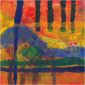
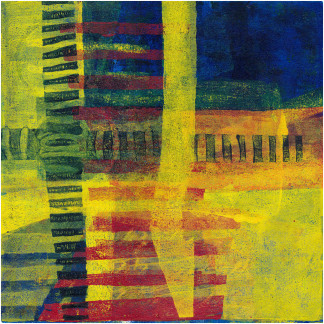
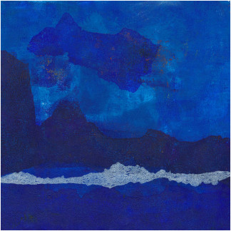
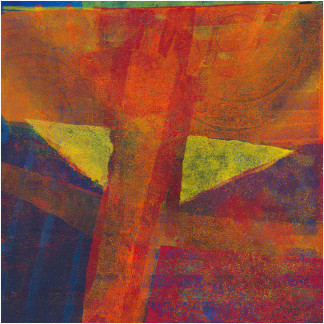
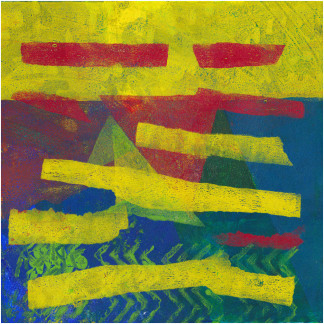
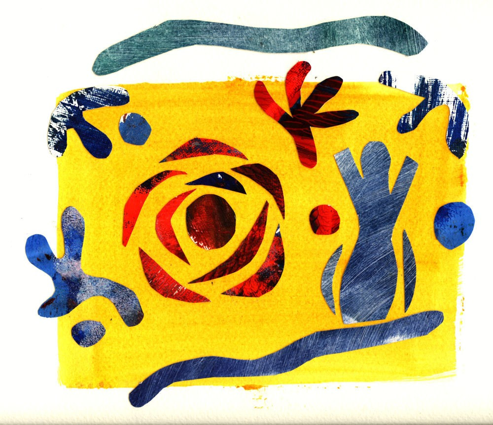
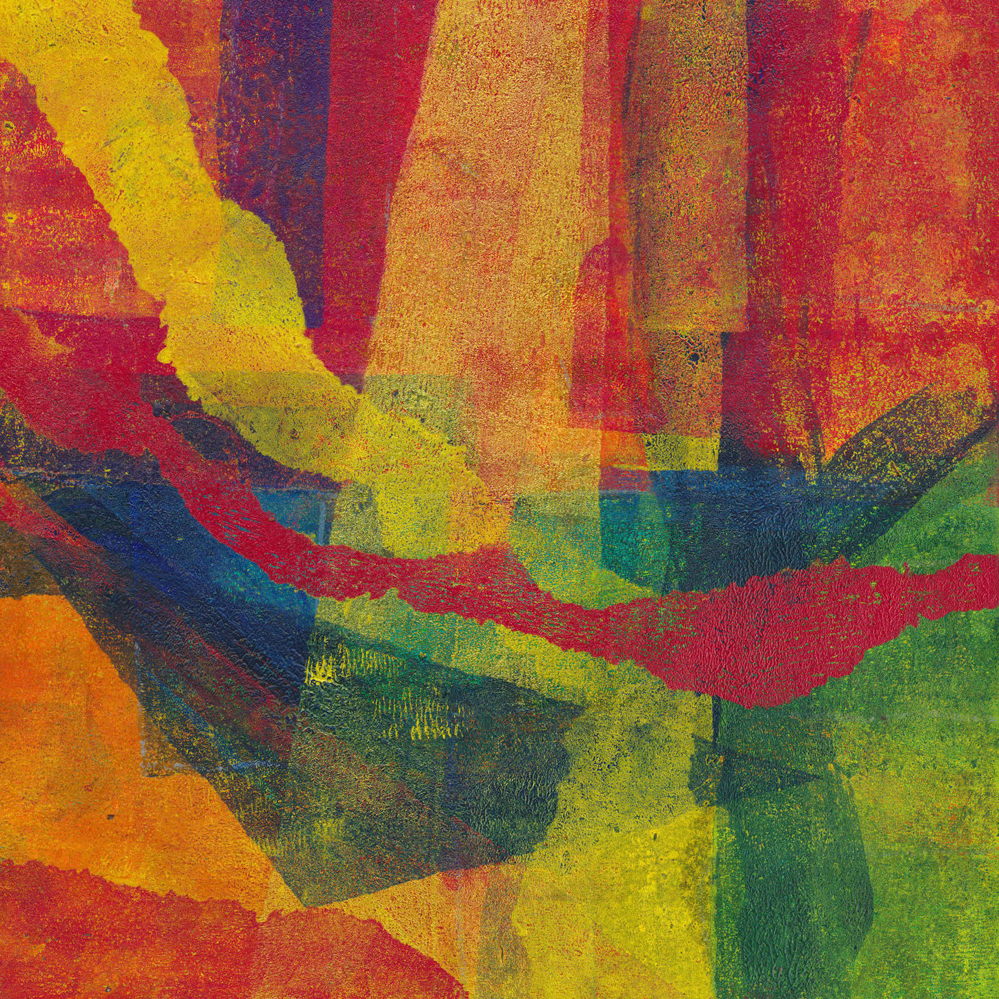
Examples of my gel prints
There are lots of examples in the shop in the Lockdown Series 2020 and many more in my Instagram feed.