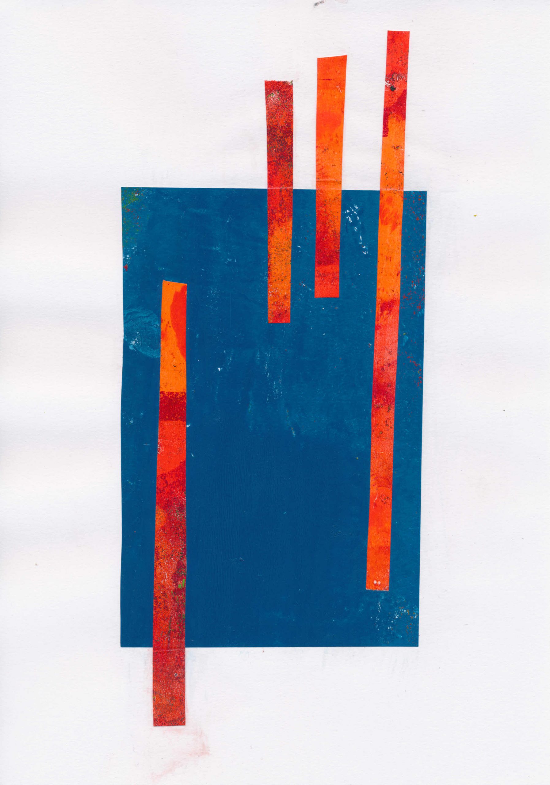
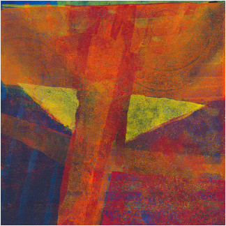
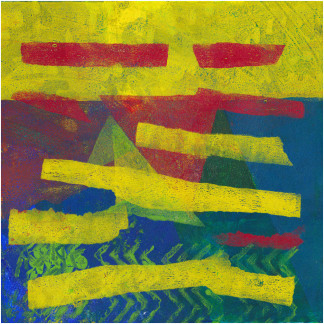
I’ve just made a set of digital images built around stripes. Working digitally is my fallback position when I’m prevented from doing anything else, whether by time, health or anything else. I had no great expectations for these. I picked on stripes for the same reason I first picked on the cross, and recently the fuji-like peak silhouette. They were a recognisable starting point.
I’ve been adding some of my recent digital images to the shop. I’m not sure if these will make it though. The outcome was interesting, although not quite what I’d been expecting. That’s not a problem, of course. I like these on screen, but I think they might need some physical texture to really come alive.
They started life as gel prints, which I cut up to make collage. You can see those here. To make the digital images, I used the scans of the collage made for the shop listings. I brought these back into Paint Shop Pro and then edited and recombined them in various ways.
I’m not sure of the next steps if I don’t offer them digitally. One option is going back to collage. The tissue I use to remove excess paint from the gel plate before printing would work well over solid blocks of colour, whether painted or collaged. It’s certainly a path worth exploring.
It also occurs to me that scans of the tissue could also be used in digital prints, taking the cycle round again.
Mixtape No. 2 is the second of these online shows I have been in. As before, it has an eclectic mix of artists and styles. Please head over there and look at the work on offer. There are links to follow if you want to look at an artist in more depth.
One of the things taking part in these two shows (Mixtape No.1 is still up, so if you haven’t seen it, do check it out) has done is made me look afresh at my own work and wonder if perhaps it’s just a wee bit too tidy. I don’t know for sure yet, but it’s made me think, and that’s what it’s all about, isn’t it?
I’m posting below the latest small monotype prints from my last studio session. Nos. 2 and 4 have a similar Hubble feel to the others, while 1 and 3 seem to have found their own way.
Are these finished, do you think? I’m not sure. I know from experience with these small works that it is very easy it is to go one step too far and lose it. Because they are so small, there isn’t much room to manoeuvre if marks end up in the wrong place. Of course, that also means there isn’t much lost if a print fails.
Even so, I don’t immediately throw away prints that look like failures. Instead, I add them to a ‘slush pile’ which I review from time to time. This includes anything from monotype prints like these to collagraphs, drypoints or digital prints. It is surprising how impressions can change once the process of making has been forgotten. After a while, you see the image as if for the first time. Sometimes reviewing two disparate images can give that spark you need to work out what to do next.
Mobility problems have kept me out of my home studio for months. I haven’t entirely wasted my time, as previous posts about my writing testify. Even so, I really wanted to be doing more than staring at a computer screen. There is something about making things with your own hands that is always appealing. The way I work means that the piece emerges slowly. There is something almost magical in the way a collection of pigments on paper can suddenly snap into focus as a finished piece of original art. This is what draws me to printmaking.
The first day back was a bit of a disaster, it was almost as if I had forgotten what to do. Day two went much better, and I ended up with new work in the form of several small monotype prints. In case the word ‘print’ concerns you, it shouldn’t in this case. Every monotype is an original work of art. Unfortunately, there is a lot of confusion about prints. I’ve posted already on this, which is worth reading if you find the language used by galleries to sell art confusing
I always start small when coming back after a long gap. It is very easy to become overwhelmed otherwise. Actually, I enjoy working that way. There is a jewel like quality to small original art works., especially when put into generous mounts. They have an added advantage of course of being very affordable, which these days is an important consideration.
I’ve added some of the prints I made to the shop. The rest will be added soon.
This is the first of a planned series of posts about making stencils for gel printing using a digital cutter. In my case it is a Cricut Maker, but the principles are general.
These stencils came out of some thoughts I had about making silk screen versions of my gel prints. I was hoping to use colour separations. This is the process by which original full-colour digital files are separated into individual colour components for four-colour process printing. Every element in the file is printed in a combination of four colours: cyan, magenta, yellow, and black. This is known as CMYK in the world of commercial printing and in silk screen printing. This isn’t an original idea, of course. Anyone familiar with Matisse will almost certainly be aware of his stunning cutouts, but may not be aware that they were also published in silk screen versions.
I began with a scan from one of my prints. I created the CMYK colour separations with Paint Shop Pro (from now on PSP). Unfortunately, I no longer have access to screen beds, so this is currently not an option. In practice, I don’t think I’m fit enough any more, to spend several hours pulling ink through the screens. However, having already used scans of pen drawings to make stencils, I decided to experiment with these separations. The print I’m using here is called ‘Area 52’, available from my shop.
The image below is an example of one of the colour separations. This is from the magenta colour channel. In this form, it clearly can’t be used directly to make a stencil suitable for gel printing.
Magenta colour separation from original image file
Simplifying the file
To create a version that can be cut as a stencil, it needs to be much simplified. I did this using various tools in PSP, which led to this. (More details of the process by which I did this, will be in later posts. If you can’t wait though, get in touch and I’ll try to help.)
Simplified Magenta channel
PSP allows me to digitally recombine these simplified images, which led in turn to this image. This is closer to what you would get with screen printing, but is useful to visualise the outcome.
Digital image created from recombined and simplified channels
Be flexible
However, just because a file is called magenta, doesn’t mean that it has to be used that way. PSP allows me to digitally recombine the image files in any order. With four files to combine, there are 24 possible combinations, so this one below is just one. It helps to make a point though. When the stencils are cut and used to make gel prints, you have complete freedom in the colour you use.
Image created by recombining channels in different order.
In the real, as opposed to the digital world, there are other variables. Varying the opacity of the paint used, and varying the order in which you use the stencil, will also give different results.
Finally, just as an experiment, here is a combination image using CYMK files from two different images. I’ve included it just to make the point that once you have the stencil you have complete freedom in their use.
Electric Avenue – limited edition digital print
In many ways, this last image is analogous to making a collagraph print from multiple plates. I have experimented with this many times in the past.
I’ve only recently discovered the work of the wonderful Gee’s Bend Quiltmakers (also here and here). These quilts have been created by generations of women in the isolated African-American hamlet of Gee’s Bend, in rural South West Alabama. The earliest identified quilt maker was Dinah Miller in 1859. Throughout the post-civil war years and into the 20th century, the women of Gee’s Bend made their quilts from scrap materials such as old shirts, overalls, aprons and dress bottoms. They did this from necessity not art. Even now the average income is less than $10,000 and these quilts were needed to keep themselves and their children warm in unheated shacks that lacked running water, telephones and electricity.
Gee’s Bend and the Civil Rights Movement
Gee’s Bend is very isolated. Until the 1960s there was a primitive ferry which reduced the journey time significantly. However, when black residents of Gee’s Bend began taking the ferry to the county seat at Camden to try to register to vote the local authorities reacted by closing the ferry service.
The shutdown of the 15-minute ferry ride forced the residents of Gee’s Bend to drive, if indeed they had a car, 40 miles over narrow rural roads to get to the county courthouse in Camden, then 40 miles back. They would be without a ferry service for over forty years. Even when federal funding was agreed in the 1990s it still took until 2006 before it reopened. Such enforced isolation made already hard times even harder.
Recognition
From the 1960s onward, the opening of the Freedom Quilting Bee in nearby Alberta, which had many from Gee’s Bend as members, began to generate increased attention, although the aim of the Quilting Bee was to meet commercial contracts for the likes of Sears, not sell the work of individual quilters. It took until the late 1990s to generate real interest after art collector, historian, and curator William Arnett began to buy quilts from Gee’s Bend makers.
Arnett organized an exhibition called, “The Quilts of Gee’s Bend” at the Museum of Fine Arts in Houston. This later travelled to a dozen other locations across the USA. The exhibition featured sixty quilts created by forty-five artists. When it reached New York, one critic rather gushingly described the quilts as “some of the most miraculous works of modern art America has produced. Imagine Matisse and Klee (if you think I’m wildly exaggerating, see the show), arising not from rarefied Europe, but from the caramel soil of the rural South.” In 2006, the US Post Office issued a set of stamps to commemorate their work, but without giving individual credits.
While this exhibition brought fame to the quilts, Arnett’s relationship with the quilters was troubled and in 2007, two of them filed lawsuits alleging they had been cheated out of thousands of dollars from the sales of their quilts. The lawsuit was resolved and dismissed without comment from lawyers on either side in 2008. From the outside it is hard to work out what really happened, but it seems that the issue is in part the nature of the art market, where pieces travel from dealer to dealer at ever inflated prices.
The future
Despite the controversy, the Souls Grown Deep Foundation, created by Arnett, continues to collect and organize exhibitions for Gees Bend Quilts. It is also managing multiple campaigns to support the quiltmakers and African-American artists in general. They aim to provide documentation, marketing, and fund-raising, as well as education and opportunity for quiltmakers. The foundation is also involved in a multi-year campaign with the Artists Rights Society to protect intellectual property rights for the artists of Gee’s Bend. Some of the quilters have been selling on Etsy for a while, but from February they are creating their own brand presence. Sadly, but not unexpectedly, the site is however already overrun with knockoffs and attempts to cash in on the name. The domain name geesbendquilts[dot]com appears to have been hijacked by someone in Indonesia.
The work of the women of Gee’s Bend raises many questions about the nature of art, challenging as it does the mainstream view that art is made by people who call themselves artists. The utilitarian nature of these quilts is married with a real aesthetic sense that has created objects of great beauty which are indeed art. In achieving that state, they need no validation by comparisons to Klee or Matisse or any other artists. Nor are they ‘outsider art’ except from the perspective of those who wish to control the cultural narrative. They are not ‘naïve’ or ‘folk’ art – their artistic decisions are just as sophisticated as those of the artists with which they are compared.
The artists
The community of Gee’s Bend are just as much an artistic community as places like St Ives. Even more so perhaps, since their art genuinely springs from the community and continues through the generations. Reading various interviews with the quilters it looks as if they are finally being recognised as individual artists and the money generated is finally beginning to have an impact locally. The Gee’s Bend Quilting Collective currently has 50 members, working as ever to make each quilt unique. Two members (China and Mary Ann Pettway) now run quilting retreats, passing on their skills to quilters and makers across America.
I would love to list all the artist’s names, but I haven’t been able to find a definitive list. The list of quilters on the Souls Grown Deep website numbers 120 but over the generations there must have been many more whose names are now lost to us. The list below is drawn from the Foundation website and is based on the works acquired by Arnett and then held by the Souls Grown Deep Foundation.
As I continue to add new items to the shop, I’ve taken to including in the item description a brief explanation of the title. In connection with the ‘Lockdown Series’ of monotypes this is sometimes difficult. Naming a piece of abstract art is never easy and may well end up saying more about the artist than the art! Humans appear to have strong pattern matching instincts. We see shapes and can’t help trying to make sense of them. There is even a scientific term for it – pareidolia. It isn’t surprising then that abstract paintings and prints fall victim to the same tendency. Any meaning in abstract art has to be put there – usually by the viewer, not the artist.
Several things spring to mind from this.
First, just because you see something in an abstract image, that doesn’t mean it is the result of deliberate intent.
Second, just because you see something in an abstract image that doesn’t mean others will also see it. Equally, if you can’t see anything, it doesn’t mean others cannot.
Third, just because an artist gives an abstract image a title suggestive of something in the real world, that doesn’t mean it is actually in the picture.
For example take one of my favourite artists, Gillian Ayres. Many of her paintings only got a title after she finished it. Sometimes she even asked friends to suggest titles. These titles almost never describe what the painting is about. Instead, they seem to reflect how the artwork made her feel and what that reminded her of. Gillian Ayres said you don’t need to understand her art to like it. She just wanted you to look at it. I found many similar quotes from Mark Rothko.
There is a wider point here. There is no meaning in abstract art. It does not require understanding. It just is. A Renaissance painting, with its richly symbolic visual language has much more intrinsic meaning than say a painting by Jackson Pollock. If an artist attaches personal meanings to the shapes and colours of an abstract painting, they must either share those meanings or accept that others will attach their own and, going back to our starting point, see different things.
Because I’m still finding my way around WordPress and its various plugins, I haven’t fully implemented searches. At some point I will be adding the ability to search by price and probably also size and medium. Until then, here is a selection from the shop of what is currently available. There are lots more on the Printmaking pages in the shop, and I’m adding more all the time.
Once we have got past the COVID-19 crisis I would very much like to hold a physical show. Follow the blog or better still sign up for my mailing list to be notified.