I’m trying to set up a regular schedule of posts to the blog. I’m aiming to put up a substantive post every Friday. There may be short snippets at other times. The next post is already written and in the schedule for Friday morning.
I’m trying to set up a regular schedule of posts to the blog. I’m aiming to put up a substantive post every Friday. There may be short snippets at other times. The next post is already written and in the schedule for Friday morning.
This is the first of a planned series of posts about making stencils for gel printing using a digital cutter. In my case it is a Cricut Maker, but the principles are general.

These stencils came out of some thoughts I had about making silk screen versions of my gel prints. I was hoping to use colour separations. This is the process by which original full-colour digital files are separated into individual colour components for four-colour process printing. Every element in the file is printed in a combination of four colours: cyan, magenta, yellow, and black. This is known as CMYK in the world of commercial printing and in silk screen printing. This isn’t an original idea, of course. Anyone familiar with Matisse will almost certainly be aware of his stunning cutouts, but may not be aware that they were also published in silk screen versions.
I began with a scan from one of my prints. I created the CMYK colour separations with Paint Shop Pro (from now on PSP). Unfortunately, I no longer have access to screen beds, so this is currently not an option. In practice, I don’t think I’m fit enough any more, to spend several hours pulling ink through the screens. However, having already used scans of pen drawings to make stencils, I decided to experiment with these separations. The print I’m using here is called ‘Area 52’, available from my shop.
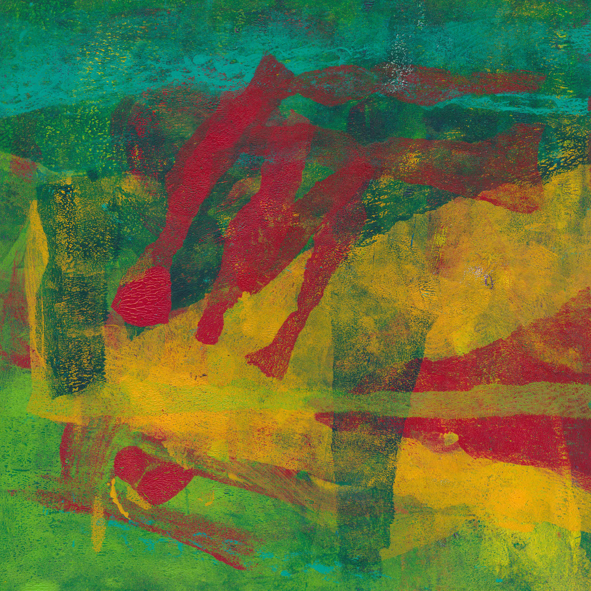
The image below is an example of one of the colour separations. This is from the magenta colour channel. In this form, it clearly can’t be used directly to make a stencil suitable for gel printing.

To create a version that can be cut as a stencil, it needs to be much simplified. I did this using various tools in PSP, which led to this. (More details of the process by which I did this, will be in later posts. If you can’t wait though, get in touch and I’ll try to help.)

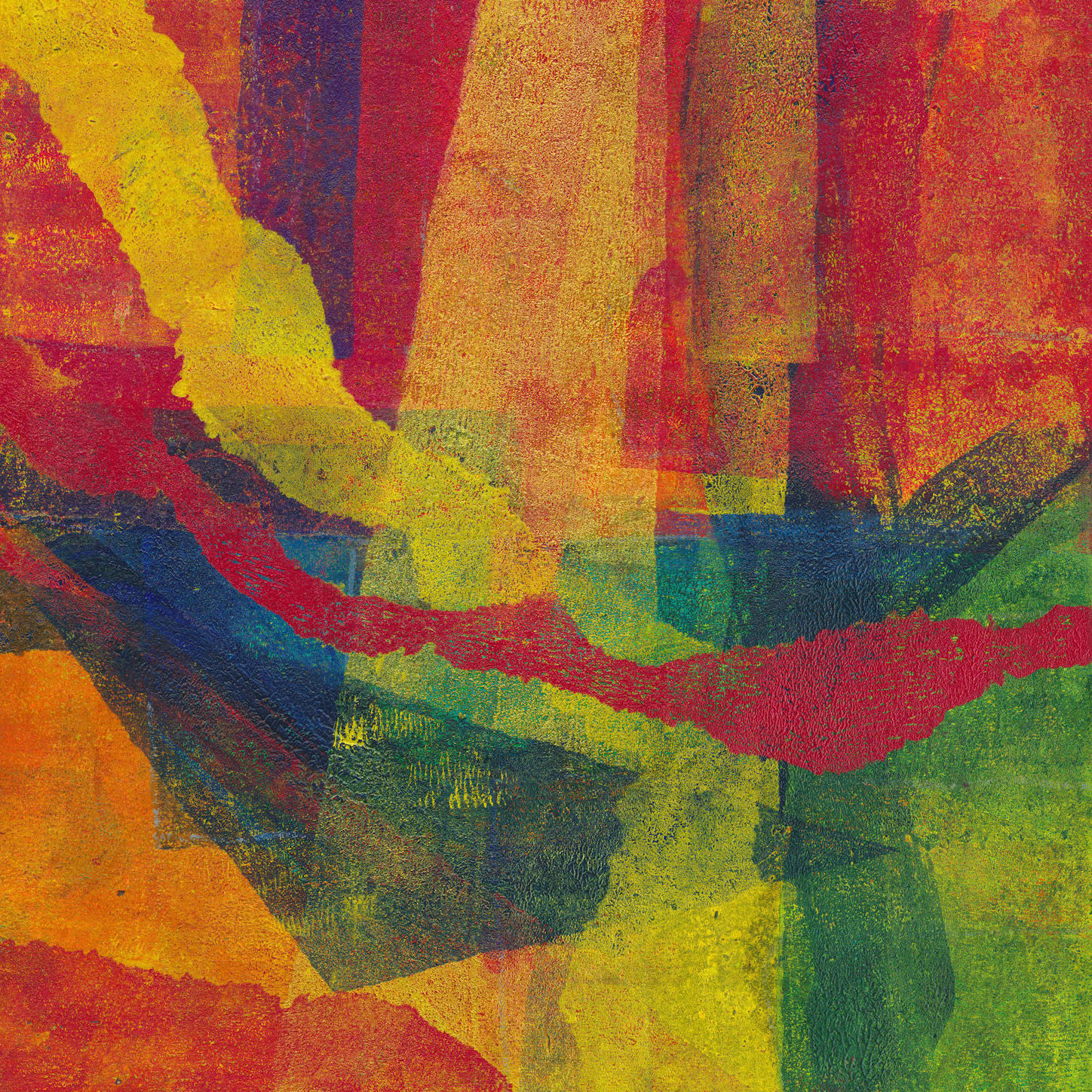
PSP allows me to digitally recombine these simplified images, which led in turn to this image. This is closer to what you would get with screen printing, but is useful to visualise the outcome.

However, just because a file is called magenta, doesn’t mean that it has to be used that way. PSP allows me to digitally recombine the image files in any order. With four files to combine, there are 24 possible combinations, so this one below is just one. It helps to make a point though. When the stencils are cut and used to make gel prints, you have complete freedom in the colour you use.

In the real, as opposed to the digital world, there are other variables. Varying the opacity of the paint used, and varying the order in which you use the stencil, will also give different results.
Finally, just as an experiment, here is a combination image using CYMK files from two different images. I’ve included it just to make the point that once you have the stencil you have complete freedom in their use.

In many ways, this last image is analogous to making a collagraph print from multiple plates. I have experimented with this many times in the past.
That’s it really. I have closed both my Etsy shops, probably permanently. I think I have disabled all the links, but if you get a broken link from one of the posts, I would be grateful if you let me know.

I’ve only recently discovered the work of the wonderful Gee’s Bend Quiltmakers (also here and here). These quilts have been created by generations of women in the isolated African-American hamlet of Gee’s Bend, in rural South West Alabama. The earliest identified quilt maker was Dinah Miller in 1859. Throughout the post-civil war years and into the 20th century, the women of Gee’s Bend made their quilts from scrap materials such as old shirts, overalls, aprons and dress bottoms. They did this from necessity not art. Even now the average income is less than $10,000 and these quilts were needed to keep themselves and their children warm in unheated shacks that lacked running water, telephones and electricity.
Gee’s Bend is very isolated. Until the 1960s there was a primitive ferry which reduced the journey time significantly. However, when black residents of Gee’s Bend began taking the ferry to the county seat at Camden to try to register to vote the local authorities reacted by closing the ferry service.
https://www.smithsonianmag.com/arts-culture/fabric-of-their-lives-132757004/
The shutdown of the 15-minute ferry ride forced the residents of Gee’s Bend to drive, if indeed they had a car, 40 miles over narrow rural roads to get to the county courthouse in Camden, then 40 miles back. They would be without a ferry service for over forty years. Even when federal funding was agreed in the 1990s it still took until 2006 before it reopened. Such enforced isolation made already hard times even harder.
From the 1960s onward, the opening of the Freedom Quilting Bee in nearby Alberta, which had many from Gee’s Bend as members, began to generate increased attention, although the aim of the Quilting Bee was to meet commercial contracts for the likes of Sears, not sell the work of individual quilters. It took until the late 1990s to generate real interest after art collector, historian, and curator William Arnett began to buy quilts from Gee’s Bend makers.
Arnett organized an exhibition called, “The Quilts of Gee’s Bend” at the Museum of Fine Arts in Houston. This later travelled to a dozen other locations across the USA. The exhibition featured sixty quilts created by forty-five artists. When it reached New York, one critic rather gushingly described the quilts as “some of the most miraculous works of modern art America has produced. Imagine Matisse and Klee (if you think I’m wildly exaggerating, see the show), arising not from rarefied Europe, but from the caramel soil of the rural South.” In 2006, the US Post Office issued a set of stamps to commemorate their work, but without giving individual credits.
While this exhibition brought fame to the quilts, Arnett’s relationship with the quilters was troubled and in 2007, two of them filed lawsuits alleging they had been cheated out of thousands of dollars from the sales of their quilts. The lawsuit was resolved and dismissed without comment from lawyers on either side in 2008. From the outside it is hard to work out what really happened, but it seems that the issue is in part the nature of the art market, where pieces travel from dealer to dealer at ever inflated prices.
Despite the controversy, the Souls Grown Deep Foundation, created by Arnett, continues to collect and organize exhibitions for Gees Bend Quilts. It is also managing multiple campaigns to support the quiltmakers and African-American artists in general. They aim to provide documentation, marketing, and fund-raising, as well as education and opportunity for quiltmakers. The foundation is also involved in a multi-year campaign with the Artists Rights Society to protect intellectual property rights for the artists of Gee’s Bend. Some of the quilters have been selling on Etsy for a while, but from February they are creating their own brand presence. Sadly, but not unexpectedly, the site is however already overrun with knockoffs and attempts to cash in on the name. The domain name geesbendquilts[dot]com appears to have been hijacked by someone in Indonesia.
The work of the women of Gee’s Bend raises many questions about the nature of art, challenging as it does the mainstream view that art is made by people who call themselves artists. The utilitarian nature of these quilts is married with a real aesthetic sense that has created objects of great beauty which are indeed art. In achieving that state, they need no validation by comparisons to Klee or Matisse or any other artists. Nor are they ‘outsider art’ except from the perspective of those who wish to control the cultural narrative. They are not ‘naïve’ or ‘folk’ art – their artistic decisions are just as sophisticated as those of the artists with which they are compared.
The community of Gee’s Bend are just as much an artistic community as places like St Ives. Even more so perhaps, since their art genuinely springs from the community and continues through the generations. Reading various interviews with the quilters it looks as if they are finally being recognised as individual artists and the money generated is finally beginning to have an impact locally. The Gee’s Bend Quilting Collective currently has 50 members, working as ever to make each quilt unique. Two members (China and Mary Ann Pettway) now run quilting retreats, passing on their skills to quilters and makers across America.
I would love to list all the artist’s names, but I haven’t been able to find a definitive list. The list of quilters on the Souls Grown Deep website numbers 120 but over the generations there must have been many more whose names are now lost to us. The list below is drawn from the Foundation website and is based on the works acquired by Arnett and then held by the Souls Grown Deep Foundation.
Nellie Mae Abrams 1946 – 2005
Willie “Ma Willie” Abrams 1897 – 1987
Ella Bendolph 1904 – 1995
Louisiana P. Bendolph 1960 –
Annie Bendolph 1900 – 1981
Mary Lee Bendolph 1935 –

Margaret Bennett 1916 – 1994
Polly Bennett 1922 – 2003
Linda Diane Bennett 1955 – 1988
Mary L. Bennett 1942 –
Amelia Bennett 1914 – 2002
Agatha P. Bennett 1919 – 2006
Delia Bennett 1892 – 1976
Loretta Pettway Bennett 1960 –
Maggie Benning 1891 – 1985
Willie Ann Benning 1927 –
Sarah Benning 1933 –
Della Mae Bridges 1905 – 2000
Emma Lee Pettway Campbell 1928 – 2002
Minnie Sue Coleman 1926 – 2012
Minder Coleman 1903 – 1999
Ruby Gamble 1918 – 2001
Rachel Carey George 1908 – 2011
Eddie Lee Pettway Green 1926 –
Queen Hall 1938 – 2015
Pearlie Pettway Hall 1908 – 2000
Gloria Hoppins 1955 –
America Irby 1916 – 1993
Ella Mae Irby 1923 – 2001
Sally Bennett Jones 1944 – 1988
Marlene Bennett Jones 1947 –
Rebecca Myles Jones c. 1896 – 1986
Ruth Kennedy 1926 – 2020
Nettie Jane Kennedy 1916 – 2002
Mary Elizabeth Kennedy 1911 – 1991
Clementine Kennedy 1904 – 1974
Seebell Kennedy 1915 – 1981
Nazareth Major 1947 – 2020
Lizzie Major 1922 – 2011
Helen McCloud 1938 –
Gertrude Miller 1884 – 1970
Lucy Mingo 1931 –
Lottie Mooney 1908 – 1992
Lucy Mooney c. 1880 – 1969

Flora Moore 1951 –
Aolar Carson Mosely 1912 – 1999
Ruth Pettway Mosely 1928 – 2006
Sadie Bell Nelson 1936 – 1981
Addie Pearl Nicholson 1931 –
Mertlene Perkins 1917 – 2015
Martha Pettway 1911 – 2005
Candis Pettway 1924 – 1997
Leola Pettway 1929 – 2010
Lottie Pettway 1914 – 1997
China Pettway 1952 –
Henrietta Pettway 1894 – 1971
Emma Mae Hall Pettway 1932 –
Nellie Pettway 1940 –
Lola Pettway 1941 –
Louella Pettway 1921 – 2006
Arie Pettway 1909 – 1993
Plummer T. Pettway 1918 – 1993

Arlonzia Pettway 1923 – 2008
Beatrice Pettway 1928 – 1988
Edwina Pettway 1950 –
Essie Bendolph Pettway 1956 –
Belinda Pettway 1957 –
Joerina Pettway c. 1881 – 1945
Mensie Lee Pettway 1939 –
Jennie Pettway 1900 – 1990
Joanna Pettway 1924 – 1993
Nancy Pettway 1935 –
Lillie Mae Pettway 1927 – 1990
Lucille Bennett Pettway 1921 – 1999
Annie E. Pettway 1904 – 1972
Katie Mae Pettway 1950 –
Creola Bennett Pettway 1927 – 2015
Mary Ann Pettway 1900 – 1953
Vera Pettway
Annette Pettway 1964 –
Allie Pettway 1916 – 2010
Sweet T. Pettway 1903 – 1983
Indiana Bendolph Pettway 1913 – 1996
Jessie T. Pettway 1929 –
Marie Pettway 1926 – 1987
Malissia Pettway 1914 – 1997
Loretta Pettway 1942 –
Annie Bell Pettway 1930 – 2003
Rita Mae Pettway 1941 –
Nell Parker Pettway c. 1914 – 1981
Lorraine Pettway 1953 –
Lucy P. Pettway 1930 – 2003
Martha Jane Pettway 1898 – 2003
Missouri Pettway 1902 – 1981
Lutisha Pettway 1925 – 2001
Pearlie Kennedy Pettway 1920 – 1982
Linda Pettway 1929 – 2012
Pearlie Irby Pettway c. 1898 – 1955
Qunnie Pettway 1943 – 2010
Arcola Pettway 1934 – 1994
Lucy T. Pettway 1921 – 2004
Stella Mae Pettway 1952 –

Sally Mae Pettway Mixon 1965 –

Bettie Bendolph Seltzer 1939 – 2017
Sue Willie Seltzer 1921 – 2010
Florine Smith 1948 –
Mary Spencer 1949 – 2017
Gearldine Westbrook 1919 – 2016
Hannah Wilcox 1896 – 1973
Irene Williams 1920 – 2015
Andrea Williams 1973 –
Nell Hall Williams 1933 –
Patty Ann Williams 1898 – 1972
Liza Jane Williams 1916 – 1988
Magalene Wilson 1898 – 2001
Lucy L. Witherspoon 1953 –
Estelle Witherspoon 1916 – 1998
Aestean P. Young 1936 – 2001
Deborah Pettway Young 1916 – 1997
Ethel Young 1910 – 2000
Annie Mae Young 1928 – 2013
Nettie Young 1916 – 2010
After my last blog post, in which I concluded the answer was effectively – nothing- it was heartening to see this interview with Gillian Ayres on YouTube where, in the opening minutes she says much the same thing.

As I continue to add new items to the shop, I’ve taken to including in the item description a brief explanation of the title. In connection with the ‘Lockdown Series’ of monotypes this is sometimes difficult. Naming a piece of abstract art is never easy and may well end up saying more about the artist than the art! Humans appear to have strong pattern matching instincts. We see shapes and can’t help trying to make sense of them. There is even a scientific term for it – pareidolia. It isn’t surprising then that abstract paintings and prints fall victim to the same tendency. Any meaning in abstract art has to be put there – usually by the viewer, not the artist.
Several things spring to mind from this.
First, just because you see something in an abstract image, that doesn’t mean it is the result of deliberate intent.
Second, just because you see something in an abstract image that doesn’t mean others will also see it. Equally, if you can’t see anything, it doesn’t mean others cannot.
Third, just because an artist gives an abstract image a title suggestive of something in the real world, that doesn’t mean it is actually in the picture.
For example take one of my favourite artists, Gillian Ayres. Many of her paintings only got a title after she finished it. Sometimes she even asked friends to suggest titles. These titles almost never describe what the painting is about. Instead, they seem to reflect how the artwork made her feel and what that reminded her of. Gillian Ayres said you don’t need to understand her art to like it. She just wanted you to look at it. I found many similar quotes from Mark Rothko.
There is a wider point here. There is no meaning in abstract art. It does not require understanding. It just is. A Renaissance painting, with its richly symbolic visual language has much more intrinsic meaning than say a painting by Jackson Pollock. If an artist attaches personal meanings to the shapes and colours of an abstract painting, they must either share those meanings or accept that others will attach their own and, going back to our starting point, see different things.
For other posts see here and here
I’ve tried to record the process of making one of my gel prints several times, but without success. This is because my working methods mean I am usually working on perhaps a dozen prints at once, jumping between them. I build up each image over time by adding layer after layer of colour and texture. The closest I have come is a series of photographs of different stages. This post tries to fill some of that gap.
All gel prints start with paint on the plate. This is the first big variable. I apply the paint with a brush, a roller and even my fingers. Rollers give the most even effect. Even then as the roller loses paint to the plate in one place it can start picking it up elsewhere. The basic aim is to create variations in the thickness of the paint sitting on the plate. This helps to create variations in colour and visual texture in the eventual gel print.
How much variation you want is a matter of choice. For me, early layers tend to have more or less complete coverage using a limited palette. For later layers I may only cover part of the plate, perhaps using a mask or stencil. On any layer, I can create textural variation by applying anything with texture to the paint as it sits on the plate. I use pill packets, bits of card, pieces of scrap plastic with interesting textures or just crumpled paper. I often remove paint completely with cotton buds.
How this will print depends on a range of factors – what colour is it going over, on the use of opaque or transparent paints and on how much is left in the thinnest areas. Using more than one colour at a time on the brush or roller also creates variations and colour blends. Adding acrylic medium also alters things.
I don’t clean down the plate between every layer. Because the transfer from plate to paper is not always 100% this can leave patches of paint behind. Rolling fresh colour over these patches often picks them up and transfers them to the print, adding texture.
Using transparent paints in a layer will shift the colour underneath depending on the two colours used. If the upper layer is partial this will leave the underlying colour untouched in some areas. Removing part of a layer also allows the underlying colour to come through. The effect will vary between transparent and opaque colours.
I also restrict the area to which I’m applying the paint using masks or stencils. I usually cut or tear these from newsprint. Opaque paint will obscure what is underneath. I do this to simplify messy areas or perhaps to combine separate blocks of colour. Using transparent or semi-transparent paint can subdue contrast between adjacent areas or shift colours by mixing through layering. Acrylic medium can create translucent effects if you mix it with opaque colours.
Eventually the build up of paint on a plate makes the transfer of paint to the print too unpredictable. This is my cue it needs cleaning. The paint left on the plate won’t be wasted however, even if it has dried completely. Start by rolling out an even coat of colour over everything. Then start to take the print as normal, but leave the paper on the plate longer than usual before you lift it. If everything goes well the last layer has bonded with the residue on the plate and most of it will transfer to the paper. You are unlikely to get a print this way that stand in its own right. The idea is just to use it as the first layer for a subsequent gel print.
As the layers of paint build up I look for the happy accidents and try to reinforce them. It is the way that successive layers show through that creates the subtle colours and textures which I think are the defining characteristic of gel prints. Some paints are opaque, other transparent. It is very rare for me to plan out an image. Even when I do that plan is often quickly abandoned when I see something unanticipated but which works! Eventually I get to a point where, as I look at an image it says Stop! That is something I can’t define. IT seems to be a combination of visual balance in terms of shapes and colours and overall cohesion/balance of the image as a whole.
Building up the image in layer after layer makes adhering to a specific composition difficult. I rarely have a fully planned composition in mind. Even when I do, that can be derailed when something unexpected happens which I like. The closest I usually come is the use of very simple structures like this crib sheet of mine. The artist Bob Burridge produces a rather more refined version you can buy.

As you add layers to your gel prints, you need to consider not just the area to be printed but the colour you will use. Careful thought here will give you more control over the final image. The first thing to do is to get a colour wheel. If your first layer is pretty much all cadmium yellows, look on the wheel at the colours either side of yellow. Using these colours for subsequent layers will give you a final image which is harmonious and balanced.
Alternatively look on the wheel at the colour opposite yellow – the complementary colours. Don’t just look at the direct complementary, look at the colours on either side of it which form the so-called split complementary. Some wheels also include markings for colour triads and for four colours. Try them. Using these colours will add drama and intensity to your work.
Don’t make the assumption that you need equal areas of complementary colours. Sometimes a large area of a relatively low-key colour can be balanced by a small intense area of its complementary. Think also about the effects of using transparent layers of one colour over its complementary. Think about how the effect differs from using opaques colours side by side. This can have an impact on your composition too.
There are lots of examples in the shop in the Lockdown Series 2020 and many more in my Instagram feed.
I’ve written before about some lessons I have learnt about selling online. This post is about the more concrete aspect of getting a consistent and attractive presentation of your work.
The monotypes I’ve been making during lockdown now number about 70 with more still in progress. I’m thinking of setting myself a final target of 100 for the series. Making them has taught me a lot about colour and composition and I want to try to use those lessons in other print forms, especially collagraph. With so much work though consistent presentation is critical, not least because it raises issues of up-front costs in framing etc. Like any small business, artists need to minimise overheads
The cheapest option is obviously to offer these prints unframed and unmounted. However, I have noticed that there is a difference in perception between what you might call the ‘raw’ and ‘presented’ images. The simple act of presentation seems to be key in transform your work from just a piece of paper into an object of value.
By their very nature, gel plates are stretchy, so it can be difficult to get them accurately squared up before printing. Consequently, most of the nominally square prints are slightly distorted. Mounting them conventionally, with the edge of the print showing doesn’t look good because the gap between the print edge and the aperture edge is variable. The mount aperture can of course be cut to fit just inside the image. This gives a clean square look, and if the mount’s external dimensions are a standard frame size, gives a lot of flexibility in framing.
The print can also be torn down to a clean edge and ‘float mounted’. This needs a box frame to keep the glass off the image, which may be slightly more expensive. Here’s a video showing several ways of achieving this.
Instead of framing the print can be mounted on canvas or on a cradled wooden panel. This video by artist Bob Burridge shows how to do that neatly. I have to say I think this works best for larger pieces. Smaller works treated this way somehow lack ‘presence’, at least on their own.
I haven’t made my mind up yet. The float mounting technique in the video looks wonderful, but takes time to do well and would therefore be more expensive. I think in the end I will probably go for mounts cut to mask the edges. That way I can buy the mounts in bulk with bags and a backing board and to fit a standard frame size. Most of the images I’m talking about are 30 cm square so would look good in a 50 cm, but square frame. That’s a bit on the large size for easy shipping but should be possible. I have in the past sent 20″ x 16″ (about 50 cm x 40 cm) without problems.
However you do it, having a consistent and attractive presentation of your work is an important factor in achieving sales. If you are at all serious about your work it deserves that effort.
Let me know in comments how you do this for your work.