In this post, I describe some methods for digitally generating abstract shapes. One produces almost entirely random shapes, the second creates forms that look like text but are not (sometimes called asemic writing), while the third creates images looking like figure ground diagrams. The files created can then be used to create cutting files for use in a digital cutter.
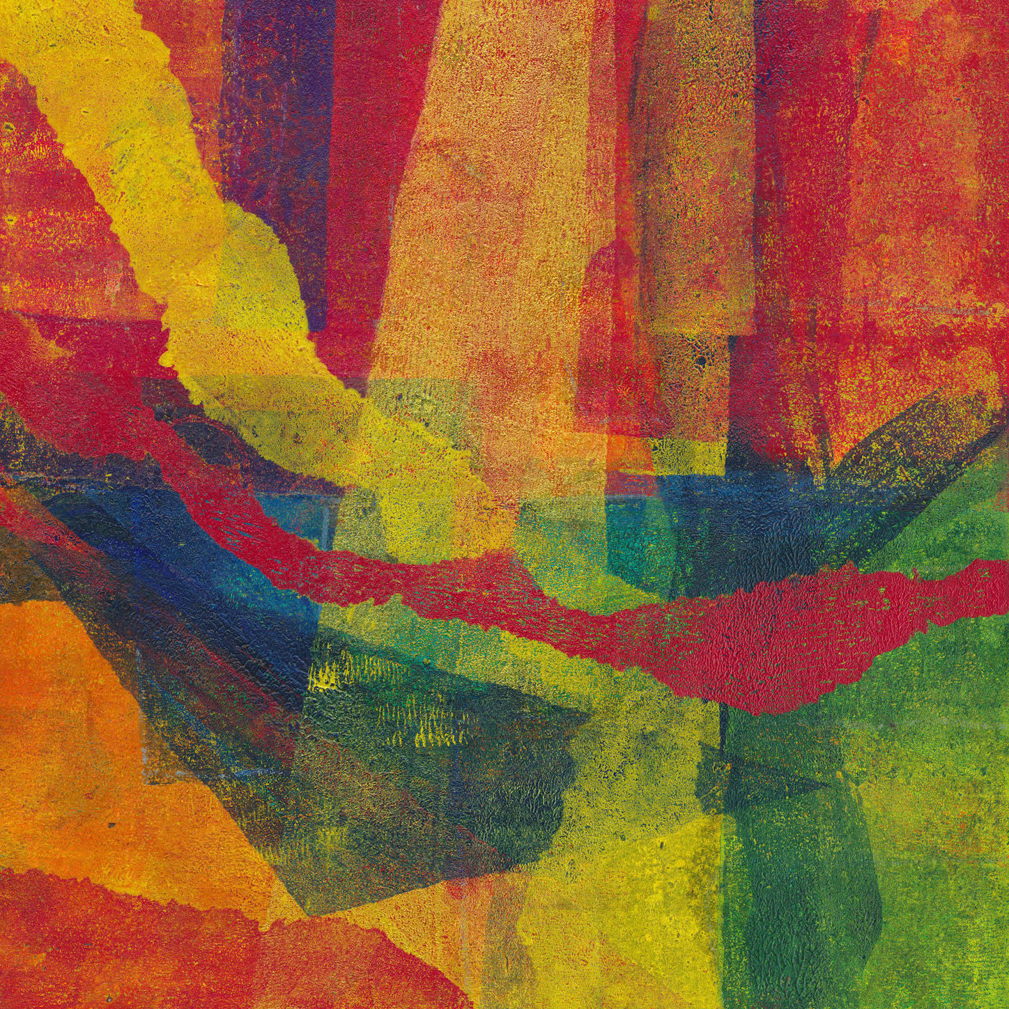
This is the third in a series of posts about digital tools for gel printing. The first is here, the second, here. Also relevant, is this post on using the prints themselves as a digital resource
Random shapes
It’s very difficult to create a genuinely random shape. I developed this technique to get around that.
Start with a photograph. The subject doesn’t matter, but landscapes and skies seem to work well. In PSP, select the ‘Magic Wand’ tool from the icon menu on the left-hand side.
Third icon down and select ‘Magic Wand’ from the drop-down menu. Once selected, a toolbar opens along the top. Two options are critical – ‘Tolerance’ and a checkbox marked ‘Contiguous’.
‘Tolerance’ defines how close a pixel has to be to the colour you click on in the image to be selected. A zero means it has to exactly match. I tend to use between 10 and 20, but play around with it. ‘Contiguous’ when ticked means that only pixels connected to the click point are selected.

When you click, you will see the ‘marching ants’ around the selected area. If it looks too limited, hold down the shift key and click somewhere nearby. Keep clicking until you get a shape that looks OK. Copy that selection [PSP Menu – Edit/Copy or Ctrl+C], then paste the contents of the clipboard into a new image [PSP Menu – Edit/Paste as new image or Ctrl+Shift+V]
The resulting image should be a random irregular shape, still at this stage in the colours of the original image, which still needs some manipulation to generate the cutting file. Start by using the threshold option to reduce it to a single colour. You will need to find the sweet spot to make the shape all black. If there are small gaps, you can touch them in with the brush tool.
You should now have an irregular shape with almost fractal edges. The stencil could be cut directly from this or the edges could be smoothed further, using the Median filter.

You could also reverse the colours, as below. In both cases, there is no requirement to use the whole image, it could be cropped or modified further. The second image below is a detail from the first.


False Text
To create shapes with script like character, begin by creating a new document the size and resolution you require [PSP Menu – File/New or Ctrl+N] This opens up a dialogue box. Pick the size and resolution you want and select Vector Layer.
Now select the text icon from the left-hand menu. From the toolbar at the top, select the font and size you want. I suggest you start with either a large blocky font or a thin geometric font. Make sure both ‘font colour’ and ‘stroke colour’ are selected as Black, so that edge and infill are the same colour.
Click on the page at the top left and start to type text to fill the page. It doesn’t matter what you type. It doesn’t wrap automatically, so make sure to hit return at the end of a line. Once the page is full, go to the Layers Palette, right-click on the text layer and select convert to raster layer. This turns the text you have typed into just graphic shapes. You can now manipulate this image in various ways described below. All of these can be done in isolation or in combination. The order in which you do things will also often affect the outcome. Just play and see what happens. Remember, Ctrl+Z will back you out of anything you don’t like. You can back out of several steps if you wish.
Drawing over the lettering
Select the ‘pen’ tool from the icon menu on the left. If you hover your mouse pointer over the icons, you will see what they are called and also see the keyboard shortcut, which for the pen is V. A new toolbar should open across the top. From the ‘mode’ selection, choose the ‘Draw Lines and Polylines’ option. Moving along, deselect ‘Create on vector.’ Next make sure the line style is a solid line and finally type in the width of line you want to draw – here you may need to experiment (Ctrl+Z gets you out, remember). Make sure you are drawing white lines. Then click outside the page and draw a white line through your text. This will start to break up the image and move it away from recognisable text. Repeat as you think fit, changing angles and moving from horizontal lines to vertical lines.
Using software tools
Use Effects/Edge Effects/Dilate or Adjust/Add or Remove Noise/Median Filter to alter the letter shapes. Median Filter works well with the line drawing option above.
Copy the base image and then rotate it. Paste as New Image. Go to Image Arithmetic [PSP Menu – Image/Image Arithmetic] The drop-down boxes at the top of the window that opens should show the two images you have open. You will see a host of options. Just play with them. You will see that some of them look like the options for combining layers. The outcome will depend hugely on the nature of your original image. Note that for this approach, the two images don’t have to be the same size or proportions. If they are different, you may get an error message, in which case swap the two images over, and try again.
Using layers
Copy the layer [Ctrl+C] then rotate the existing layer 90°. Paste the contents from the clipboard as a new layer. [Ctrl+V] If the image is square, this will fit neatly over the bottom layer, otherwise you may need to click and drag the upper layer to a suitable position. Remember Ctrl+Z if you don’t like it. Select the new layer in the Layers Palette. Just above it is a box with drop down options that should start with ‘Normal’. Select ‘Darker’. You will now see both layers combined. Think of the layers as sheets of tracing paper. Now select ‘Lighter’ and see the difference. Try all the other options. Most won’t make any difference since you are working in black and white, but it’s a useful exercise in seeing what options are available. Try rotating 90° in the opposite direction. Try 180°. Combine this with the Mirror and Flip options [PSP Menu – Image/Mirror or Image/Flip]
For any image with multiple layers, try turning some of them off and on in turn. To do this, click on the little ‘eye’ icon on the appropriate layer. [Lower box to the left of the small picture of the layer] When the box is empty, the layer is turned off.
When you are happy with a particular multi-layer image, you can combine all the layers together or ‘flatten’ them. This reduces the file size and also prevents any inadvertent changes to layer settings. [PSP Menu – Layers/Merge/Merge All (Flatten)] You can use the various options under Layers/Merge to combine multiple layers in various ways. You can also save the flattened image under a new name and carry on playing with the various combinations. [PSP Menu – File/Save As and enter the new file name where prompted.] If you think about it, you can generate several very different images from different combinations of layers, all initially stemming from the same sketch. These new images can then in turn be added as new layers, offering even more possibilities.


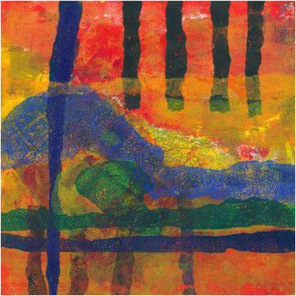
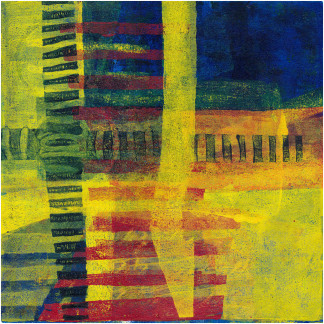
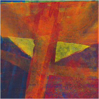
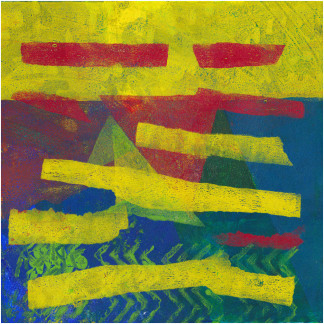
Some examples of this process above.
Figure Ground plans
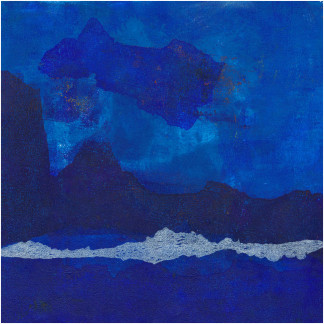
These can be made similarly to the false text. Draw the lines in black, without any underlying text. Then inverts the image and process in the various ways described above. Some examples below.


I’ve only hinted at the various options available. My advice is just to play, and where there is an option, turn it all the way up to 11 to see what happens!
Make sure you are working with copies of any original files, and be sure to save off any versions that look promising.