As the absence of posts here might indicate, I’ve been going through a period where I can’t seem to make progress, whether writing or printmaking. I’ve been casting around for ways of getting through this creative block. This post is about one of the approaches I’ve tried, inspired by artists on YouTube, Instagram and elsewhere including Jane Davies, Karen Stamper, Albert van der Zwart, and Sally Hirst whose Collage Creations course I’m currently working through. (I wasn’t when I first wrote this.)
From these, and others, I realised that a common factor in being blocked is fear. That may be fear of not getting it ‘right’, fear about wasting materials because of a lack of confidence. That’s nonsense, of course, everything doesn’t have to be brilliant every time, and nothing used with intent is wasted. Still, it’s an easy mind set to fall into, especially when you’ve been working hard. With that in mind, I set out to create quantity, not quality, setting myself some arbitrary rules to stop me overthinking.
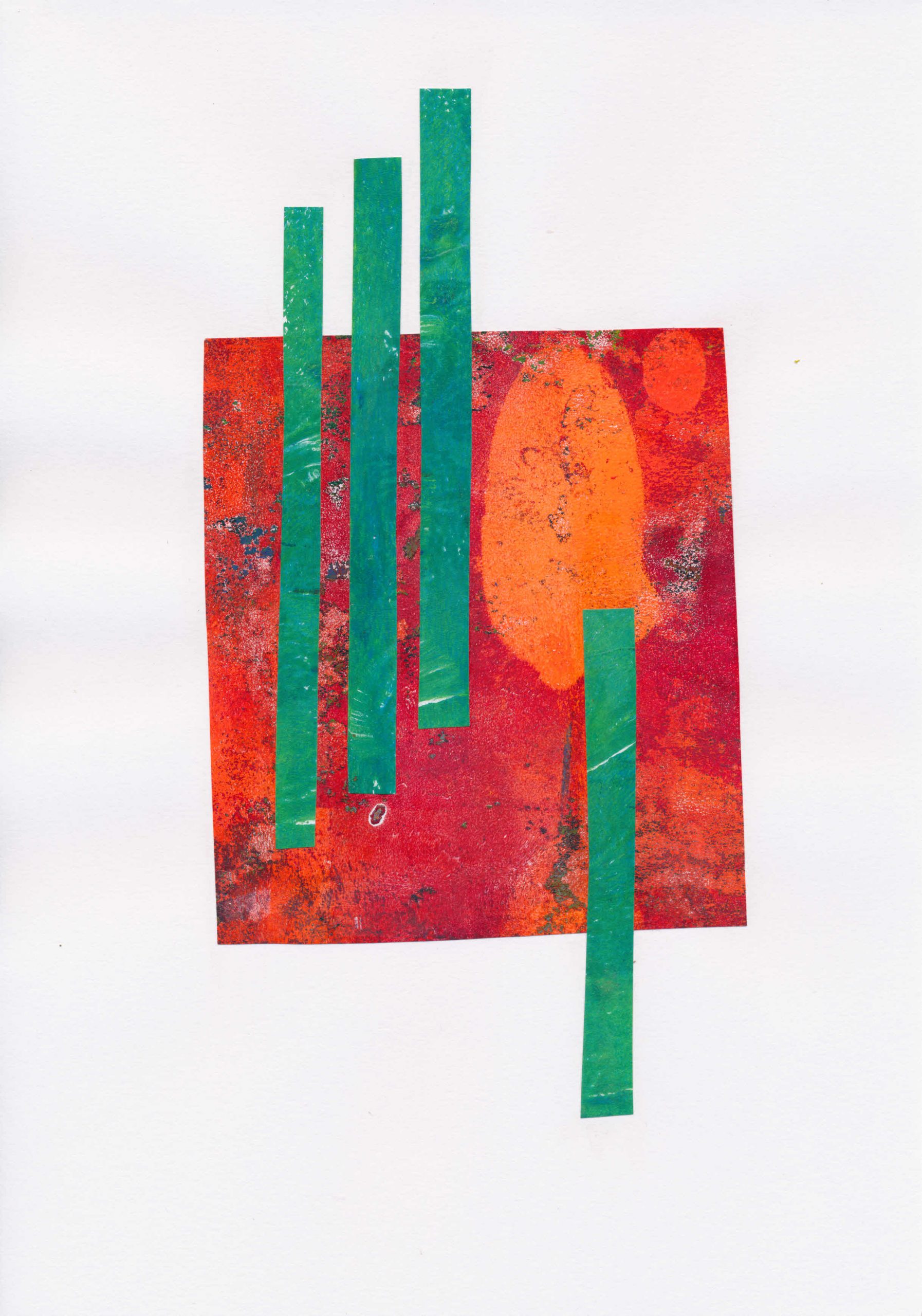
Normally, if I get stuck I make some small gel prints, as that is a quick and effective way of getting something to look at. I couldn’t do that this time, because I felt I was in a rut. So, I created an extra disruption by choosing collage, a medium I hadn’t done a lot of work in.
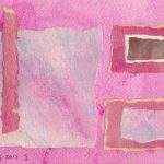
I started with some very small (A6) pieces of mixed media paper and a pile of random shapes cut from prepared papers, old maps etc. I gave no thought to how they might fit together. To make the collage, the rules I set myself were:
- work fast – no more than a couple of minutes on each. Don’t go on endless searches for the perfect shade or piece.
- no more than 2 or 3 pieces in any one composition.
- free form – i.e. not working to a rectangular shape. Let the paper decide
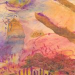
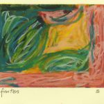
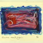
I don’t think the results are in any way finished pieces, although a few are quite pleasing. I don’t even think of them as ‘studies’. A study, to me, implies a degree of planning, of working toward something. These are ideas, no more, and like all ideas some are better than others.


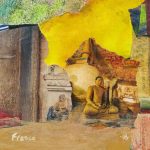
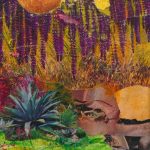
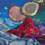
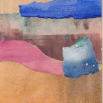
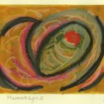
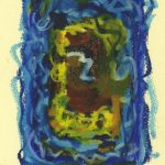
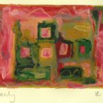
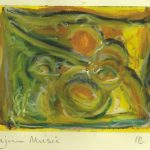
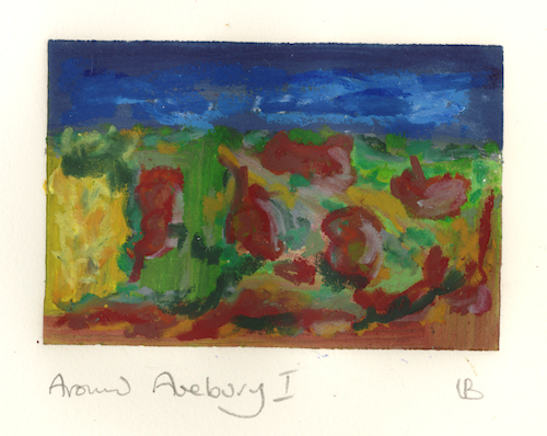
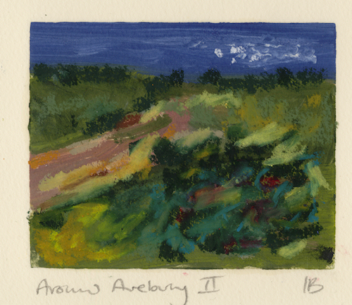
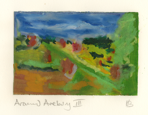
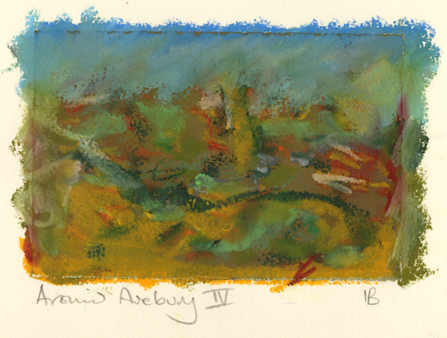
I’ve put the full set so far in the slide show below.


So, what’s next? Again, I’m not entirely sure. I’ll probably make another batch in similar fashion, perhaps a little larger. I don’t want this way of working to be the new normal, so I will need to make sure I keep experimenting. I’ve started making similar pieces in a concertina sketchbook I made by folding and cutting a large A2 sheet. Working that way stops me seeing them as ‘art’, but as trials.


In a variation on this, I dripped and spattered acrylic ink across a similar A2 sheet, then folded and cut it to make another sketchbook. You can see the effect below.


EDIT: Since I first wrote this, I have enrolled on Sally Hirst’s Collage Creations course. Other factors have intervened, so my reading has got far ahead of the making. So far, though, I’m finding it worthwhile. Obviously, some bits I knew already. Sally’s clarity of exposition has, though, has enabled me to use what I knew with deliberate intent, and to build on that. I’m looking forward to working through the rest of it.
Updated and extended 28/08/2023