On the portfolio pages I’ve added some more larger gel prints to an album I have renamed as ‘Life In Lockdown’. At some point I aim to get these into mounts and bagged for sale. If in the meantime you are interested in any of them, please get in touch. They are available ‘as is’ with no mount or frame for £85.00 plus postage.
Category: printmaking
Getting past Lockdown Lethargy
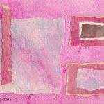
No one who is in the least bit creative will be surprised if I say that the last few weeks have been a bit barren creatively. So I was pleased to finally get some work done making some larger gel prints. I’ve added some images to the portfolio page but you can also see them on Instagram alongside other work in progress. As a build up to the larger prints I have also made a large number of smaller ones around 7″ x 5″ (18cm x 13cm) which are for sale matted to fit a 10″ x 8″ frame. These are now being added to the portfolio page. These smaller prints are being sold as part of the #artistsupportpledge or to raise funds for my local foodbank. I’ve added a contact form below if you see anything you would like to know more about.
Small prints on the Portfolio page


Updates

I haven’t posted here in a while for a whole parcel of reasons I won’t bore you with. In particular some health issues have caused me to temporarily close my Etsy and Folksy shops. I’m using the hiatus to try and clear some of the small prints stacked up in my studio (and the spare bedroom) I won’t say I’m going the whole Marie Kondo route, but I do need to declutter. These prints are being posted for sale in my Instagram account, and crosslinked from time to time to my FaceBook page and my Twitter account. The sale will run until about mid-September.
I’ll probably be running a separate sale later in the year to clear some of the reproduction prints I have in stock from when I was selling at craft fairs. I’ll post a link at the time here and on the Panchromatica Designs blog and Facebook page.
Finally, the print group I belong to, Wiltshire Print Creatives, is having a group show in November in Frome in Somerset from 9th to 23rd November. More details closer to the date.
Original and Reproduction

This long post examines the difference between an original and a reproduction, in the context of Printmaking. It is based on material first published in about 2012, revised and updated for this post in 2019. It has been extensively revised again 31/12/2022
What is the difference?
Many years ago, I had an Irish friend who would in conversation regularly use “yer man”. Unfortunately, “yer man” might end up being applied to several different people, so it became very difficult to follow what he was saying. I sometimes feel the same frustration when talking about printmaking. Words like ‘print’ are used liberally and inconsistently.
My last post, about the Wiltshire Print Creatives website, mentioned the goal of promoting the art of the print. Why is this necessary? Because a mixture of sloppy language and marketing hype has corrupted the meaning of the term ‘print’ almost beyond recovery.
Avoid sloppy language
By sloppy language, I don’t mean slang. I mean using words without thinking of whether it is the right one for the context. I know I’m picky about this, but the marketing men exploit such sloppiness. That reflects badly on the rest of us. Terms like ‘Art Print’ are meaningless, unless put into context. This has got me into trouble from time to time, in various online fora. I always challenged the use of the word ‘print’ to mean ‘reproduction’, and people don’t like being challenged.
Why does it matter?
For my own part, I have always tried to practice what I preach. I used to have an online shop where I sold reproductions of out of copyright vintage graphics. Every listing made it clear that the item for sale was a copy, a reproduction. Not everyone read it, but the information was there.
My position
- I have no objection to other people producing reproductions of their own work. I don’t wish to do so myself.
- A reproduction of a painting is not, OF ITSELF, a work of art. It is a copy of a work of art.
- A reproduction of a painting may be called a print, yes, but it is a reproduction print. Accurate description is a legal requirement in UK consumer law and omitting key information may land you in difficulty.
- Reproductions sold as limited edition ink-jet or giclée prints are sold this way for marketing purposes. It has nothing to do with art and everything to do with creating artificial value.
- Creating a limited edition reproduction print does not create genuine value. The true value of such a print depends only on its price in the secondary market. For 99% of such prints, that market does not exist.
- With a genuine original print, the original artwork IS THE PRINT ITSELF. The image may have been created in a variety of ways, but the work does not exist in any other form.
- An original print should also be distinguished from a restrike. Restrikes are produced using the original matrix, but as part of a later, unconnected publishing venture.
Giclée or Inkjet?
The widespread availability of ‘giclée’ prints probably won’t have escaped your attention. The term is not one I would normally use. Like the word print itself, it has become so vague in its use as to be almost meaningless.
In 1989 while searching for fine art output for his scanned images, Graham Nash came across the Fujix printer being used by John Bilotta at Jetgraphix, UCLA. Graham was further introduced to digital print technology when viewing a demonstration of the IRIS 3047 graphics printer used in the commercial printing industry. The IRIS was designed to interface with digital prepress systems and used thin proofing papers that were mounted on the printing drum. With the help of Dave Coons, Steve Boutler, Jack Duganne, Mac Holbert and Charles Wehrenberg the concept of the first fine art digital printmaking studio was created. On July 1, 1991, Nash Editions opened its doors in Manhattan Beach, CA. For over twenty years Nash Editions has been offering digital print making services to photographers and artists all over the world. By 2003 Epson wide-format printers replaced the IRIS 3047 graphics printers. The original IRIS 3047 graphics printer purchased by Graham Nash now resides in the Smithsonian’s National Museum of American History.
https://www.nasheditions.com/about-us.html
My understanding is that the term was invented by Jack Duganne. Then, under commercial pressure, it came to mean and inkjet print made with archival inks. It then shifted again, at least in the US, to simply mean a reproduction. My impression, gained from following the online debate, is that the first shift happened under pressure from artists trying to defend their position against cheap colour photocopies, while the second shift came out of opposition from traditionalists to the whole idea of digital art. The outcome though is that the term ‘giclée’ has lost any meaning or utility.
Reproductions
Setting that aside for the moment, the widespread availability of these printers has lead to a massive growth in reproductions of paintings and other artworks. Although a giclée print is much more expensive than the offset it has replaced, the ability to produce only one at a time places the opportunity to make and sell reproductions into the hands of even minor artists. (And because this also proves a sensitive topic every time I raise it on art forums, by minor, I simply mean unknown or less well known artists, often outside the gallery system, and I am not implying any judgement on their work. For the record, that term includes me.)
…there are now many tens of thousands of individual photographers and artists, from amateurs to pros, who are able to print high-quality images in their own studios, homes, and offices. No longer constrained by the high costs of traditional printing methods, the production of “artistic” prints has been put in the hands of the greatest number of people–the artists and the image makers themselves.
[originally a quote from a website covering these issues, www.dpandi.com which is now defunct]
This easy availability, this democratisation of the process of making reproductions is an example of the ‘accelerated intensity’ of the means of reproduction referred to by Walter Benjamin in his early paper, “The work of art in the age of mechanical reproduction“
In principle a work of art has always been reproducible. Man-made artifacts could always be imitated by men. Replicas were made by pupils in practice of their craft, by masters for diffusing their works, and, finally, by third parties in the pursuit of gain. Mechanical reproduction of a work of art, however, represents something new. Historically, it advanced intermittently and in leaps at long intervals, but with accelerated intensity. The Greeks knew only two procedures of technically reproducing works of art: founding and stamping. Bronzes, terra cottas, and coins were the only art works which they could produce in quantity. All others were unique and could not be mechanically reproduced. With the woodcut graphic art became mechanically reproducible for the first time, long before script became reproducible by print. The enormous changes which printing, the mechanical reproduction of writing, has brought about in literature are a familiar story. However, within the phenomenon which we are here examining from the perspective of world history, print is merely a special, though particularly important, case. During the Middle Ages engraving and etching were added to the woodcut; at the beginning of the nineteenth century lithography made its appearance. With lithography the technique of reproduction reached an essentially new stage. This much more direct process was distinguished by the tracing of the design on a stone rather than its incision on a block of wood or its etching on a copperplate and permitted graphic art for the first time to put its products on the market, not only in large numbers as hitherto, but also in daily changing forms. Lithography enabled graphic art to illustrate everyday life, and it began to keep pace with printing. But only a few decades after its invention, lithography was surpassed by photography. For the first time in the process of pictorial reproduction, photography freed the hand of the most important artistic functions which henceforth devolved only upon the eye looking into a lens.
A logical analysis of terms
The rest of this post is an attempt to unscramble things by using neutral language as an exercise in logic, not art. It is an edited version of something that began as a post in an Etsy forum about 6 or 7 years ago, then became a blog post on my now lost Arts Blog and now reposted with further editing here.
So – to begin:
It is generally accepted by most people that there is a class or category of objects called prints. Because there are various types of prints, let us call this overall category Prints(cat).
It is argued by a very large group of people that terms like silkscreen print, woodblock print etc represent a class of objects also called prints, sometimes qualified as ‘hand-pulled’ prints. So, if we have a single category Prints(cat), that would logically include ‘hand-pulled’ prints. For clarity let’s call this sub-class, Prints(h).
It is argued by a significant number of people that what I think of as a reproduction is validly called a print. So, Prints(cat) would logically contain what I call reproductions. Let’s call this sub-class Prints(r).
Finally, it is also argued by perhaps a smaller but still significant number that the output from photomanipulations made using packages like Photoshop or Paint Shop Pro or originated using packages like Corel Painter, Bryce etc – are also validly called prints, perhaps qualified in this case as ‘digital prints’. So again, Prints(cat) would logically include ‘digital’ prints. Let’s call these Prints(d).
Print categories
So – we have a generic class of objects called Prints(cat).
We also have various sub-classes described in various ways but generally as ‘x’ prints or in the form I have adopted here Prints(x).
If we keep these logical labels it is clear what is going on. In other words:
Prints(cat) contains Prints(r), Prints(h) and Prints(d). {1}
When we remove the suffixes and state this proposition in plain English we get:
Prints as a category contains Reproduction Prints, Handpulled Prints and Digital Prints. {2}
However, REMOVE the qualifier and what happens?
Prints contains Prints, Prints and Prints {3}
Not very helpful. That confusion could be removed easily if we used the terminology in the plain English statement at {2} above.
Digital Prints are not reproductions
It is further complicated, though, in that the terms Reproduction Print and Digital Print are unacceptable to some people, although those who object to the first may not object to the second – and vice versa. Others argue that they are in fact the same thing and should not be differentiated.
There are indeed of course similarities between the two subclasses, but those similarities relate to the form of the output, usually but not exclusively ink jet/giclée printing. The similarities do not extend to the question of artistic input.
In the case of Prints(r) the artistic endeavour has gone into the creation of the source image. Some judgements have to be made in creating the print file in terms of issues like fidelity of colours to the source image etc, but in comparison to the artistic input to the source image proper that is minimal and the work to achieve it often delegated to print technicians or others, as evidence by the huge number of Print on Demand services available.
In the case of Prints(d), the artistic endeavour has gone directly into the creation of the digital file. Other issues like colour fidelity are of course relevant, but are incorporated in the process of making the image on-screen.
A specious argument
The argument that Prints(d) are equivalent to Prints(r) is specious. It depends on a definition of the computer file as the original. This is false for two reasons.
- We are talking about a visual medium and the computer file is not a visual artefact.
- The argument conflates two uses of digital technology – as tool in the creation of the physical print and as medium in the creation of artwork like net installations, animation, virtual reality etc.
It would be possible, I suppose, to argue that the original of a digital work is the version seen on screen, and that physical prints are reproductions of that screen display. That ignores the intention of the artist, however. If I make a digital print with the intention from the outset of producing physical objects – i.e. the print, then I could argue (and to a degree I do so argue) that the screen image is analogous to the matrix of hand-pulled prints.C
Where next?
So where does that leave us? I’ve argued above for a particular use of words. I obviously believe that to be the best use. Even so, provided that any terms are used consistently, that they are adequately defined or clear from the context and are not used to confuse or obfuscate there isn’t an issue. The problems so far as it exists is back to the two problems I raised at the beginning – sloppy language and marketing hype. I don’t think either of them are going away any time soon, so printmakers will have to take the initiative and defend their corner.
EDIT: Since writing this, we’ve seen the rise of AI art. For a set of posts looking at AI and AI art, click here for Part 1. Subsequent posts are linked from there.
Group Show – Salisbury, Wiltshire
The printmaker’s group I am a member of, Wiltshire Print Creatives, has another group show running at the moment. The venue this time is the wonderful Fisherton Mill, in Salisbury. We have almost 50 works available framed, plus about the same again in browsers and lots of cards, which given the wide range of styles in which we work and the varied subjects, means lots of choice for buyers.
Every Saturday between 11am and 3pm, some of the group will be in the gallery to talk about their work and about printmaking in general. You will also be able to see examples of printing plates, tools etc used to make some of the works in the show.


Some recent work
I’ve added another page to my Portfolio Pages here with examples of some Gel Prints. I’ve also been using the prints made this way as elements for collage. I’ve always liked collage, ever since I came across the work of Max Ernst and Kurt Schwitters in my teens, too many years ago.

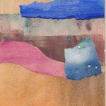
Here’s a couple of slightly larger collage pieces (about 12″ x 9″ or 300 x 225 mm)


Finally here’s another one from some time ago, using prepared papers again, but this time by monoprinting on paper smaller than the plate, so taking the colour to the edges. I originally intended this to be overprinted with a drypoint, but I haven’t taken the plunge yet…
Wiltshire Print Creatives
Last year I joined with a group of other artist printmakers who share the same workshop space to form Wiltshire Print Creatives, an informal collective. We had our first group show in November at 44AD Artspace in Bath. We were very pleased with the reception we got and sold quite well, so we are now firming things up to create a more coherent presence with a website and social media. You can already find us on Twitter and get an informal peak behind the scenes but we intend to ramp this up over the next few months and probably add other social media platforms like Instagram.
We also have a couple of further shows lined up – more later – but are still looking for new opportunities and venues, especially where we might be able to establish a more permanent presence.
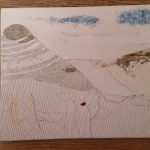
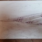
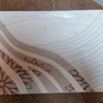
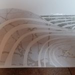
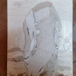
A new print series
I’ve been unable to do any printing for quite a while. I have been plagued with problems with my foot, putting me on crutches since mid-November. I used my down time looking at a lot of pictures, but also thinking about subjects and themes. I’ve been interested in neolithic rock art for some time now and living near Avebury and Stonehenge it’s impossible to avoid standing stones. Scattered also across the landscape of Wessex are hundreds, if not thousands of barrows and burial mounds and of course the White Horses like Pewsey, Cherhill, Westbury etc in Wiltshire or Uffington in Oxfordshire. In addition we have the famous Cerne Abbas Giant, the Long Man of Wilmington and assorted other hill figures, many now lost completely.

It isn’t just Britain with these features. The stone alignments of Carnac in Brittany are well known, but there are a multitude of standing stone circles, alignments and dolmens across France and Ireland and much further afield.
Putting all this together made me wonder about the sort of landscape we might see if more had survived. Out of that has evolved the print series I’m putting together. This will take landscapes, more or less stylised and incorporate into them other figures. I will draw on a range of sources. I’m researching Celtic and Saxon myths, cave paintings as well as the sort of abstract shapes found in rock art.
Technically, these prints will incorporate collagraph and dry point plus perhaps solar etching and ultimately hand embellishments. I also expect to use monoprinting or hand painting as the ground on which the prints will be made. I’m also going to try and incorporate some of the techniques used by Australian artist, Kim Westcott. (http://www.kimwestcott.com, although the site did not load properly for me.) She reuses old plates in combination with new, mixing in shadow prints and rotation of the plates to create her drypoints.
I have no prints as yet, but here are some rough sketches and photos of some plates in preparation.

With luck, I’ll have more over the next few weeks.
***
I’m not the only one finding inspiration in these themes. See the web pages for Irish artist Tommy Barr.
Group Show
A bit late in the day for a promo, but I’m taking part in a group show at 44AD Gallery in Bath as a part of Wiltshire Print Creatives. We are an informal collective of printmakers, united only by the use of the same workshop space at Wiltshire College in Trowbridge.
We hung the show on Monday morning. Coming back for the evening Preview and seeing the show as a whole for the first time it was obvious that sharing the same workspace has allowed for some sort of artistic osmosis. Everywhere I looked I could see commonalities in vision and expression across all the work. I was very proud to see what we had achieved. Despite the fact that this is the work of friends I can genuinely say that the work on show is to a high standard both technically and creatively and well worth a visit if you can. My thanks to the other 11 for their support over the years and for their work in putting this together and making it happen.
The Wiltshire Print Creatives are…
- Tonia Gunstone
- Caroline Morriss
- Kerrie McNeil
- Martin Covington
- Bella Bee
- Judy Brett
- Ian Bertram
- Hayley Cove
- Flora Jayne Camacho
- Alex Nash
- Claire Camacho
- Jane Temperley


