I’ve just extensively revised and updated this post, dealing with the issue of Reproduction and Original prints, and why the distinction is important, especially for printmakers.
I’ve just extensively revised and updated this post, dealing with the issue of Reproduction and Original prints, and why the distinction is important, especially for printmakers.
I’ve started adding some new digital prints to the shop. I’ve always worked this way, it is where I started as a printmaker. Because I’ve been doing this for a while (more than 20 years), I’ve written several previous posts on this aspect of my work, but this one is probably the best place to start if you want more detail.
Originally, I priced these at a similar level to my work in other print media. On reflection, though, I have decided to try a different approach. I have always tried to have work available at a wide range of price points, and decided to use these new prints to support that strategy. Apart from images made by photomanipulation, I have withdrawn all the digital work I had in the shop, I’m now in the process of adding them back, but at a much lower price (£40 reduced from £80) and with a slightly larger edition size (70 instead of 50).
No one has been affected by this change. None of the work I had in the shop had been sold, so no one has been adversely affected by this change.
These are still originals. There is no pre-existing image in another medium. I created them digitally and they had no physical existence until I printed them. See here for a definition of digital printmaking from the Royal Society of Painter-Printmakers. You can read my own take on it here.
Edited for style and to include extra links 31/12/21

I haven’t been able to get into my studio for a week or so. The time hasn’t been entirely wasted. I have a couple of monotype prints in an open show at Pound Arts in Corsham. A couple of submissions for other shows were unfortunately not successful. That’s not unusual. The selection process for shows always seems a bit of a lottery.


I’ve also been making some digital work. These won’t stay entirely digital, but will probably end up as RISO prints. Silkscreen or cyanotype are also a possibility. They will be the subject of a separate post, since the techniques I used may be of interest.
Check this link for other posts on digital printmaking.
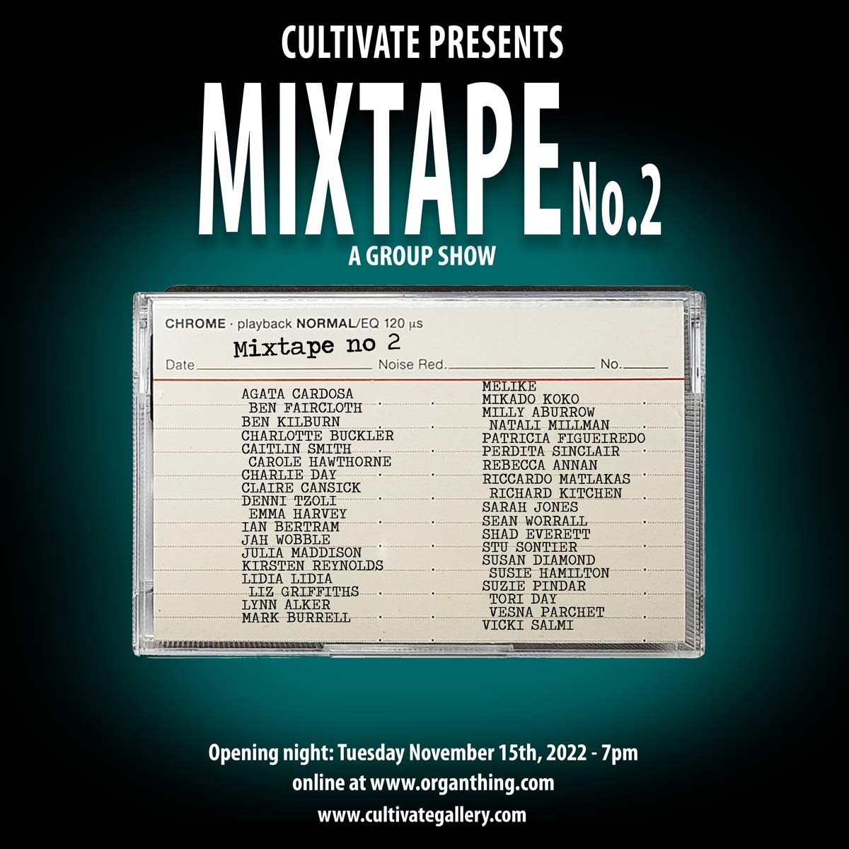
Mixtape No. 2 is the second of these online shows I have been in. As before, it has an eclectic mix of artists and styles. Please head over there and look at the work on offer. There are links to follow if you want to look at an artist in more depth.
One of the things taking part in these two shows (Mixtape No.1 is still up, so if you haven’t seen it, do check it out) has done is made me look afresh at my own work and wonder if perhaps it’s just a wee bit too tidy. I don’t know for sure yet, but it’s made me think, and that’s what it’s all about, isn’t it?

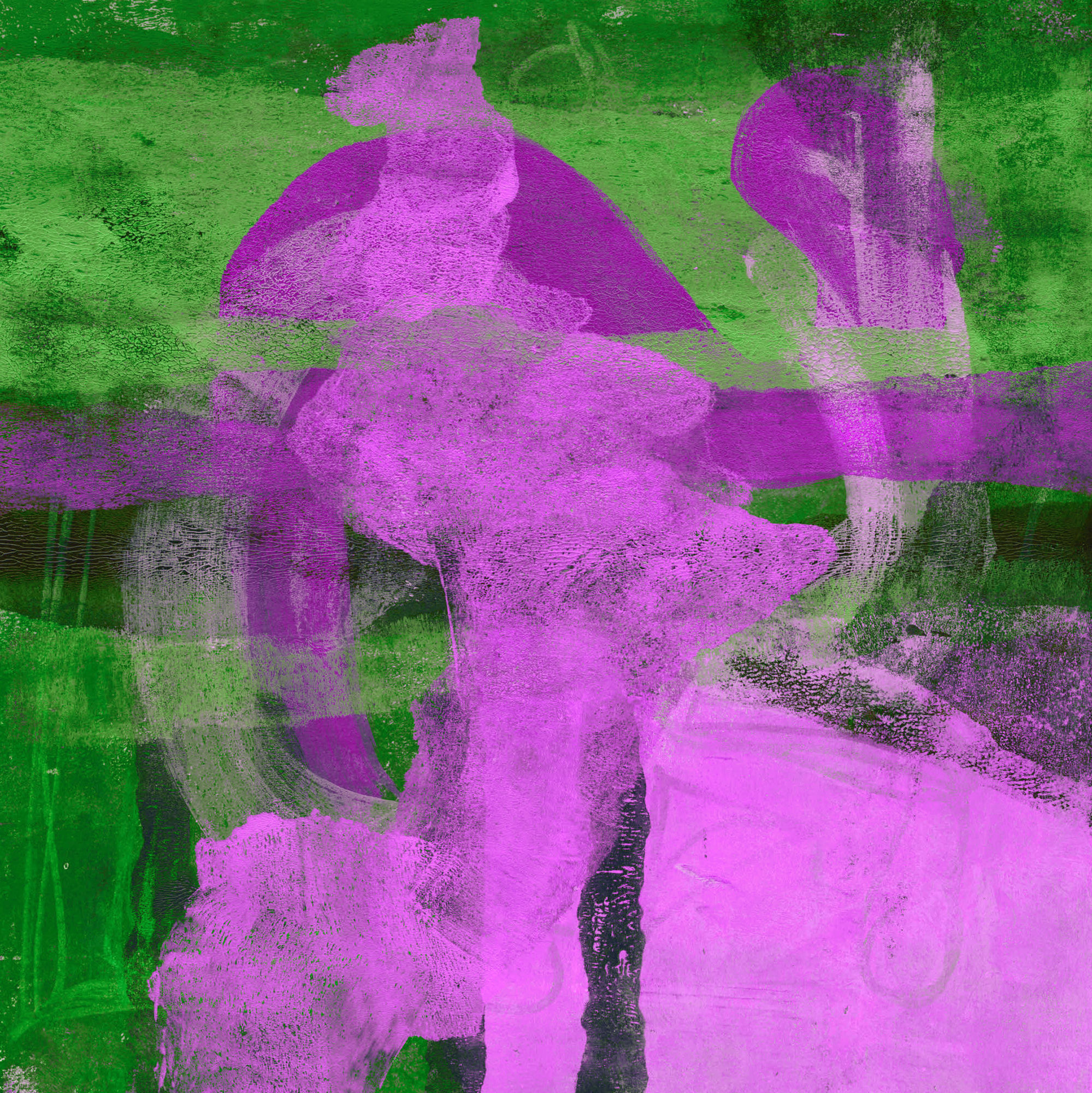
Usually when I’m making gel prints, I’m improvising, reacting to what is in front of me. This might be the remains on the plate from a previous session or a random mark made to get started. That isn’t an approach that works with other print media, some of which require a lot of pre-planning. The ability to improvise, to find an image in random marks, can be liberating, but sometimes I need a framework.
When I first started gel printing, I explored the process by making dozens of prints using a cross motif. The current images use the same idea of a simple graphic shape, probably recognisable to almost everyone.

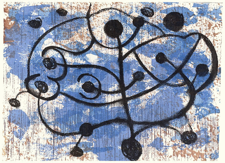
I wasn’t expecting to achieve the elegance of Hokusai’s print, but I am quite pleased with the way they are working out. All the prints, whether 15 cm x 15 cm (the first batch) or 30 cm x 30 cm, were made the same way. I slowly build the image up from layer after layer of paint. Some layers use transparent colours, others opaque. The aim is always to let underlying layers show through. Sometimes I do this by partially removing colour from the plate before taking an impression. This is part of the improvisatory process, responding to the chance juxtaposition of colours as they emerge.
My favourite way to remove the colour is with crumpled tissue paper, which leaves a beautiful texture in the paint. A by-product of that is a wonderful pile of colourful paper to use in collage.

Prints in the first batch are all 15 cm square. I don’t know why I’m so attracted to the square, but I seem to be making most of my recent prints in this format.


In the studio last week, I moved up in size, to 30 cm square. These are still work in progress, so I haven’t scanned them yet. These are just phone photos, so not properly square. As you can see, I’m beginning to elaborate the setting and still have work to do on the skies. There is still a way to go before I can call them finished.


Even with a strong concept in mind, accidents happen. Images go their own way and other themes emerge. The quick phone photos below are a good example. Again, these are very much unfinished. I don’t like that blob of green in the middle of a couple of them, so that will have to go. The second of these also needs more tonal variation. Provisionally, this series is called ‘String Theory‘.


None of these are in the shop yet, but there are many examples of the same improvisatory approach in the printmaking section.
Most people will be aware of the mandala, but probably only as intricate, symmetrical patterns. They are unlikely to be conscious of their original religious meaning beyond a vague ‘new age’ association. Having said that, the symbolism often attached to the passion flower is perhaps similar. It was, in fact, the passion flower I had in mind, when I started exploring ideas of reflection and symmetry using software.
I soon became bored by the perfection of computer generated patterns and started exploring ways to break that absolute precision. I’m not going to describe my methods here, it would be too tedious. I will simply say it involves the use of the reflection effect in Paint Shop Pro, coupled with various other tools, plus multiple layers.
My long term aim is to turn some of these images into RISO prints. I think the intrinsic variability of RISO will add some ‘wabi sabi‘ feel to what could otherwise be a little cold. For now, though, I’m showing some of the digitally generated passion flower images. Close inspection will reveal that some of them are not as symmetrical as they at first appear.


The next images are what I think of as ‘fractured mandala’.


Some other digital imagery can be found here: https://ianbertramartist.uk/new-digital-prints-now-in-the-shop
This collection of latest new prints is all small size monotypes. Each one is 15 cm square (6″).


As I’ve said many times, there is something about working at small sizes I enjoy. Obviously they are quicker to make. Even so, many layers go into creating the rich textures. These are not in the shop yet. When I do list them, they will be in mounts sized to fit a 10″ x 10″ frame (about 25 cm) at a price of £30 plus postage. If you are interested in something here, email me quoting OCT£5OFF to buy one for £25.
The offer is only valid on the nine images in this post and expires at midnight (my time) 11th November 2022. Subject to availability.
I’m currently working on some larger prints – 30 cm x 30 cm (12″). I’ve picked up the ‘peak’ motif from these recent pieces, aiming for a similar diffused effect.
For other similar prints, go to the ‘Art under £75‘ section of the shop.
To see some of the inspiration for the ‘Hubble’ images, go here:
https://www.nasa.gov/multimedia/imagegallery/index.html
Prints made by painters seem to have a distinctive quality to them. It seems to me this is a matter of perspective. Painters seem to be focused first on the effect they want, rather than thinking about any specific print technique.
My first example is new to me. Emily Mason (1927-2019) was an American abstract painter and printmaker. I first came across her work in a video on YouTube by Albert van der Zwart, in his Channel ‘Imperfect paintings‘ (well worth following) Having watched it, though, the memory slipped away until I rewatched Albert’s video, after which I did some more online research. This was when I discovered she was also a printmaker.
From there I was led to a short documentary about her, on Vimeo, showing her at work and talking about what she was trying to achieve. Although talking about her paintings I still found it illuminating. I always find I get more from watching an artist making their own work than telling me how to do mine, however well-intentioned.
You can see a good example of the interplay between painter and printmakers at work in this video of Richard Diebenkorn at work in the studios of Crown Point Press in 1986. I very much like his work and really regret missing the major exhibition in London because of illness. His paintings, especially those he made in New Mexico, seem to have strong affinities with those of Mason, although I don’t know if they ever met.
The sound quality isn’t brilliant, but you can see at the beginning he knows broadly what he wants and is trying to duplicate the improvisational quality of his paintings in prints and is more or less reliant on the printmakers to tell him how to get a given effect.
Howard Hodgkin’s work as a printmaker was instrumental in getting me into printmaking. I visited a printmaking workshop where work was in progress on one of his prints. I touch on this on the About page. From what I understand, his relationship with the printmakers was much more hands-off than Diebenkorn’s. His work is characterised by strong, bold colours.
I saw this print, along with several others, at the Alan Cristea Gallery in Cork Street in London. They, like Hodgkin, were characterised by strong colours, but with more organic shapes. The retrospective exhibition of her work at Cardiff Museum and Art Gallery was stunning.
Albert Irvin was the subject of an exhibition of his work at the Royal West of England Academy in 2019. I’ve adapted the approach to screen printing shown in this video to the making of my own gel monotype prints.
I haven’t managed to see Martyn Brewster’s work in the flesh yet. His work was recommended to me by a gallery owner I was talking too. I’ve now got a couple of catalogues from former shows and looked at a lot of work online. I certainly want to see the real thing.
For all these artists, their work making prints complements their painting. Each practice supports the other.
Stone circles, hill figures and rock art generally have fascinated me for years. That’s why I was so drawn to the drone photographs of these artefacts, taken by David Abram, when they began to appear on Instagram. I’ve just received my copy of his Aerial Atlas of Ancient Britain. It doesn’t disappoint. The photography is stunning.
Each picture is stitched together from multiple drone photos into a single high resolution image. The image below, drawn from his website, is a good example. It shows White Sheet Hill, part of the Stourhead estate, in southern Wiltshire. On the hill there is a neolithic causeway camp and barrows, an Iron Age hill fort, and it is traversed by a Roman road.
Without these photographs, the only way to see the full extent of these ancient places is via maps and plans. The simplification inherent in their production creates a strong graphic image, which I find appealing. On the ground, they don’t reveal themselves in the same way. The attraction of the images, for me anyway, comes from the way they put these bold, graphic shapes back in their landscape settings, with all the rich and subtle colours that implies. In addition, many of these are in remote places, inaccessible to a 76-year-old with mobility problems, so they offer a vicarious experience to complement the data in reference books.
I’ve used references to neolithic art in my own work many times, and I think the Aerial Atlas will be a source of inspiration for some time.
These tiny collagraphs draw on the idea of stone circles, for example.


These draw on hill figures. These are proof prints from a project derailed by the COVID pandemic.


This sketch, manipulated digitally, is based on craters, but contains the same archetypal round shapes.

I have a theory, which began with art, but applies equally well to the constructions in the Aerial Atlas, that there are certain archetypal shapes with which we have a physiological as much as an aesthetic response. The obvious ones are of course line and circle/disc, but also spirals and labyrinths and probably others. The job of the artist is to tap into that physiological response. David Abram’s photos do that, I think. They expose the ‘complex simplicity’ of the shapes our ancestors created on the land, never seeing those shapes themselves, but somehow reacting to them.
I’m posting below the latest small monotype prints from my last studio session. Nos. 2 and 4 have a similar Hubble feel to the others, while 1 and 3 seem to have found their own way.
Are these finished, do you think? I’m not sure. I know from experience with these small works that it is very easy it is to go one step too far and lose it. Because they are so small, there isn’t much room to manoeuvre if marks end up in the wrong place. Of course, that also means there isn’t much lost if a print fails.
Even so, I don’t immediately throw away prints that look like failures. Instead, I add them to a ‘slush pile’ which I review from time to time. This includes anything from monotype prints like these to collagraphs, drypoints or digital prints. It is surprising how impressions can change once the process of making has been forgotten. After a while, you see the image as if for the first time. Sometimes reviewing two disparate images can give that spark you need to work out what to do next.


