Posted on Leave a comment

Asemic Writing

Some time ago, I linked to this wonderful video, featuring an artist book ‘Hushed Writing’ or Grafia Callada, by Spanish graphic designer and artist, Pepe Gimeno. I make no apologies for showing it again.

Since then, I have come across the work of the US artist Cecil Touchon, in particular his asemic writing. Some of Touchon’s work involves fragmentary text which he arranges into collage, often then painting the image. I’ve touched on the idea of fragmented text in this post on making stencils, but I confess I hadn’t thought of taking that idea further. It is the earlier work in which he transforms found texts by overwriting that seems to have strong affinities with Gimeno. They both produce pieces which have the structure and appearance of text, but without content.

Asemic writing is not the exclusive domain of Touchon. Indeed the roots, seem to go back to c800 CE and the Tang Dynasty. Since then, the Middle Ages and Renaissance saw the use of Pseudo-Kufic (imitation Arabic script) decoration. In the 20th century, many artists including Kandinsky and Man Ray have experimented with it. In many ways, the pictographs of Adolf Gottlieb fall into this genre too. The abstract expressionist scribbles which appear in much contemporary art are surely also descended from this idea. However, in its approach, Grafia Callada, from Gimeno seems to remain unique.

Posted on Leave a comment

Meditation

Minimalist Collage

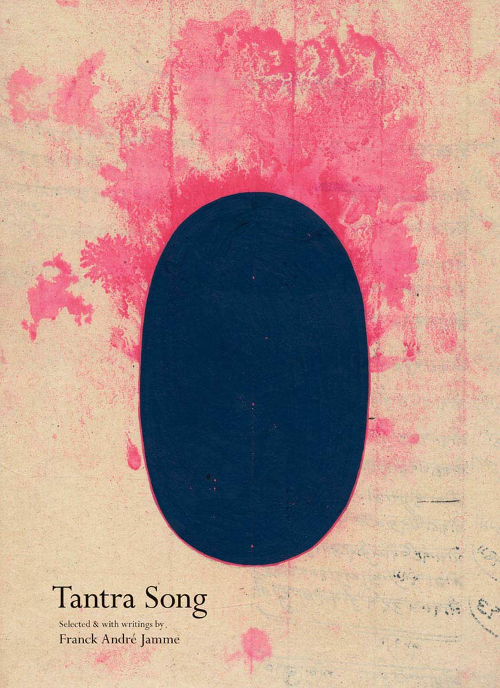
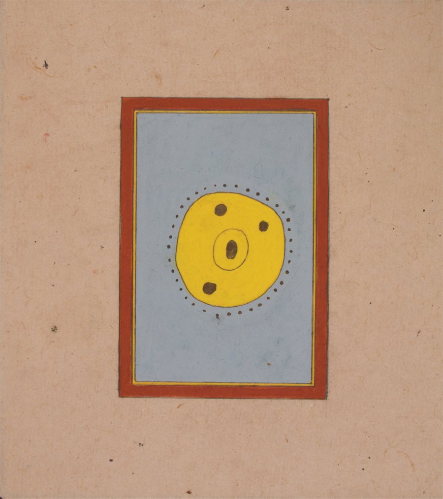
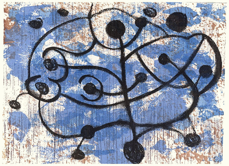
Some time ago, I can’t remember how, I came across a reference to this book. The images intrigued me, since they seemed to have so much in common with 20th century abstraction, despite their origins in 17th century Rajasthan as aids to meditation.

Book cover Tantra Song

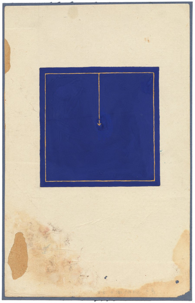
Paradoxically, the strongest visual affinity seemed to be with minimalism. Compare, for example, ‘Tremolo’ by Agnes Martin from 1962 (on the left) with this piece from the book.

The paradox stems from the symbolism of the Tantric paintings when compared with the aim of the minimalists to remove the self. To quote another minimalist, Sol de Witt, ‘what you see is what you see.’

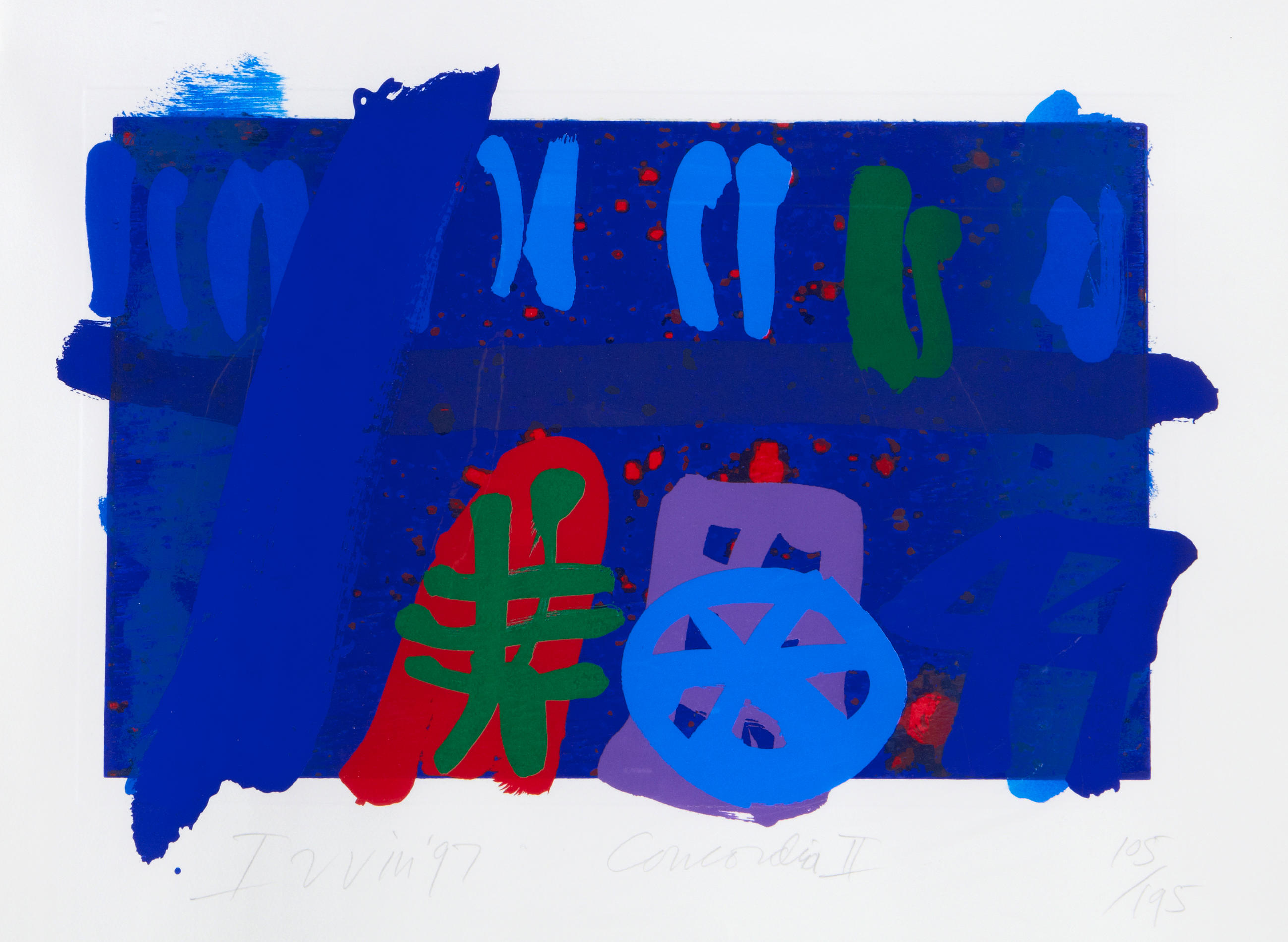
Mark Rothko, not a minimalist, described the myths of antiquity as “the eternal symbols upon which we must fall back to express basic psychological ideas.” This ties in very strongly with the work of an avowedly spiritual artist, Bill Moore. That isn’t surprising since he was an ordained Roman Catholic Priest.

“I often use cruciform shapes,” he says. “But, like Antoni Tàpies, I believe that the power of the cross goes far beyond its use in a Christian context. We’re drawn to what I call essential shapes, patterns and textures. They’re found in all kinds of civilizations and traditions. In fact, the geometric ratios that I use almost subconsciously are the same as those used in ancient Indian, Egyptian and Greek architecture, as well as medieval European cathedrals.”

https://frbillmoore.com/

The Tantric images seem to be made on similar terms. The symbols used have meaning for the devotees, although according to Jamme, these are not fixed. The images are the prop for meditation, beginning with whatever the image ‘means’. This expands and shifts as the mind explores itself.

This seems similar to the use of the Stations of the Cross in Christianity. While the images at each station can be quite elaborate, they can be reduced simply to a Roman numeral. It is the meditation on the meaning of each station that matters.

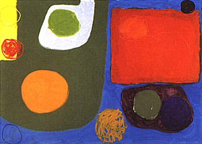
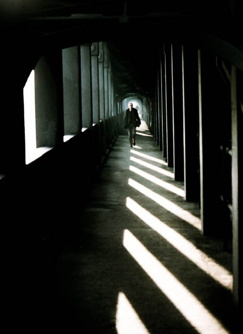
Another painter, Sir Terry Frost, (here) said: “To look at a painting which gives you the opportunity to have solitude, to be yourself and to be able to wander into reverie, is more than hedonistic, it’s spiritual”.

Until I came across that quote, I had never ‘got’ the work of Mark Rothko. I loved his way with paint, but the paintings themselves seemed shallow. Somehow it managed to pin down for me their essentially meditative nature. Which leads me back to the man himself:

“Art to me is an anecdote of the spirit, and the only means of making concrete the purpose of its varied quickness and stillness.

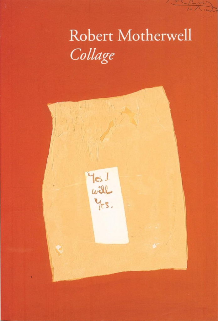
However, despite all this, the artist who first sprang to mind when I looked at the Tantra paintings, was Robert Motherwell. More specifically, it was the collage in this small catalogue from a show of his work in 2013.

(See also here)

Cover to Robert Motherwell Collage, published by Bernard Jacobson Gallery

I think it was probably the simplicity of these pieces which made me draw the parallels. They transcend their commonplace, everyday origins, encouraging a similar meditative response as the Tantra paintings.

When I discovered it, the quote, from Terry Frost, gave me a focus for thinking about my own work. Until then, I think I always had, at the back of my mind, the guilty feeling that I was just making patterns. Understanding that others can find meaning in something, even if I don’t embed it there myself, liberated me. I realised that there is no meaning in abstract art. It does not require understanding. It just is. An artist may mentally attach meanings to the shapes and colours of their work, but even if they explicitly share those meanings, there can be no guarantee others will discover them or see the same things.

In the end, all art has the potential to be a subject for meditation. Even the flight of the eye across an image, is a form of meditation, a form of reverie. That is as it should be, I think. Art without emotion, seems an empty exercise.
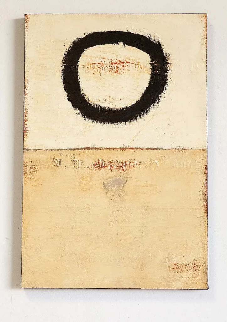
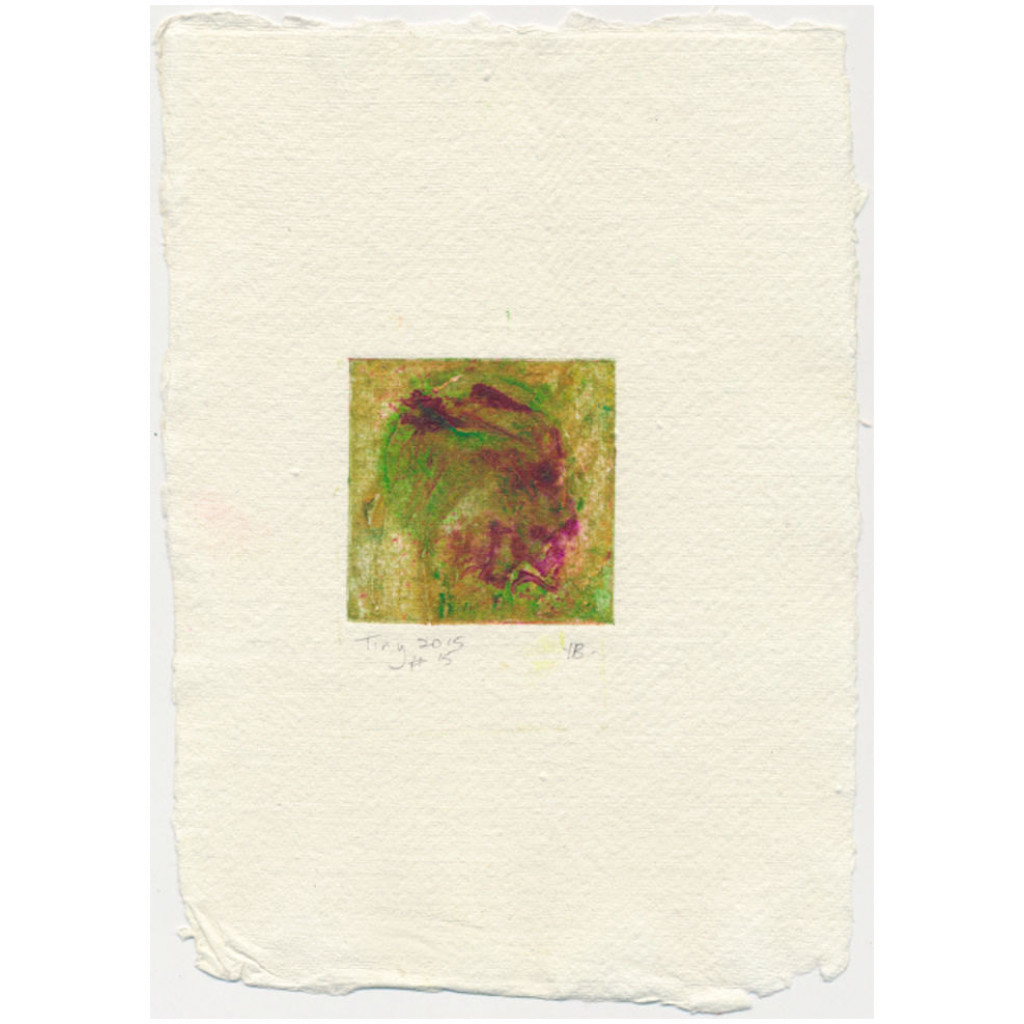
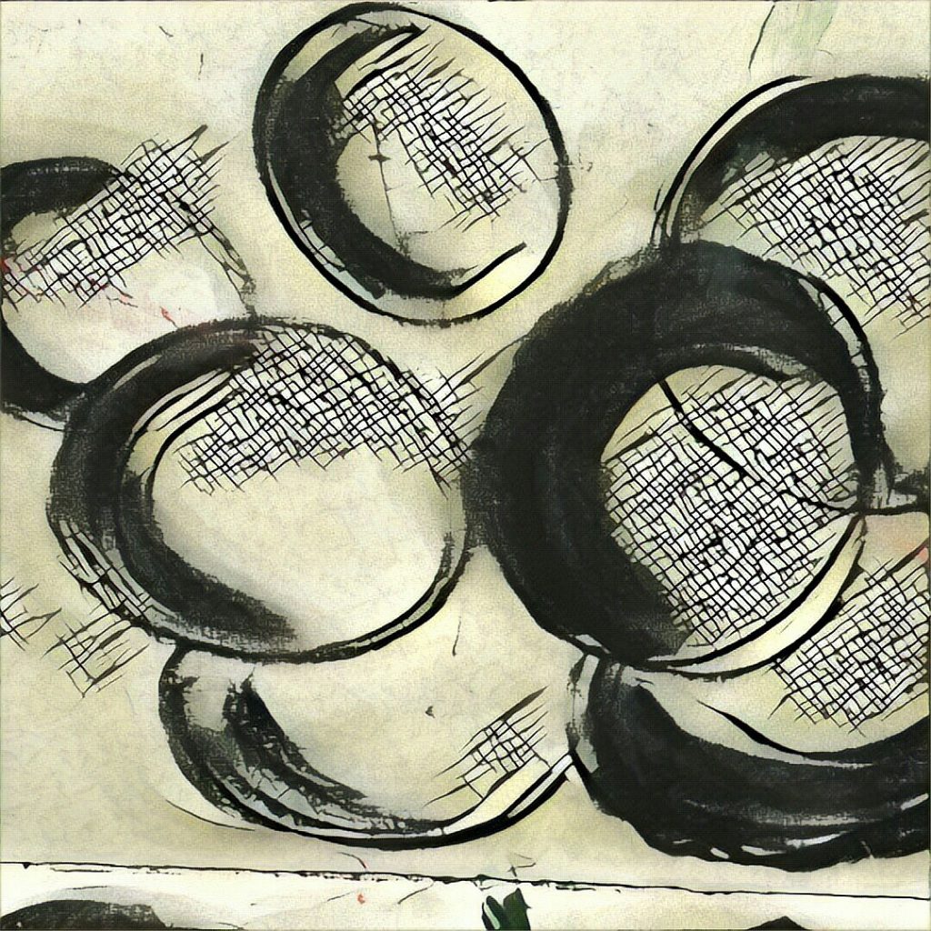
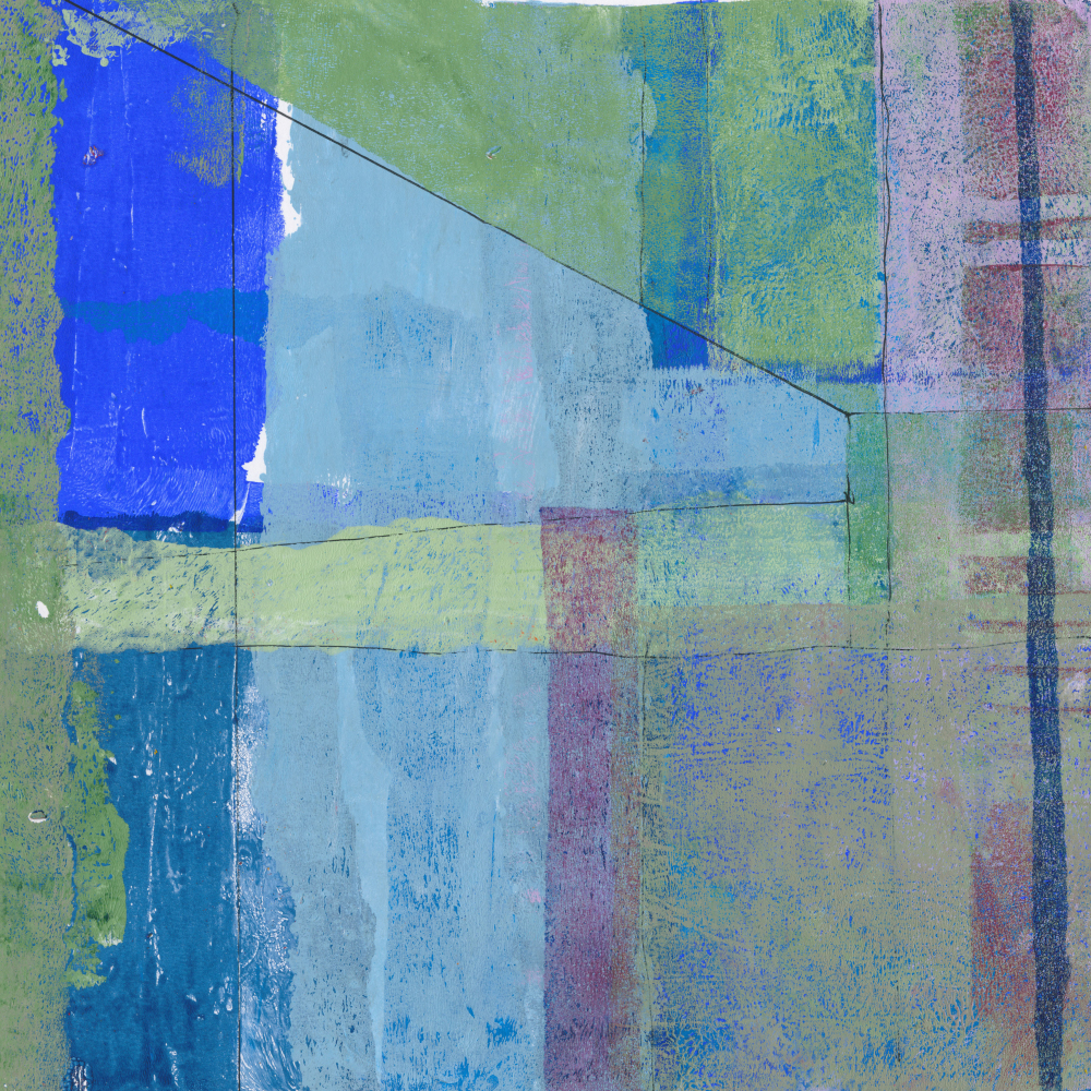
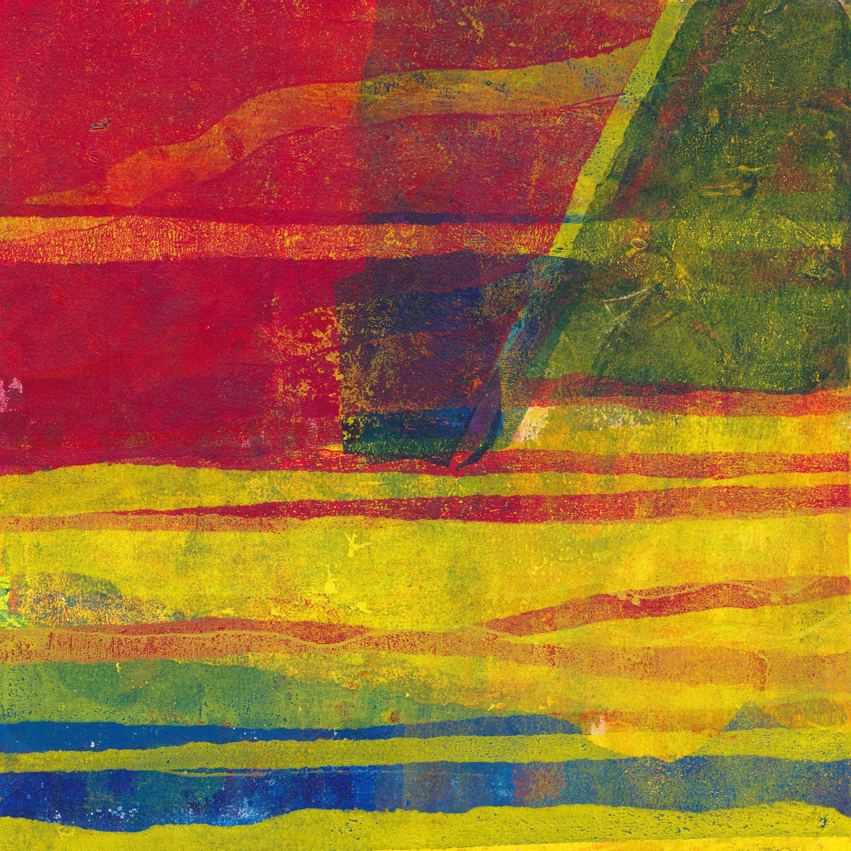
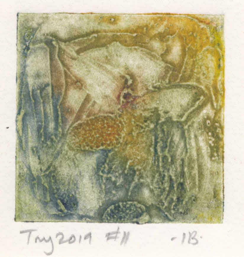
Some images from Tantra Song

Further Reading

Tantra Song

The Atlantic

The Paris Review

Hyperallergic

Robert Leeming

Bill Moore

Modernist Missionary

Stations of the Cross

My Last Art Beats (video)

Robert Motherwell

Robert Motherwell, abstraction and philosophy

Robert Motherwell, early collages

Agnes Martin

MoMA biography

Abstract Minimalism

Terry Frost

Tate Bio

Posted on 1 Comment

The chain of creative inspiration

This post looks at how long buried memories can resurface and trigger creative inspiration.

Albert Irvin

Back in December 2018, I went to an outstanding exhibition at the Royal West of England Academy in Bristol, Albert Irvin and Abstract Impressionism.

In 1959, Irvin visited an exhibition called The New American Painting at Tate, curated by MOMA New York and toured to eight European cities. It brought the boldest and best new artistic talent from across the Atlantic to London. The exhibition redefined what was possible for a generation of British artists.

For Irvin, it was an epiphany.

Albert Irvin and Abstract Expressionism will bring together works by Irvin and the major abstract expressionist artists that inspired him, including Jackson Pollock, Willem de Kooning, Robert Motherwell, Barnett Newman, Sam Francis and Adolph Gottlieb from UK collections and works by Grace Hartigan and Jack Tworkov on loan from the USA, giving a unique chance to see so many of these important artists’ works in this country.

RWA website

Gateshead and public art

I had come across Irvin before, sometime in the late 1980s. I was still working as a planner then, in Gateshead, with responsibility for the Town Centre. One area I was working on was improvement of the physical environment of the centre. One of the projects I identified was a dismal and uninviting roadway under a railway bridge. This underpass led from a housing estate on the opposite side of the railway line to the town centre.

My idea was to line the underside of the bridge with vitreous enamel panels. Many stations on the recently opened Tyne and Wear Metro system used this system. The photo, of Jesmond Station in Newcastle, shows one example, with artwork by Simon Butler from 1983. Making these involves screen printing the image onto the surface before firing. The panels were robust and resistant to damage. In an unsupervised location like this one, they would have been ideal.

Jesmond Metro Station, Newcastle

This is where Albert Irvin comes in. I had already had contact with the Regional Arts Association, (Northern Arts), through a minor involvement in Gateshead’s Public Art Programme. I approached them again for advice on a suitable artist. The artist they suggested was Irvin. Sadly, I never saw his work in the flesh, only some murky colour transparencies in a hand held viewer. Even more sadly for me, the project never secured funding and soon afterwards I moved to Wiltshire. Looking at Google Maps, it seems that the bridge has now been rebuilt with a rather pedestrian tiled wall. The link shows the view in 2021.

https://goo.gl/maps/kPfKeS8dQYo6Wj5MA

Since then, I’ve only been back to the Town Centre once, when I photographed the soon-to-be demolished multi-storey, ‘Get Carter’ car park. The housing estate had gone, only partly redeveloped, largely with the usual mixture of sheds found anywhere.

Memories

I had forgotten much of this until I went to the show. Nothing I saw reminded me of those murky slides, but something triggered the memories, and they came flooding back. The comparison between the superb paintings and the tiny 35 mm slides, though, was dramatic. I was, I must admit, unimpressed by the slides, so the paintings in the show had a huge impact on me. I must have sat in front of Almada, for instance, for a good half an hour, mentally disentangling the layers, trying to work out the way they had been built up.

Another painting, Kestrel, looks much simpler, but that simplicity is deceptive. In this case how it was made is irrelevant, all that really matters are the colours, which simply sing out.

It was via this exhibition that I became aware of Irvin’s screen prints. I was lucky to see them, since they were only displayed up to Christmas. Printmaking seems always to have been an important part of Irvin’s creative practice. For me, they captured just how well he handled colour. It is to them, too, that I return for inspiration, in the form of the catalogue of his prints published in 2010 by Lund Humphries. The way he worked is well described in the book, and also seen in this YouTube video.

Irvin and screen printing

The two prints below are striking examples of his exuberant approach to colour and also capture some of the recurring motifs he uses – starbursts, quatrefoils and mock Chinese characters abound.

I’ll come back to all this in another post, looking at the way I think these and other influences have worked their way into my own work.

Posted on Leave a comment

What does it mean – part 3

Fourteen Discs - painting by Patrick Heron

This is the paradox that lies at the heart of the mystery of artistic creation. The meaning which a work of art has for society is not the same meaning that the artist was conscious of putting into it. This is because a work of art is not just a telephone exchange which facilitates straightforward communication. The work of art is in some profound sense an independent, live entity. It has its own life. It draws nourishment from its creator that he was totally unaware of having put into it: and it redistributes nourishment to the spectator (including the artist himself, for he is merely a spectator once the work is completed). What the work itself communicates is a transformation of all that the artist was conscious of investing in it. Its success or failure, as a transmitter of thought or emotion, simply cannot be planned and guaranteed beforehand. This is why I say that to demand a certain result from art in advance is utterly to misconceive the central creative process itself. It is to suppress spontaneity: to batten down on the subconscious.

Patrick Heron, Art is Autonomous
First published in The Twentieth Century, September 1955.
Reprinted in Painter as Critic, Patrick Heron: Selected Writings
Editor: Mel Gooding, Tate Gallery Publishing, 1998
ISBN 1-85437-258-0

More on Patrick Heron: https://www.tate.org.uk/search?q=Patrick+Heron

Posted on Leave a comment

Aerial Atlas of Ancient Britain

screen print called Tree of Life

Stone circles, hill figures and rock art generally have fascinated me for years. That’s why I was so drawn to the drone photographs of these artefacts, taken by David Abram, when they began to appear on Instagram. I’ve just received my copy of his Aerial Atlas of Ancient Britain. It doesn’t disappoint. The photography is stunning.

Each picture is stitched together from multiple drone photos into a single high resolution image. The image below, drawn from his website, is a good example. It shows White Sheet Hill, part of the Stourhead estate, in southern Wiltshire. On the hill there is a neolithic causeway camp and barrows, an Iron Age hill fort, and it is traversed by a Roman road.

Without these photographs, the only way to see the full extent of these ancient places is via maps and plans. The simplification inherent in their production creates a strong graphic image, which I find appealing. On the ground, they don’t reveal themselves in the same way. The attraction of the images, for me anyway, comes from the way they put these bold, graphic shapes back in their landscape settings, with all the rich and subtle colours that implies. In addition, many of these are in remote places, inaccessible to a 76-year-old with mobility problems, so they offer a vicarious experience to complement the data in reference books.

I’ve used references to neolithic art in my own work many times, and I think the Aerial Atlas will be a source of inspiration for some time.

Examples in my work

These tiny collagraphs draw on the idea of stone circles, for example.

These draw on hill figures. These are proof prints from a project derailed by the COVID pandemic.

This sketch, manipulated digitally, is based on craters, but contains the same archetypal round shapes.

Image from sketchbook with idea for 'Martian Landscape' image
Craters

I have a theory, which began with art, but applies equally well to the constructions in the Aerial Atlas, that there are certain archetypal shapes with which we have a physiological as much as an aesthetic response. The obvious ones are of course line and circle/disc, but also spirals and labyrinths and probably others. The job of the artist is to tap into that physiological response. David Abram’s photos do that, I think. They expose the ‘complex simplicity’ of the shapes our ancestors created on the land, never seeing those shapes themselves, but somehow reacting to them.

Posted on Leave a comment

Artistic Influences

Sometimes the artistic influence on a piece of work is deliberate. There is a lot to be learnt from trying to emulate the look of another artist without directly copying. This was the case with ‘Shalimar’ below, where I was channelling Richard Diebenkorn and his Ocean Park paintings. (Not in the shop yet, but will be soon. Contact me if you are interested before then.)

Shalimar - monotype print in blues and greys in style of Richard Diebenkorn.
Shalimar – monotype print made with acrylic on paper

Sometimes, though, the influence is accidental. You looked, perhaps, at the other artist’s work years ago. Then as you work, something in front of you triggers the memory, and it becomes embedded in what you make. I think that’s what has happened here with ‘Mercury Beach’. I was framing a batch of prints for upcoming shows, (watch this space for more news on that and where to see them). Suddenly I saw Barbara Rae. Not the subject matter, but the intense colours and the ribbon like horizontal marks. Incidentally, when framing it, I decided it looked better inverted. The version below is upside down compared to the version in the shop. I think it was that change of perspective that made me see the artistic influence coming through.

Imaginary landscape abstract monotype print
Mercury Beach – abstract monotype print

Of course, I may be deluding myself, but getting even part way towards the work of someone like Rae is not bad in my view.

Posted on Leave a comment

Lessons learned

My last post, about using periodic reviews of old work as a mechanism for moving forward artistically, made me remember something I know in theory, but keep forgetting. Perhaps I need to review lessons learned too. I tend to describe myself as a printmaker. It is easy to forget – well, I find it easy anyway – that the print doesn’t have to be the end state. This is especially so with gel printing or screen printing, which use acrylic paint. Take this image, from that last post.

Pictogram - gel print
Pictogram – monotype print 30 cm x 30 cm

The initial inspiration was the idea of the pictograph (definition 1 in link) as developed by Adolph Gottlieb. The mark in yellow was also supposed to be redolent of Japanese or Chinese calligraphy. The problem I have with the image is the purple/white patches which break the mark are unrelated to it and to anything else in the image. I spent some time thinking about how to overprint them using gel printing without losing other aspects, which do work. Then it stuck me. Paint them out! That was lesson one…

I would be in good company doing this. Gillian Ayres, for example, used to set aside some prints from an edition, specifically to overpaint, an example being Springfield No 2 from 1999.

The second lesson learned, which seems even harder to remember, is that every blog post doesn’t have to be a dissertation! Just because I like writing long posts, doesn’t mean others want to read them! I’ll do my best, though, because if I can remember that lesson, I’m more likely to keep posting.

Posted on 3 Comments

Moving forward

I’m always scanning through the pile of unfinished pieces in my studio. Once enough time has passed from me to forget how they were made, they become objects in their own right. Moving forward by reviewing old work and thinking about the next steps becomes much easier. Looking at the work of others, as I have been doing over the past couple of days with John Hoyland for example, is often enough to shake your mind free. The image below is an example of such a review.

Pictogram - gel print
Pictogram – monotype print 30 cm x 30 cm

Less regularly, I review the pile of finished but unframed prints. When I do this, I typically change my mind about some of them. The last time I did this, I removed about 10% as no longer being acceptable quality. Some of these may benefit from additional work, and others may have elements that can be salvaged to make smaller pieces. Many of the Tiny series were made that way.

tiny collagraph print
Tiny collagraph print

I’m aiming to get back in the studio next week, probably starting some new prints from scratch, although for some reason, I’m getting the urge to paint and create some really heavy textures. Time to dig out the Polyfilla?

Posted on Leave a comment

Influences

What or who is the biggest influence on your work? I’m not sure if I can give a coherent answer to that question. I rarely try to deliberately emulate the work of another artist. If I do, it is largely for self-instruction. This one, for example, is called Shalimar. It was an examination of the Ocean Park paintings of Richard Diebenkorn.

Shalimar - monotype in blues and greys
Shalimar – monotype print made with acrylic on paper

Beyond that, it gets a bit more tenuous. I look at a lot of art books – and the real thing too when I get the chance. I don’t see explicit direct influences in my work, but I suppose others more distant from it might. There are many things I explicitly avoid, too. There’s a very strong generic look around at the moment. Look on Instagram or Pinterest to find many examples, with patches of colour against neutrals or greys, coupled with curved shapes in black or white.

Recently I came across a wonderfully eclectic list of influences, cited by the artist John Hoyland in a talk he gave at the Tate in 1980.

shields, masks, tools, Avebury Circle, swimming underwater, views from planes, volcanoes, mountains, waterfalls, graffiti, the cosmos inside the human body, food, drink, music, dancing, relenting rhythm, the Caribbean, the tropical light, the northern light, the oceanic light. Borges the metaphysical, dawn, sunsets, fish eyes, flowers, seas, atolls. The Book of Imaginary Beings, the Dictionary of Angels, heraldry, Rio de Janeiro, Montego Bay”.

John Hoyland 1980

That’s a great list. It is probably closer to the way most of us absorb influence in any field, not just art. One of the things that struck me is that there are no artists in the list. The sort of ‘copycat’ work that abounds on Instagram and Pinterest doesn’t stem from this sort of list.

Somewhere in one of my notebooks is a list I made, not of influences, but just headed as ‘Things I Like’. From memory, it included:

stone circles, standing stones, hill figures, neolithic carvings, NASA/Hubble photographs, collections of similar objects, cave paintings, Nazca lines, shadows, Native American art, city plans, layers, mid-century graphics, Miles Davis, Duke Ellington, Science Fiction, Martian landscapes, Misssissippi maps, valley sections, Northern landscapes.

shadows on the High Level Bridge
Shadow on the High Level Bridge

Do you have a list you are willing to share? Let me know in the comments.

Posted on Leave a comment

Make time for play

For me setting aside time for play is a key part of creativity. It’s a way to get past my inner censor. It allows me to fail. That’s important because without failure there is no measure of success.

It’s almost a month since I spent time in my studio. Initially I took a break to think, because I found myself repeating the same thing. The work looked superficially different, but the process was the same, and so less and less enjoyable. Some health issues then intervened, so my time away from the studio became even more protracted.

I’ve already blogged about making digital prints. They are where I came from as a printmaker, so an important part of my practice. Going back to them while not in the studio was still a form of play. It gave me the freedom to think about ideas of shape and form and composition without investing too much time. Or money for that matter, since decent paper is not cheap. In the end, even though I was ‘only playing’ the outcomes were very satisfying, and I ended up with two ‘suites’ of prints. One is a set of square prints which relate quite strongly to the monotypes I have been making all year. The second set are panoramic in format, but oriented vertically. I wanted to avoid any landscape references and make these wholly abstract.

Digital abstract print
Aksinto – digital abstract print

This isn’t the first time I’ve used play to generate work. Back in 2014 I made a set of what I later called Tinies. I was painting then and very bad at judging how much paint to put on my palette. Rather than waste the leftovers I took, as I realised later, what were monotypes from the palette using some heavy mixed media paper I had to hand. Later I cut these down into small squares, each about 25-30 mm on a side. My original intention was to reassemble them into a collage.

I never made any progress, although I did play around with the pieces for a while. I kept the pieces though, then later still, mounted a selection of these to fit into a 6” x 6” frame (150 mm). When I took these to an ‘art boot sale’, to my surprise they sold very well. Many were sold before I decided to number the rest into a series – Tiny 2014.

The next year I acquired a number of pieces of mount board, originally samples of different colours. I used these to make a set of collagraph plates, experimenting with materials like tile cement. Printing these allowed me to play gain, experimenting with colour combinations, trying out the effects of overprinting colours. These became Tiny 2015.

Tiny collagraph
Tiny 2019 No 12 – collagraph

Tiny 2017, was another set of ‘found images’, this time cut from failed monotypes made with oil based inks, while Tiny 2019 was a return to the small collagraph plates. So far there have been no more.

Now though, I’m itching to get back to physical printing. I find it immensely satisfying to see an image gradually emerge out of the clutter of bits of paper, stencils and general rubbish I use to make my monotype prints. How I do that will be covered in another post.

I hope though that I can still retain the freedom from the last few weeks of ‘playtime’.