Posted on Leave a comment

CMYK and RGB

A post outlining the meaning of the terms CMYK and RGB, in support of a variety of posts here on the use of digital processes in support of analogue.

CMYK and RGB are terms used in design and printing. CMYK is used for physical printing, while RGB is used for digital displays.

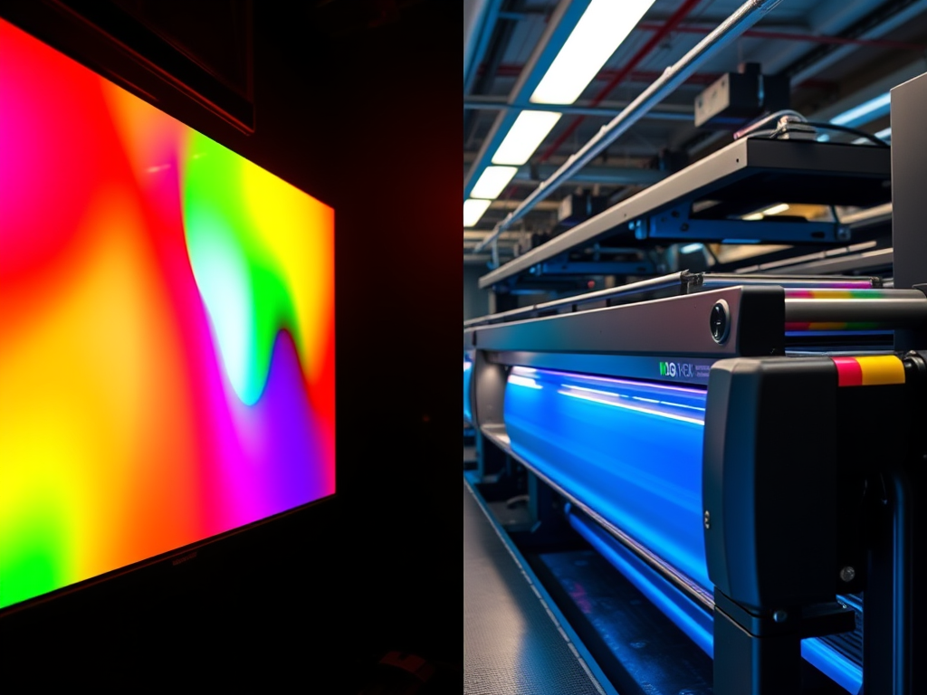
RGB: Red, Green, Blue

RGB is an additive colour model used for digital displays. It combines red, green, and blue light to create a wide spectrum of colours, by adding the lights together. Each channel (R, G, B) ranges in intensity from 0 to 255, allowing over 16 million colour combinations. When all three colours are at full intensity, the resultant colour is white. With zero intensity, the result is, as you would expect, black. This is used for the screens you use every day, whether computer monitors, TVs, smartphones, tablets or cameras and, the content you view on those screens.

CMYK: Cyan, Magenta, Yellow, Key (Black)

CMYK is a subtractive colour model used in printing. It blends physical inks to reproduce colours on paper and other materials. When all three colours are mixed together, you get black, although not the deepest blacks. Other colours are created by subtracting light using ink pigments. That means when you see a given colour on a page, it is because only that colour is reflected into your eye. There are other factors of course, like time of day, weather etc, which affect how ‘white’ the white light hitting the page really is. (Known as colour temperature, hence the concept of warm and cool colours.

More ink on the page gives darker colours, less ink leads to lighter colours. Black is added to enable the very deepest blacks. CMY alone can’t produce these, which is why you will come across ‘warm’ blacks and ‘cool’ blacks.

CMYK is used for any image or design intended for physical reproduction. Trying to create an image by printing with RGB colours is likely to result in dull or inaccurate prints.

Posted on Leave a comment

From Analogue to Digital to Analogue

Digital processes and techniques have always been a part of my practice as I move from analogue to digital and back to analogue.

Digital Prints

The transition from analogue to digital sometimes places these techniques well to the forefront, as in the digital images I was making when I started printmaking. These used photo-manipulation, filters and plugins, graphics tablets and digital collage to generate the image. Some examples are shown below.

Inky Fingers – Analogue

My first steps into traditional, ‘inky fingers’ printmaking were with collagraph and entirely analogue.

Dales Memories was selected for the Bath Society of Arts Open, while Sarsen Stones was in the Oexmann Open at Devizes Museum.

My one and only venture into screen print reintroduced digital elements. Several of the stencils I used to make the screens for this image were created by digital processes.

screen print called Tree of Life
Tree of life, screen print

At different times I also made monoprints, drypoint and collage

Mixing things up – analogue and digital

Around this time I began to have health issues which limited the time I could stand at the press. Screen printing especially was very stressful. Searching for something I could do seated, I eventually stumbled on gel printing.

At an early stage I began using digital processes to create stencils for gel printing, using a Cricut digital cutter. I began by using rough drawings in a process described in this post. Another post looked at ways to generate abstract shapes to be used as stencils.

Another bout of ill health kept me out of the studio entirely so I returned to digital printmaking. I began to explore ways to use my existing monotypes, not as images, but as data to create new digital prints. I described this process in here.

In an extension of the process used to create digital prints, I have now produced some Risograph prints. Even these are not straight reproductions, since process colours (CMYK) are not available for RISO printers. I will cover that process in another post to follow.

Posted on Leave a comment

Playing with digital images again

Photographs of the iconic 'Get Carter' car park in Gateshead, before demolition

I came into printmaking via digital images and still use digital tools, for example to make stencils, as I have described in various posts here. When I can’t get into my studio, whether lack of time, or more recently health issues again, I also like to play with my software of choice, Paint Shop Pro, to make digital prints. These may or may not end up n the shop, my main reason for making them is simply to keep my creative eye in practice.

These are two of the latest such prints, both monochromatic, both and made from some old photos of mine of the now demolished ‘Get Carter’ shopping centre in Gateshead. The main image is one of the source files. It was pretty much abandoned when I took them, and I was vaguely aiming for the same grey dystopic feel. The first of these seems to capture that feeling quite well.

Digital print entitled Dystopia, with grainy indistinct buildings in the background and on the left a sigh saying PARKIN without the G, aligned vertically
Dystopia 1

Working on the second digital image, however, it decided to take a different path. Instead of a brutalist buildings, I saw not architecture but some sort of engineering structure, floating in space. This may have come via the TV series, ‘The Expanse’. Then I noticed a round white shape with what looked a bit like an outstretched arm, and out of that came the title, ‘Space Walk’. I’ve added a detail below in case I’m seeing things…

Digital image showing what appears to be a tangle of engineering structures in a harsh light against a dark, star-studded background with a figure in what looks like a white space suit clinging to the structure about halfway down on the left
Space Walk
detail from the previous image showing the apparent figure with helmet and outstretched arm
Space walk – detail

I love the smoky, grainy aspect of both these digital images and think they would work well as photopolymer etchings. That’s certainly something I intend to try.

Posted on Leave a comment

New digital print series

I’ve started adding some new digital prints to the shop. I’ve always worked this way, it is where I started as a printmaker. Because I’ve been doing this for a while (more than 20 years), I’ve written several previous posts on this aspect of my work, but this one is probably the best place to start if you want more detail.

Originally, I priced these at a similar level to my work in other print media. On reflection, though, I have decided to try a different approach. I have always tried to have work available at a wide range of price points, and decided to use these new prints to support that strategy. Apart from images made by photomanipulation, I have withdrawn all the digital work I had in the shop, I’m now in the process of adding them back, but at a much lower price (£40 reduced from £80) and with a slightly larger edition size (70 instead of 50).

No one has been affected by this change. None of the work I had in the shop had been sold, so no one has been adversely affected by this change.

These are still originals. There is no pre-existing image in another medium. I created them digitally and they had no physical existence until I printed them. See here for a definition of digital printmaking from the Royal Society of Painter-Printmakers. You can read my own take on it here.

  • Cassandra - digitsl print
  • digital print in vivid green and purple
  • digital print with rounded abstract shapes
  • freeform abstract shapes in digital abstract print
  • Abstract Digital print in bright colours
  • digital abstract print in pastel colours
  • Digital print mainly in blue and yellow

Edited for style and to include extra links 31/12/21

Posted on 1 Comment

Improvisation – a new set of prints

Usually when I’m making gel prints, I’m improvising, reacting to what is in front of me. This might be the remains on the plate from a previous session or a random mark made to get started. That isn’t an approach that works with other print media, some of which require a lot of pre-planning. The ability to improvise, to find an image in random marks, can be liberating, but sometimes I need a framework.

When I first started gel printing, I explored the process by making dozens of prints using a cross motif. The current images use the same idea of a simple graphic shape, probably recognisable to almost everyone.

woodblock print of Mt Fuji by Hokusai
Fine Wind, Clear Morning from 36 Views of Mount Fuji by Hokusai

I wasn’t expecting to achieve the elegance of Hokusai’s print, but I am quite pleased with the way they are working out. All the prints, whether 15 cm x 15 cm (the first batch) or 30 cm x 30 cm, were made the same way. I slowly build the image up from layer after layer of paint. Some layers use transparent colours, others opaque. The aim is always to let underlying layers show through. Sometimes I do this by partially removing colour from the plate before taking an impression. This is part of the improvisatory process, responding to the chance juxtaposition of colours as they emerge.

My favourite way to remove the colour is with crumpled tissue paper, which leaves a beautiful texture in the paint. A by-product of that is a wonderful pile of colourful paper to use in collage.

First Batch

Prints in the first batch are all 15 cm square. I don’t know why I’m so attracted to the square, but I seem to be making most of my recent prints in this format.

Second batch

In the studio last week, I moved up in size, to 30 cm square. These are still work in progress, so I haven’t scanned them yet. These are just phone photos, so not properly square. As you can see, I’m beginning to elaborate the setting and still have work to do on the skies. There is still a way to go before I can call them finished.

Even with a strong concept in mind, accidents happen. Images go their own way and other themes emerge. The quick phone photos below are a good example. Again, these are very much unfinished. I don’t like that blob of green in the middle of a couple of them, so that will have to go. The second of these also needs more tonal variation. Provisionally, this series is called ‘String Theory‘.

None of these are in the shop yet, but there are many examples of the same improvisatory approach in the printmaking section.

Posted on 1 Comment

Latest new prints

This collection of latest new prints is all small size monotypes. Each one is 15 cm square (6″).

As I’ve said many times, there is something about working at small sizes I enjoy. Obviously they are quicker to make. Even so, many layers go into creating the rich textures. These are not in the shop yet. When I do list them, they will be in mounts sized to fit a 10″ x 10″ frame (about 25 cm) at a price of £30 plus postage. If you are interested in something here, email me quoting OCT£5OFF to buy one for £25.

The offer is only valid on the nine images in this post and expires at midnight (my time) 11th November 2022. Subject to availability.

I’m currently working on some larger prints – 30 cm x 30 cm (12″). I’ve picked up the ‘peak’ motif from these recent pieces, aiming for a similar diffused effect.

For other similar prints, go to the ‘Art under £75‘ section of the shop.

To see some of the inspiration for the ‘Hubble’ images, go here:

https://www.nasa.gov/multimedia/imagegallery/index.html

Posted on Leave a comment

Painters and printmakers

Prints made by painters seem to have a distinctive quality to them. It seems to me this is a matter of perspective. Painters seem to be focused first on the effect they want, rather than thinking about any specific print technique.

Emily Mason

My first example is new to me. Emily Mason (1927-2019) was an American abstract painter and printmaker. I first came across her work in a video on YouTube by Albert van der Zwart, in his Channel ‘Imperfect paintings‘ (well worth following) Having watched it, though, the memory slipped away until I rewatched Albert’s video, after which I did some more online research. This was when I discovered she was also a printmaker.

From there I was led to a short documentary about her, on Vimeo, showing her at work and talking about what she was trying to achieve. Although talking about her paintings I still found it illuminating. I always find I get more from watching an artist making their own work than telling me how to do mine, however well-intentioned.

Richard Diebenkorn

You can see a good example of the interplay between painter and printmakers at work in this video of Richard Diebenkorn at work in the studios of Crown Point Press in 1986. I very much like his work and really regret missing the major exhibition in London because of illness. His paintings, especially those he made in New Mexico, seem to have strong affinities with those of Mason, although I don’t know if they ever met.

The sound quality isn’t brilliant, but you can see at the beginning he knows broadly what he wants and is trying to duplicate the improvisational quality of his paintings in prints and is more or less reliant on the printmakers to tell him how to get a given effect.

Howard Hodgkin

Howard Hodgkin’s work as a printmaker was instrumental in getting me into printmaking. I visited a printmaking workshop where work was in progress on one of his prints. I touch on this on the About page. From what I understand, his relationship with the printmakers was much more hands-off than Diebenkorn’s. His work is characterised by strong, bold colours.

Gillian Ayres

I saw this print, along with several others, at the Alan Cristea Gallery in Cork Street in London. They, like Hodgkin, were characterised by strong colours, but with more organic shapes. The retrospective exhibition of her work at Cardiff Museum and Art Gallery was stunning.

Albert Irvin

Albert Irvin was the subject of an exhibition of his work at the Royal West of England Academy in 2019. I’ve adapted the approach to screen printing shown in this video to the making of my own gel monotype prints.

Martyn Brewster

I haven’t managed to see Martyn Brewster’s work in the flesh yet. His work was recommended to me by a gallery owner I was talking too. I’ve now got a couple of catalogues from former shows and looked at a lot of work online. I certainly want to see the real thing.

For all these artists, their work making prints complements their painting. Each practice supports the other.

Posted on Leave a comment

Latest monotype prints from my studio

I’m posting below the latest small monotype prints from my last studio session. Nos. 2 and 4 have a similar Hubble feel to the others, while 1 and 3 seem to have found their own way.

Are these finished, do you think? I’m not sure. I know from experience with these small works that it is very easy it is to go one step too far and lose it. Because they are so small, there isn’t much room to manoeuvre if marks end up in the wrong place. Of course, that also means there isn’t much lost if a print fails.

Even so, I don’t immediately throw away prints that look like failures. Instead, I add them to a ‘slush pile’ which I review from time to time. This includes anything from monotype prints like these to collagraphs, drypoints or digital prints. It is surprising how impressions can change once the process of making has been forgotten. After a while, you see the image as if for the first time. Sometimes reviewing two disparate images can give that spark you need to work out what to do next.

Monotype print in blue and yellow
Work in progress 1
Monotype gel print with blue background overlain with amorphous shapes in red and yellow
Work in Progress 2
Monotype gel print with a large block of orange yellow at the top and narrow irregular purple band at the bottom. The purple band has three delta shapes in different greens over the top
Work in progress 3
Monotype gel print, broken purple background, largely overlaid by an amorphous semi-transparent block of yellow.
Work in progress 4
Posted on 1 Comment

Mixtape No. 1 – an online art exhibition

Poster for Mixtape No. 1 - online art exhibition

I’m currently in an online art exhibition called Mixtape No. 1 with several of my abstract monotypes.

Have a look, there are an incredibly eclectic mix of images in this virtual show. If you look at them, try to do it on a decent size screen. Your phone won’t do them justice. There are links to all the artist websites or IG pages after the online slide show. I’m working my way through them slowly. The point of this is of course to sell art, so here’s my shameless promotional link! Click on an image to be taken to the shop. (Not all of them are online yet.)

abstract monotype print taking inspiration from Hubble Telscope images
A Furnace of Stars – abstract monotype print
A monotype print with blocks of colour in greens, yellow, magenta and orange
A small angry planet – monotype print
Abstract print in cadmium yellow, red, orange, blue and green
Cadmium Concerto – abstract monotype print
Diving for rubies - under the sea -monotype print with underwater feel
Diving for Rubies – monotype print – 30 cm x 30 cm
monotype gel print
That day the Aliens came – monotype print

Don’t just look at my work. This virtual art show is about generating exposure, building recognition. So, make sure you look at the other work and the artist’s web pages. The range of work included in the show is truly remarkable. There are almost 200 pieces by about 40 artists. Make sure you check out the work of Sean Worrall and Emma Harvey, who have put the whole thing together – and 178 others since 2017!

During the pandemic, many mainstream galleries mounted virtual exhibitions, but this is the only one of which I’m aware that gives space to unrepresented artists, the artists who make work simply because they can.