This is Part 3 of a series of linked posts considering AI. It looks at AI art from an artist’s perspective. Inevitably it raises the, probably unanswerable, question ‘what is art’.
Part 1 looked at AI in general. Some more specific issues raised by AI art are covered in Part 2. Part 4 will be about my experience with one app, including a gallery of AI-generated images.
Links to each post will be here, once the series is complete.
Is AI Art, Art?
Is the output from an AI art app, actually ‘art’? I’m not sure if that is a debate I want to enter or if there is a definitive answer. Just think of the diversity of forms which are all presented under the banner of Art. What brings together as ‘art’ the cave paintings at Lascaux, Botticelli, Michelangelo, Rembrandt, J M W Turner, David Hockney, Damian Hirst, Alexander Calder, Piet Mondrian, John Martin, Olafur Eliasson, Beryl Cooke, Pablo Picasso, Edward Hopper, Carl Andre, Kurt Schwitters and Roy Lichtenstein? Or any other random list of artists?
One way forward is suggested by the idea of family resemblances. When he considered the similar question “what is meant by a game?” the philosopher Ludwig Wittgenstein used the concept. He argued that the elements of games, such as play, rules, and competition, all fail to adequately define what games are. From this, he concluded that people apply the term game to a range of disparate human activities that bear to one another only what one might call family resemblances. By this he meant that that things which could be thought to be connected by one essential common feature may in fact be connected by a series of overlapping similarities, where no one feature is common to all of them. This approach seems as if it would work for the list above. It is possible to trace a thread of connections which eventually encompasses all of them.
Whether such a thread could be extended to include work made by AI is not clear. I don’t intend to pursue it further here, but it may yet surface as a separate blog post
See also
https://en.wikipedia.org/wiki/Art
https://www.tate.org.uk/research/tate-papers/08/nothing-but-the-real-thing-considerations-on-copies-remakes-and-replicas-in-modern-art
Thought Experiments
As I wondered how the idea of family resemblance applied to works generated via an AI app, I realised that the act of thinking about something can be as useful as actually reaching a conclusion. Asking open questions without having an answer in mind helps us tease out what things mean, what they involve, and to explore our personal boundaries. This is the approach I’m going to take here, with a series of thought experiments.
Non-human creation
Work by animals has in the past been accepted as art, notably Congo, a chimpanzee and Pockets Warhol, a Capuchin monkey. Congo, in particular, seems to have had some sense of composition and colour. He refused to add to paintings he felt complete. However, it seems that animals cannot own the copyright to their work, at least in the US.
So, is the ability of animals, non-human intelligences, to create comparable with the production of art by computers? If not, what distinguishes one from the other?
One of the criticisms, directed at AI art, is that it lacks human emotion in its creation. That seems to argue against the acceptance of work by Congo or Pockets Warhol as art.
Is it too limited, for other reasons? What about the emotional response which might be experienced by an observer? Is the emotional response to an image comparable to the response we might have to a beautiful view? In the latter case, there is no artist per se.
Alien Art
If human emotion in the creative process is the defining factor in art, can anything created by non-humans, be art in human terms? I don’t believe so. To paraphrase Arthur C Clarke – The rash assertion that man makes art in his own image is ticking like a time bomb at the foundation of the art world. Obviously, if we stick to that view, we also exclude the work made by Congo or Pockets Warhol.
We don’t know whether life exists elsewhere in the universe, let alone intelligent life. But, for the sake of our thought experiment, let’s assume aliens are here on earth and that some of them are, in their terms, artists. For our purposes, let’s also assume that these hypothetical aliens see light in more or less the same range of frequencies as humans.
Going back to Arthur C Clarke, he discussed the potential impact of alien contact on human society in Profiles of the Future, originally published in 1962. Clarke also cites Toynbee’s Study of History. From our own history, we can predict that the response to alien contact would be dramatic. If alien art became known to us, it would inevitably also have an impact.
Such art would, by definition, be beyond our experience. It would be entirely new. We would know little of the cultural context for their art. Nor would we have access to the internal mental dialogue of these alien artists. What drives them is likely to be unknowable. Our relationship with any art they make, can only be an emotional response – how it makes us feel. I suppose it could be argued that we have some common ground with primates, which helps us relate to Congo and Pockets Warhol. Lacking that common ground, would it be possible for humans to respond meaningfully to alien art?
How does your answer sit with arguments about cultural appropriation of art from other human cultures?
Animal or Human?
Closer to reality, suppose we set up a ‘blind viewing’ of work by Congo and work by other human artists.
Would our observer be able to identify which was which? On what basis? Quality or something else? If your answer is based on quality (i.e. good/bad) does that not imply art is only art if it is good? Who decides if it is good?
In case you are wondering, the image on the left is by Joan Mitchell, that on the right is by Congo.
What if Congo was still around and his work used as a dataset to train an AI. That AI then generates work using that dataset. Would our observer be able to identify which was which? What about a three-way comparison, adding AI work to the Congo/human choice above?
See also this: https://www.nytimes.com/2022/08/18/t-magazine/art-activism-social-justice.html
Untouched by human hands…
Suppose, in some AI development lab, we link up a random text generator to an AI art app. The app is set up to take the random text and to generate an image from it. Each image is then automatically projected for a defined period of time, before the process is repeated with the next generation. Beyond the setup process, there is no human intervention.
What would an observer see? I suspect that, not knowing what was going on behind the scenes, they would see some remarkable images but also much dross and repetition. Isn’t dross and repetition, though, a characteristic component of almost all human endeavours? What does it mean if an AI does the same?
Are the individual images created in this way ‘art’? Would your view change, once you knew the origin of the image?
Ask yourself – what distinguishes an image generated by a human from one of otherwise comparable quality, generated by an AI? What happens if we compare the human dross with the AI dross?
Take a step back. Is the whole set up from text generator to projection equipment and everything in between, a work of art?
Does that view change if the setup moves from the lab to an art gallery, where it is called an ‘installation’? Why? The same human being conceived the idea. (I can assure you I’m not an AI.)
What would happen if a proportion of the images were randomly drawn from real digital works. Would our observer be able to distinguish the ‘real thing’ from the AI images? On what basis would that be made? What does it mean if they can’t separate them?
Original or reproduction?
Suppose, an AI app generates an image which looks as if it might be a photograph of a physical painting. Perhaps this one.
Suppose, further, that a human artist takes that flat image and paints an exact copy down to the last splash of paint.
How would an observer, ignorant of the order of events, see the painting and the digital image? Would it be unreasonable for them to assume the painting was the original and the digital image the copy? What does that say about the idea of the original? What if the AI image was the product of the random text generator? Does your view change if the painter wrote the original text prompt?
A further twist. Suppose that the digital image file was sent instead to a very sophisticated 3D printer to create a physical object that mimicked in every way the painting made by the artist. Where is the original, then?
For a long post on the difference between an original and a reproduction, go here.
Is AI art any good?
That is a question with several aspects.
Is it good, as art?
That can only be answered at all, if you accept the output as art. On the other hand, I don’t think a definition of art based on artistic quality stands up. All it does is shift the definition elsewhere, without answering the original question.
Is it good, technically?
That is almost as hard to answer. Look at this image. Clearly the horse has far too many legs. Is that enough to say it is technically bad?
So what about this image from Salvador Dali? Mere technical adherence to reality is clearly not enough.
Is it good at doing what it claims to do?
This section is based almost entirely on my experience with one app, but from other reading I believe that experience to be typical.
The apps seem to have little difficulty in handling stylistic aspects, provided obviously that those styles form part of the training data. Generally, if you specify say 1950s comics, that’s pretty much what you get.
Other aspects are much less successful. That isn’t surprising if you consider the complexity of the task. What’s probably more surprising is that it works as often as it does.
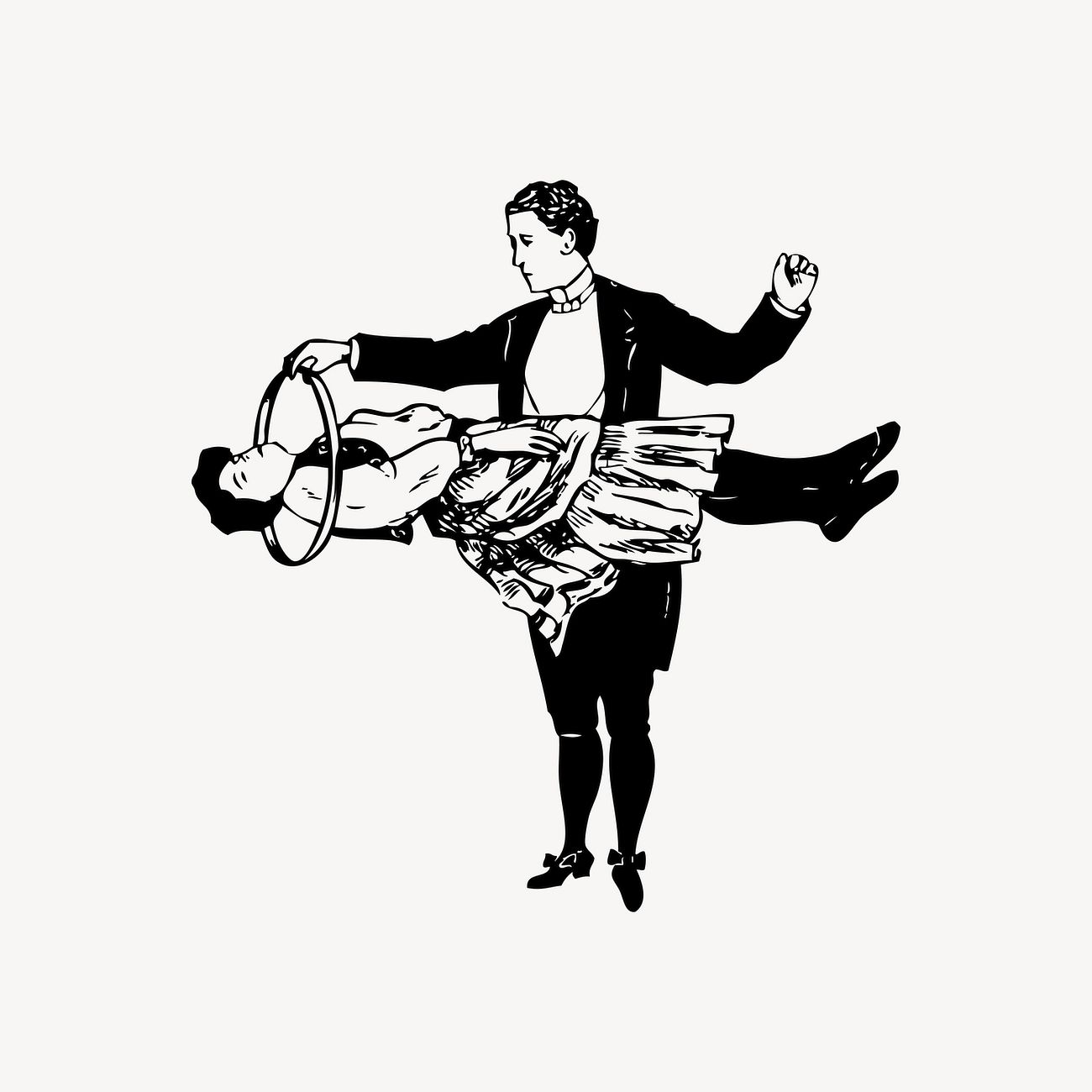
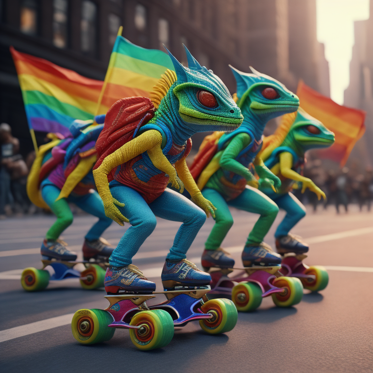
AI has a known problem with hands, but I found other problems too. A figure would often have more than the standard quota of limbs, often bending in ways that would require a trip to A&E in real life. Faces were often a mess. Two mouths, distorted noses, oddly placed eyes all appear – even without the Picasso filter! Certain combinations of model and style seemed to work consistently better than others.
Having more than one main figure in an image, or a figure with props such as tables or musical instruments, commonly caused problems. Humans in cars, more often than not, had their heads through the windscreen – or the bonnet. Cars otherwise tended to be driverless.
In a group of figures, it is common for limbs to be missing, or to be shared between figures. A figure sitting in a chair might lose a leg or merge into the furniture. If they are holding an object, it might float, or have two hands on it, with a third one elsewhere.
How close does it get, matching the image to the prompt?
In Imagine AI, the app I have using, it is possible to set a parameter which sets fidelity to the prompt against the quality of the image. I’m not sure how fidelity and quality are related, possibly through the allocation of processing resources.
I found getting specified attributes, like gender, ethnicity etc applied to the correct figure to be surprisingly difficult. Changes in word order can result in major changes to the generated image. Sometimes even the number of figures was wrong. Where I succeeded, there was no guarantee that this would be retained in further iterations. Generally, figures in the background of a scene tended to be dressed in similar colours to the main character and to be of the same ethnicity.
Getting variations in the physique of figures seems to be simpler for males than females. It seems very easy for depictions of women to become sexualised, compared to the same prompt used for a male figure. This is presumably a function of the training data.
What about the pictorial qualities?
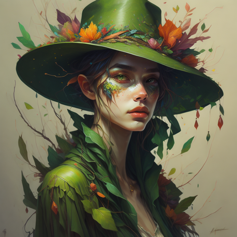
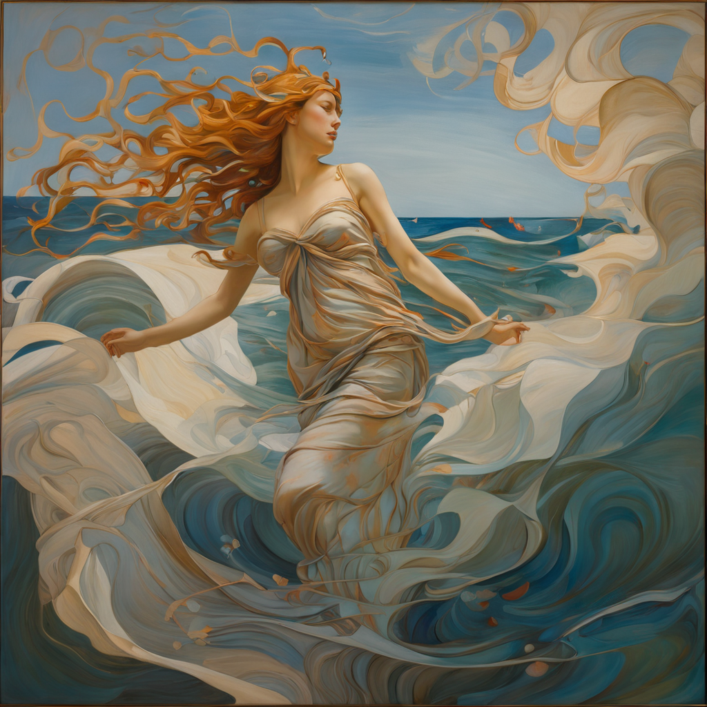
Despite all the caveats, I have been surprised by the quality of the output, even quasi-photographic images and once the prompt is right, certain painting styles. Some styles still seem more likely to be successful, especially with faces and hands, or involving props like tables. Even so, and probably with some post-processing, much of the output could stand against the work of commercial illustrators and graphic designers, especially at the low cost end of the market. I have already noticed AI imagery in cover design of self-published books on Amazon.
It is the mimicry of techniques like impasto which give me the greatest doubts. I suppose it is early in the development of the field, but I saw no sign of anything which tried to use the essential characteristics of digital media in ways analogous, for example, to the use of grain in film photography. I suppose it could be argued that the widespread availability of reproductions has detached things like representations of impasto from their origins. In addition, digital imagery has been around for a limited period of time compared to traditional photography.
Impact on artists and art practice
As I said in Part 2:
For the future, much depends on the direction of development. Will these apps move towards autonomy, capable of autonomous generation of images on the basis of a written brief from a client? Or will they move towards becoming a tool for use by artists and designers, supporting and extending work in ‘traditional’ media? They are not mutually exclusive, so in the end the response from the market will be decisive.
I’m not sure that I would welcome a fully autonomous art AI. It wouldn’t do anything that humans can’t already do perfectly well. I can however see value in an AI enhanced graphic tool, which would have the capacity to speed up work in areas like advertising, film and TV.
Advertising and graphic design
In situations like this, where a quick turn round is required, I can envisage an AI generating a selection of outline layouts, based on a written brief from a client. This could be refined by say selecting an element and describing the changes needed. A figure could be moved, its pose altered, clothing changed etc. Once the key elements were agreed and fixed in position, the AI could then make further refinements until the finished artwork is generated.
Obviously this process could be managed by non-artists, but would be very much enhanced if used under the direction of an artist, working as part of a team. If the changes were made during a discussion, via a touch screen and verbal instruction, the position of the artist in the team would be enhanced.
Print on Demand
Print on demand services are common. Artists upload their files to a website, which then handles the production and shipping of products made using the uploaded image. Orders are typically taken on the artist’s own website or sites like Etsy. Products typically offered range from prints to clothing to phone cases. AI could contribute at various points in the process.
At the moment, a template has to be set up by the artist for each product they want to offer, which seems a perfect use for AI, probably with fine-tuning by the artist.
Preparing the full description for each product can be a complex process, especially when SEO is taken into account. Again, an AI could take on much of the donkey work, enabling artists to spend more time in making art. It may even be possible to partly automate the production of the basic descriptive text for an image. If an image can be created from text, it should be possible to generate text from an image.
Retailing
Many department stores offer a selection of images in frames ready to hang. The images themselves are rarely very distinctive and probably available in stores across the country. It is unlikely that the image forms a significant part of the selling price.
Assuming the availability of an AI capable of generating images to a reasonably high resolution, I can see stores, or even framing shops, offering a custom process.
“Tell us what you want in your picture, and we will print and frame it for you.”
Artists
Many artists already work digitally. I can see how an interactive AI as described above under Advertising and Graphic Design could be used to assist. A sketch drawing could be elaborated by an AI, acting effectively as a studio assistant. This could then be refined to a finished state by the artist.
Printmakers can already use digital packages like Photoshop to prepare colour separations for printing or silk screens. It should be possible with an AI to go beyond simple CMYK separations and create multiple files which can be converted into print screens or perhaps used to make Risograph prints.
Testing the AI App
I looked at a range of apps, initially using only free versions and generally only the Android versions. Some of them were seriously hobbled by advertising or other limitations, so couldn’t be properly assessed.
Initially, I played with a series of different prompts to get a feel for how they worked. I then tried some standard prompts on all of them. I finally settled on Imagine, and paid a subscription. I’ll be basing the rest of this post on that app. I’ll include a couple of the worst horrors from others, but I won’t say which package produced them, since in all probability there will have been significant improvements that would make my criticism unfair.
The Imagine app in use.
My aim was as much to see what went wrong, as it was to generate usable images. I wrote prompts designed to push the AI system as far as possible. The prompts brought together named people, who could never have met in real life, and put them in unlikely situations. Some were deliberately vague. Others tried out the effect of male and female versions of the same prompt, different ethnicities and ages. I wrote prompts for single characters, for multiple characters interacting with each other, and for characters with props and/or animals and in different settings. I’ve given some examples below.
Imagine has different models for the image generation engine, plus a number of preset variations or styles. This adds extra complexity, so for some prompts, I ran them with different models, holding the style constant, and vice versa.
Outputs
Obviously, it isn’t enough to talk about these apps. The only test of their capabilities is to see what they produce. Part 4 will look at a selection, good and bad, of images and offer some thoughts on prompt writing as a creative process.
Conclusions
As with AI in general, AI art raises some interesting moral and philosophical questions. They may not be so fundamental as the Trolley Problem, but they will affect the livelihood of many people and will have a significant social impact. Finding a path through those questions, as the thought experiments show, will not be easy.
Much more quickly, though, we will get apps and packages that do specific jobs. Some are there already – colourising old B&W films for example. These are likely to have significant economic impact.