I’m having some issues with the shop. It seems to work fine, but the front end showing works by category includes some duplication. Bear with me while I try to resolve it.
The contact form appears to generate huge quantities of spam. I’m looking for an alternative, so again, please bear with me.
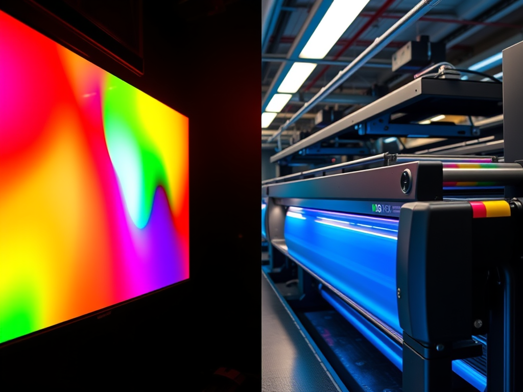
A post outlining the meaning of the terms CMYK and RGB, in support of a variety of posts here on the use of digital processes in support of analogue.
CMYK and RGB are terms used in design and printing. CMYK is used for physical printing, while RGB is used for digital displays.
RGB: Red, Green, Blue
RGB is an additive colour model used for digital displays. It combines red, green, and blue light to create a wide spectrum of colours, by adding the lights together. Each channel (R, G, B) ranges in intensity from 0 to 255, allowing over 16 million colour combinations. When all three colours are at full intensity, the resultant colour is white. With zero intensity, the result is, as you would expect, black. This is used for the screens you use every day, whether computer monitors, TVs, smartphones, tablets or cameras and, the content you view on those screens.
CMYK: Cyan, Magenta, Yellow, Key (Black)
CMYK is a subtractive colour model used in printing. It blends physical inks to reproduce colours on paper and other materials. When all three colours are mixed together, you get black, although not the deepest blacks. Other colours are created by subtracting light using ink pigments. That means when you see a given colour on a page, it is because only that colour is reflected into your eye. There are other factors of course, like time of day, weather etc, which affect how ‘white’ the white light hitting the page really is. (Known as colour temperature, hence the concept of warm and cool colours.
More ink on the page gives darker colours, less ink leads to lighter colours. Black is added to enable the very deepest blacks. CMY alone can’t produce these, which is why you will come across ‘warm’ blacks and ‘cool’ blacks.
CMYK is used for any image or design intended for physical reproduction. Trying to create an image by printing with RGB colours is likely to result in dull or inaccurate prints.
A table of image editing software which supports both colour separation file creation and layer-based editing. Information in support of various posts on digital printmaking and the use of digital processes in support of analogue methods.
Software Name
Colour Separation Support
Layer Support
Platform(s)
Notes
Adobe Photoshop
Yes
Yes
Windows, macOS
Industry standard; supports CMYK separations and advanced layer tools. PS Elements has support for Layers but not colour separation.
Corel PaintShop Pro
Yes
Yes
Windows
Offers CMYK support and robust layer editing
Affinity Photo
Yes
Yes
Windows, macOS, iPad
Professional-grade editing with CMYK and spot colour support
GIMP
Partial (via plugins)
Yes
Windows, macOS, Linux
Open-source; CMYK separation requires plugins like Separate+
Adobe Illustrator
Yes
Yes
Windows, macOS
Vector-based; ideal for print and colour separations
Krita
No
Yes
Windows, macOS, Linux
Focused on digital painting; lacks native CMYK support
PhotoLine
Yes
Yes
Windows, macOS
Supports CMYK and spot colours; lesser-known but powerful
This table of image editing software was collated using AI. I have experience with PaintShop Pro and with an early version of Affinity, but not the others. Use the information with care and double-check the availability of critical elements before any purchase.
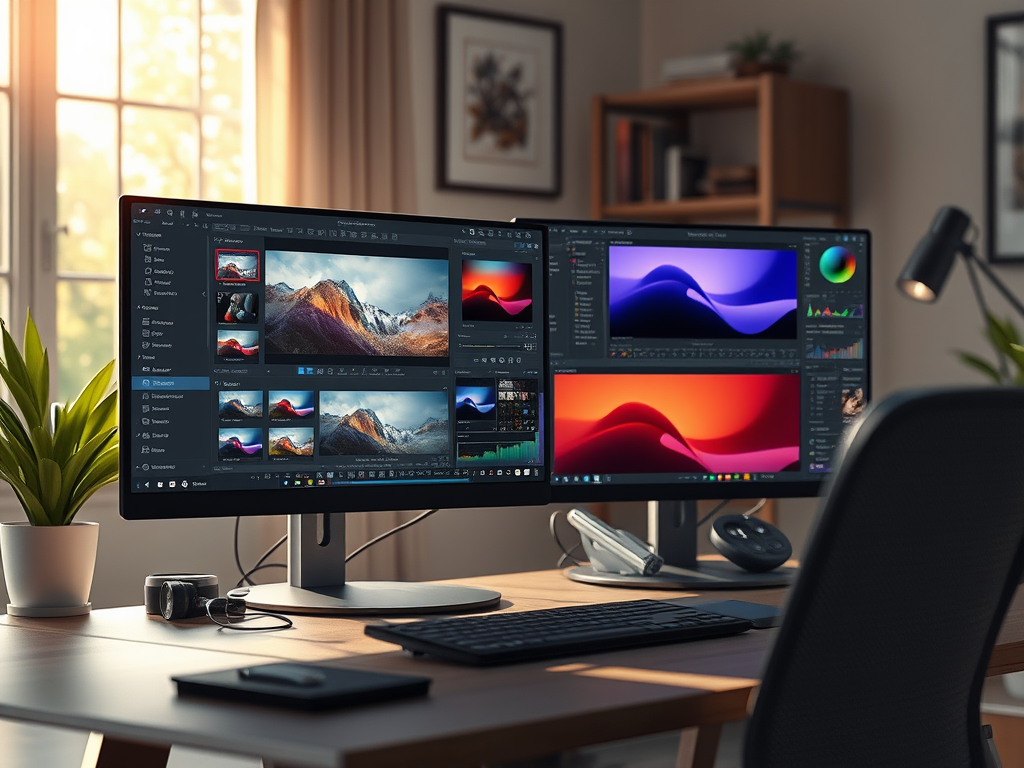
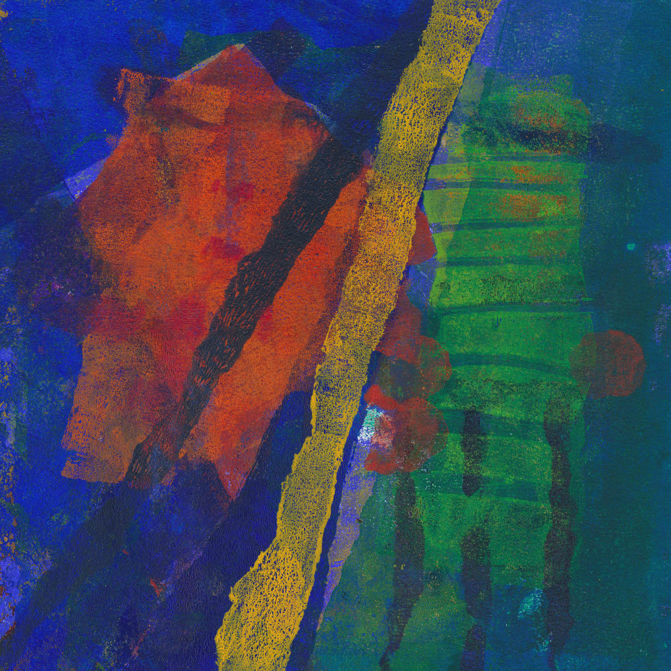
Digital processes and techniques have always been a part of my practice as I move from analogue to digital and back to analogue.
Digital Prints
The transition from analogue to digital sometimes places these techniques well to the forefront, as in the digital images I was making when I started printmaking. These used photo-manipulation, filters and plugins, graphics tablets and digital collage to generate the image. Some examples are shown below.
Inky Fingers – Analogue
My first steps into traditional, ‘inky fingers’ printmaking were with collagraph and entirely analogue.
Dales Memories was selected for the Bath Society of Arts Open, while Sarsen Stones was in the Oexmann Open at Devizes Museum.
My one and only venture into screen print reintroduced digital elements. Several of the stencils I used to make the screens for this image were created by digital processes.
Tree of life, screen print
At different times I also made monoprints, drypoint and collage
Mixing things up – analogue and digital
Around this time I began to have health issues which limited the time I could stand at the press. Screen printing especially was very stressful. Searching for something I could do seated, I eventually stumbled on gel printing.
At an early stage I began using digital processes to create stencils for gel printing, using a Cricut digital cutter. I began by using rough drawings in a process described in this post. Another post looked at ways to generate abstract shapes to be used as stencils.
Another bout of ill health kept me out of the studio entirely so I returned to digital printmaking. I began to explore ways to use my existing monotypes, not as images, but as data to create new digital prints. I described this process in here.
In an extension of the process used to create digital prints, I have now produced some Risograph prints. Even these are not straight reproductions, since process colours (CMYK) are not available for RISO printers. I will cover that process in another post to follow.
I started taking photographs when I was about 18, and more seriously when I was at University. The idea of being an artist never entered my head, however. I wanted to be an engineer. However, a long stay in hospital when I was 17 led to me repeating a school year. I soon realised it wasn’t really for me. Without much direction, I cast around, looking at all sorts of subjects, from Cybernetics at Loughborough University to Industrial Design at Hornsey College of Art, North London.
A chance encounter with a book about architecture and urban design, by Theo Crosby, brought me to planning. My A-levels were still Chemistry, Physics and Maths though, and I had largely lost interest, so my final grades were poor. Somehow I managed to get a place at Birmingham College of Art, studying planning, but had no contact with the rest of the College. My degree when it came was, for complicated reasons, a B.Sc. granted by the University of Aston.
Discoveries
My involvement in art as art was random. I became aware of Victor Pasmore via a visit to a housing development he designed in Peterlee, Co. Durham, where in 1955 he had appointed Consulting Director of Architectural Design for the development corporation. Paul Klee and Joan Miró came to my notice via the covers of Penguin science fiction books in the 1960s. I don’t recall how I discovered Kurt Schwitters. Many years later, I discovered that Schwitters’ sponsor to come to the UK as a refugee, was also my family doctor when I was very young! In the early 1970s I was a constant visitor to the V&A, exploring the galleries from sculpture to musical instruments.
In the 1980s, I worked with Northern Arts on the early days of Gateshead’s public art programme. That’s when I became aware of the work of land artists like Andy Goldsworthy and Richard Long. I also assisted on a course for teachers on Art and the Built Environment. Later, in Wiltshire, I helped organise a conference on the same topic. My focus, if I had one, was I think on creativity in general, not in any particular art form. Something was gelling, though, because in the late 80s, I enrolled on an ‘A’ level in Art. I had no intention of taking the exam, I just wanted to ‘do it’, but my move to Wiltshire ended it anyway.
From digital to ‘inky fingers’
Around the time I turned 50, I started scanning in some of my old transparencies, only to discover that many had succumbed to fungal growth and peeling emulsion. Trying to restore them involved, in some cases, the recreation of large parts of the image. At some point, I realised that the work I was doing as restoration could be done in its own right and began making and selling what I called, at different times, digital paintings and digital prints. I also took various short art courses and started going to art exhibitions more regularly.
In about 2008, another chance opportunity led to a tour of 107 Print Studios, in Wiltshire, where I saw work in progress by Gillian Ayres and Howard Hodgkin. I was hooked, and within a week had enrolled on a print workshop at Wiltshire College in Trowbridge. Later, a group of us on that workshop began organising our own shows and selling events until the Pandemic, which also closed the workshop. That was,, I think, when I first started seeing myself as an artist.
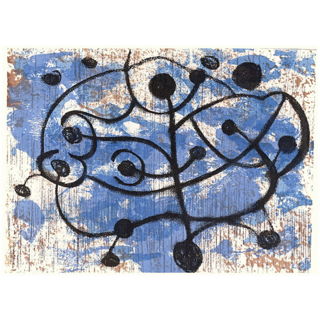
Mercury Beach – abstract monotype print
Shalimar – monotype print made with acrylic on paper
Persepolis Gate – abstract monotype print inspired by Science Fiction
Forbert – abstract monotype print
Cross 2
Falling to Infinity – abstract monotype print
If I have a ‘philosophy’, it is simply a belief that certain arrangements of colour and shape are intrinsically harmonious. I like abstract art so that is what I focus on, although landscape is never far away. I work intuitively, putting down colour on the plate, taking an impression and reacting to what I see, repeating until the picture says stop. There are several posts about my process on the blog. The link is to just one.
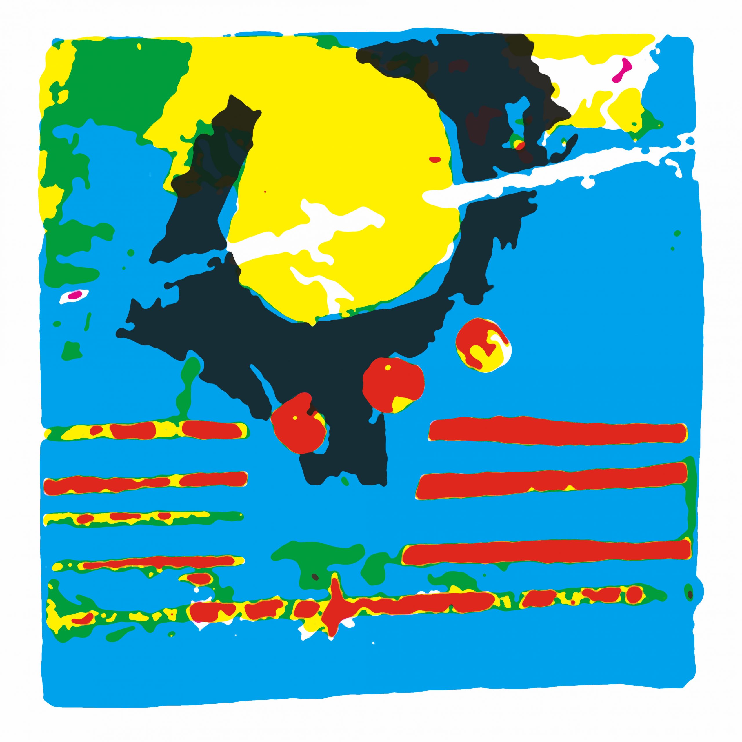
Digital again
During a period when further health issues stopped me working in the studio, I went back to working digitally. Originally I had used photographs as source material, but this time around I used colour separations generated from the scanned images of my monotypes. The digital process allowed me to create variations on the monotypes without destroying their uniqueness by printing straight reproductions.
I had been considering making screen prints, but in my brief foray in the past I found it very fatiguing. So, when around this time I came across a reference to Risograph printing, it seemed the way forward. This was confirmed when I saw work in Pressing Matters magazine. I did a workshop with 16Tonne Press near Bristol and following that produced a trial edition of four small prints, which worked out well. I’m now planning the next and much larger print.
Insert Risograph scans here
There is more I can do with gel printing, I’m sure, and I am developing some other ideas around assemblage and artist books, which may give me a vehicle for incorporating another love of mine, the artwork found in vintage SF magazine of the 40s and 50s.
I have been mulling over an idea for some months now. It is so different from anything else I’ve done in the past that I have no reference points against which I can judge its worth, which is why I’m posting it here as a ‘work in progress.’ It combines elements of an art installation, with assemblage. I finally began thinking in more detail after reading this and came across this question.
Is a game that cannot be played, because there are no known rules, really a game, or just an ornamental block of wood? (paraphrased from the original)
Many commercial board games have fairly ancient origins. Ludo for example has roots in India, in the sixth century CE. The original was played for generations and so survived to be commercialised. For many games, though, we have boards and pieces, but no rules. In some cases, academics have partially reconstructed the rules from paintings or illustrations, but not without a great many assumptions. The link above mentions The Royal Game of Ur but a similar example is the ancient Egyptian game, Senet.
Research revealed a treasure trove of interesting games, some almost lost, others played in various forms across huge swathes of the globe, yet largely unknown outside those areas. It seems likely that many others were only ever played on game boards scratched in the earth or on pieces of fabric, long since decayed. The Korean game Yunnori or Yutnori, for example is traditionally played on a fabric game board. There must have been others. I wondered, too, about the cup and ring marks found on rocks across the North of England. These already turn up as motifs in my prints. Are they perhaps a remnant of some lost game?
Games as installation
This led me to the idea of creating an installation of game boards and playing pieces, but leaving the rules unstated. I haven’t started making them yet, but I’ve set out a couple of ideas below. I’m still thinking about the approach I might take when making the boards and pieces. My first thought was to treat it as a recreation, and use materials that would have been available across most of history. Alternatively, I could use create modern interpretations using materials such as acrylic sheet. It seems to me that the two approaches raise different questions about the nature of play and competition.
‘Game’ 1
Board:
Rectangular, made up of 36 squares in three rows, 12 squares in each row coloured as shown
Row 1: Red and White
Row 2: Green and Red
Row 3: Green and White.
Game tokens:
Two sets of 9 pawn type figures in contrasting colours
Three individual pieces, 1 red, 1 green, 1 yellow
Five flat casting sticks, one side marked.
Notes:
The board is derived from that used in Senet, but I chose the colours and game tokens to suggest, without defining them, other modes of play. I have described the pieces as pawns, but they could equally be stones or pebbles. The individual pieces could be larger stones, perhaps decorated.
‘Game’ 2
Board:
Chequerboard 8×8 in Red, Black, White and Yellow with overlaid symbols on one square in each quadrant.
Game tokens:
12 white, 4 black, 1 black and gold.
2 D20 die with numbers,
1 D6 die with numbers.
Notes:
The chequerboard pattern is common, but the colours and the uneven distribution of the pieces suggest a different form of play, as does the division into quadrants and the symbols in each quadrant.
Die of all sorts from D3 upwards are widely available. The casting sticks I mentioned above are effectively D2. Modern die come in a range of materials, ranging from acrylic to ‘antiqued’ finish. I assumed, that other than D6, they were largely modern inventions, but that isn’t the case. Apparently 20-sided dice (icosahedrons) date back to Ptolemaic Egypt, around the 2nd century BCE. They were often inscribed with Greek letters and may have been used for divination or gaming. The Romans used both tali (four-sided) and tesserae (six-sided), while Knucklebones, which were used in ancient Greece and probably long afterwards, had four usable sides and were precursors to modern d4 dice. The modern polyhedral set (d4, d6, d8, d10, d12, d20) were apparently standardized in the 1970s with the rise of tabletop role-playing games like Dungeons & Dragons.
I imagined the game board as made from a cradled wooden panel or a repurposed chess/draughts board. If it is made using a panel, this could possibly double up as a box with the game pieces stored in the back, perhaps in a draw string bag or bags, with a lid made from wood/mdf or acrylic.
I’m pleased to be taking part in a new, artist led, pop-up gallery in Wilton, Wiltshire. The Ground Gallery is based in what used to be the Wilton Carpet Factory. The buildings were regenerated to become Wilton Shopping Village, and is now undergoing further refurbishment as The Guild. There will be a mixture of independent and national brands ranging from carpets, shoes, interiors, lifestyle and beauty, as well as serviced office space. Ground Gallery was originally a conventional, commercial gallery, but for a variety of reasons the owners handed it over to the exhibiting artists to manage. Since then, some have left and others stepped up to replace them, including me.
We have painters, jewellers, textile artists, ceramicists, glass artist and other makers. I’m the only printmaker so far. At least two of us are also writers.
I’m concentrating on showing current work, although I do have a bargains box, with a range of older digital pieces, which I would rather see on someone’s wall than lying around in my spare room gathering dust.
The detailed images include a new edition of Risograph prints, available in the gallery, both framed and unframed. I aim to add them to the shop as soon as possible.
The gallery is open 11.00 am to 3.00 pm Thursday to Sunday. Most weeks it is open on at least one other day, and is often open for longer hours too. I’m there next on 15th August and every other Friday after that. If you are in the area, pop in for a chat.
Give me this code AXFP and get 10% of all orders over £25.00.
I haven’t been very mobile for several months, so my studio time has been severely curtailed. I’m improving and hope to get back before Christmas. The forced downtime has left me frustrated and with lots of tiny sketches and notes. I hope they will still mean something by the time I try to use them. In the meantime, I’m trying to make some improvements to the site. I’m unhappy with a few aspects of the site layout, and I want to improve the presentation of my work by bringing it to the forefront. I’ll try not to break anything as I tinker, but if something isn’t working as it should, please be patient. It would be very helpful if you could also email me with details of the problem. You can also comment on this post, or even send me a message via Instagram.
I currently have two prints selected for two different shows. On top of that, I’ve just sold three prints via a small village show, including ‘Blue Tango’ above, which was quite something. It’s the most I’ve sold at one time in ages. So, don’t ignore similar opportunities in your area. They usually benefit a local good cause, too.
The second will be in a show at the Devizes Museum. This one, ‘Sarsen Stones’, is a collagraph on a hand made paper. The show is only held every other year and attracts submissions from a wide area. This is only my second submission to this show, so again I’m pleased to be included.
Finally, tomorrow I’m off to see an exhibition of work by American artist (although UK based) Felice Hodges at the Vanner Gallery, in Salisbury. I’ve seen the images on the gallery website, and I’m looking forward to seeing them in reality. I’ve always enjoyed the shows I’ve seen there before, and I don’t expect this one to be an exception.
I came into printmaking via digital images and still use digital tools, for example to make stencils, as I have described in various posts here. When I can’t get into my studio, whether lack of time, or more recently health issues again, I also like to play with my software of choice, Paint Shop Pro, to make digital prints. These may or may not end up n the shop, my main reason for making them is simply to keep my creative eye in practice.
These are two of the latest such prints, both monochromatic, both and made from some old photos of mine of the now demolished ‘Get Carter’ shopping centre in Gateshead. The main image is one of the source files. It was pretty much abandoned when I took them, and I was vaguely aiming for the same grey dystopic feel. The first of these seems to capture that feeling quite well.
Dystopia 1
Working on the second digital image, however, it decided to take a different path. Instead of a brutalist buildings, I saw not architecture but some sort of engineering structure, floating in space. This may have come via the TV series, ‘The Expanse’. Then I noticed a round white shape with what looked a bit like an outstretched arm, and out of that came the title, ‘Space Walk’. I’ve added a detail below in case I’m seeing things…
Space Walk
Space walk – detail
I love the smoky, grainy aspect of both these digital images and think they would work well as photopolymer etchings. That’s certainly something I intend to try.