A work in progress
I have been mulling over an idea for some months now. It is so different from anything else I’ve done in the past that I have no reference points against which I can judge its worth, which is why I’m posting it here as a ‘work in progress.’ It combines elements of an art installation, with assemblage. I finally began thinking in more detail after reading this and came across this question.
Is a game that cannot be played, because there are no known rules, really a game, or just an ornamental block of wood? (paraphrased from the original)
Many commercial board games have fairly ancient origins. Ludo for example has roots in India, in the sixth century CE. The original was played for generations and so survived to be commercialised. For many games, though, we have boards and pieces, but no rules. In some cases, academics have partially reconstructed the rules from paintings or illustrations, but not without a great many assumptions. The link above mentions The Royal Game of Ur but a similar example is the ancient Egyptian game, Senet.

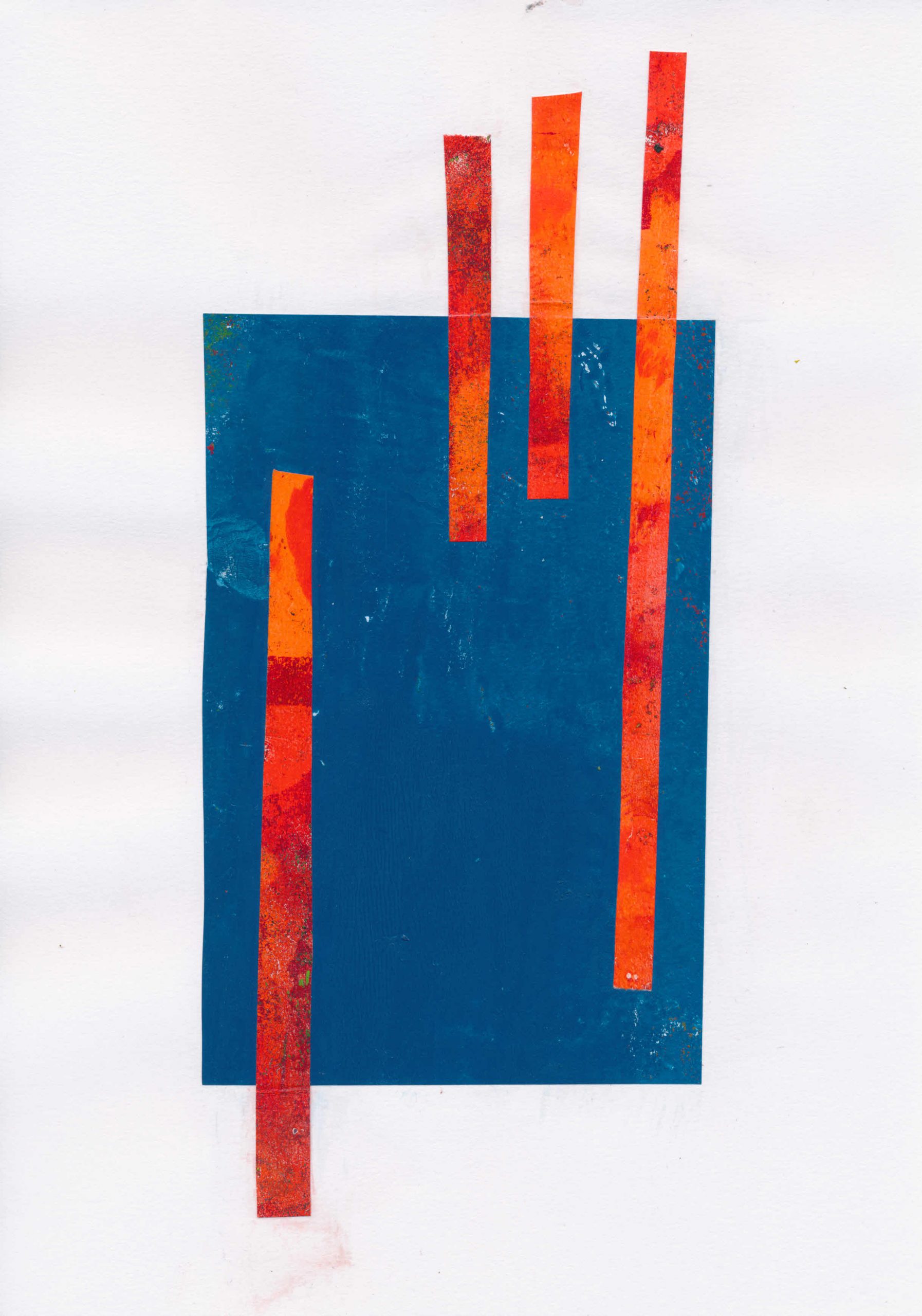
Research revealed a treasure trove of interesting games, some almost lost, others played in various forms across huge swathes of the globe, yet largely unknown outside those areas. It seems likely that many others were only ever played on game boards scratched in the earth or on pieces of fabric, long since decayed. The Korean game Yunnori or Yutnori, for example is traditionally played on a fabric game board. There must have been others. I wondered, too, about the cup and ring marks found on rocks across the North of England. These already turn up as motifs in my prints. Are they perhaps a remnant of some lost game?

Games as installation
This led me to the idea of creating an installation of game boards and playing pieces, but leaving the rules unstated. I haven’t started making them yet, but I’ve set out a couple of ideas below. I’m still thinking about the approach I might take when making the boards and pieces. My first thought was to treat it as a recreation, and use materials that would have been available across most of history. Alternatively, I could use create modern interpretations using materials such as acrylic sheet. It seems to me that the two approaches raise different questions about the nature of play and competition.
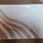
‘Game’ 1
Board:
Rectangular, made up of 36 squares in three rows, 12 squares in each row coloured as shown
- Row 1: Red and White
- Row 2: Green and Red
- Row 3: Green and White.
Game tokens:
- Two sets of 9 pawn type figures in contrasting colours
- Three individual pieces, 1 red, 1 green, 1 yellow
- Five flat casting sticks, one side marked.
Notes:
The board is derived from that used in Senet, but I chose the colours and game tokens to suggest, without defining them, other modes of play. I have described the pieces as pawns, but they could equally be stones or pebbles. The individual pieces could be larger stones, perhaps decorated.
‘Game’ 2
Board:
Chequerboard 8×8 in Red, Black, White and Yellow with overlaid symbols on one square in each quadrant.
Game tokens:
- 12 white, 4 black, 1 black and gold.
- 2 D20 die with numbers,
- 1 D6 die with numbers.
Notes:
The chequerboard pattern is common, but the colours and the uneven distribution of the pieces suggest a different form of play, as does the division into quadrants and the symbols in each quadrant.
Die of all sorts from D3 upwards are widely available. The casting sticks I mentioned above are effectively D2. Modern die come in a range of materials, ranging from acrylic to ‘antiqued’ finish. I assumed, that other than D6, they were largely modern inventions, but that isn’t the case. Apparently 20-sided dice (icosahedrons) date back to Ptolemaic Egypt, around the 2nd century BCE. They were often inscribed with Greek letters and may have been used for divination or gaming. The Romans used both tali (four-sided) and tesserae (six-sided), while Knucklebones, which were used in ancient Greece and probably long afterwards, had four usable sides and were precursors to modern d4 dice. The modern polyhedral set (d4, d6, d8, d10, d12, d20) were apparently standardized in the 1970s with the rise of tabletop role-playing games like Dungeons & Dragons.

I imagined the game board as made from a cradled wooden panel or a repurposed chess/draughts board. If it is made using a panel, this could possibly double up as a box with the game pieces stored in the back, perhaps in a draw string bag or bags, with a lid made from wood/mdf or acrylic.