Posted on Leave a comment

What is profit?

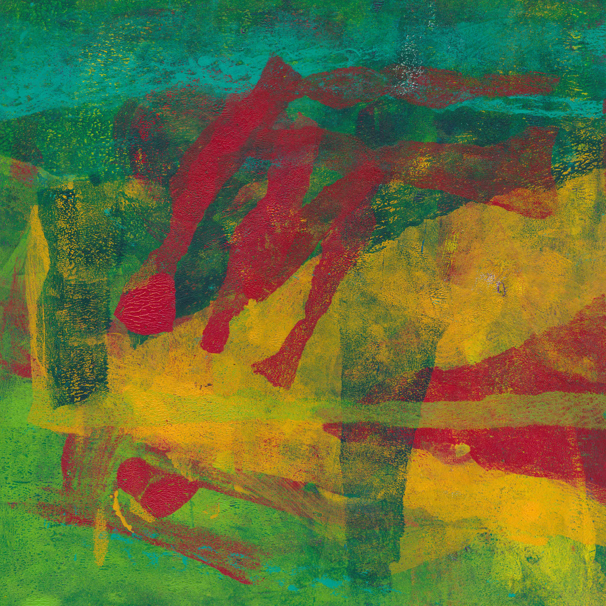
assorted paintings

How do you price your work?

Pricing of work seems to be one of those black arts with no definitive answer. It should go without saying of course that you need to cover the cost of your materials. Beyond that, go on any art based forum, and you will find a myriad of answers. I’m going to stick my neck out here and say that most of these are simply wrong, especially in the handling of profit.

Artists in particular seem to think that the art business is somehow different to mere commerce. They are wrong. Artists need to eat just as much as car mechanics or window cleaners.

Profit

Let’s start by looking at profit. The key mistake, made by many, is to think that profit is the same as income. It isn’t. You will often see statements to the effect that profit is the money you have left after paying for business expenses. From income, you pay your personal costs – food, rent/mortgage etc. It is the wage you take from your business, just as much as the wage you would be paid as an employee. Wages are an expense of business, even for a sole trader. Profit on the other hand is the money you use to build your business – from profit you pay for tools and materials, advertising and promotion, web costs, studio rental. I don’t know why, but for some reason this distinction seems hard to grasp. There is one further complication you do need to be aware of. In the UK, at least, the tax position of sole traders – which is what you would be as a solo artist – does not differentiate between income and profit. This only applies on your tax return. Do not make the mistake of applying the same approach in your accounting practices.

A common response in forums is that if the cost of say a painting is made up from hourly income plus materials plus profit, the final figure will be too high. That may well be true, but if you ignore the difference between income and profit, you may effectively be paying people to take your work…

It is common in start-ups for the business owner not to take an income in early years. They don’t however expect this situation to be permanent. Would you work for nothing for the rest of your life?

So, with that in mind, how do you calculate the price of an art object? That will be the subject of a future post.
Posted on Leave a comment

Vintage Noir

As a sideline, I sell reproductions of a range of images. I have available many maps, fashion plates, photography, travel ephemera and much more. This post is about images I have with a noir feel.

Film Noir

Browns Landing - rural noir photogrspha
Brown’s Landing Rice Creek

French film critic Nino Frank originally coined the term noir in 1946. In the 1970s, it was applied retrospectively to Hollywood films of the 1940s and 1950s. The literal translation is Black Film, but a closer rendering is Dark Film.

Darkness is key to the genre. It may be literal, as in classic 1940s thrillers such as The Maltese Falcon or The Big Sleep. It may be metaphorical, as in the many films with stories involving femmes fatales and tough, cynical detectives.

Definitions

Monochrome photo of Dallas at night 1942
Dallas 1942

There is no clear agreement on what is or isn’t a noir film. Common elements include low-key lighting, stark light/dark contrasts and dramatic shadow patterning. They often use low, or skewed camera angles. They typically have unusually convoluted story lines. Voice over narration is a particular noir hallmark. The most extreme example is perhaps Sunset Boulevard, where the narrator is dead.

Key Themes

Monochrome photo showing girl alone in bar
Girl alone in bar

Crime, usually murder, is a feature of almost all noir films. Greed or jealousy are frequent motivations. The central character is often flawed or morally compromised. They are typically drawn from a narrow range of archetypes — hardboiled detectives, femme fatales, corrupt policemen or jealous husbands. Amnesia, false suspicions, accusations of betrayal or double-cross are common.

The genre is associated with big city settings, but small towns and rural locations also feature.

In noir films, it is always raining, always nighttime. When it isn’t raining, it is hot. Whatever the setting, corruption is endemic – in modern parlance, ‘institutional corruption’ is rife.

Modern Usage

Pittsburgh street at night
Pittsburgh Street at night

The term has evolved to describe a mood or feeling. The best known usage is perhaps the genre of Scandinavian or Nordic noir. This is crime fiction written in Scandinavia, typically in a realistic style with a dark, morally complex setting. Dark secrets and hidden hatreds hide behind a facade of equality, social justice, and liberalism.

I have chosen the images scattered through this post from those originally tagged ‘noir’ in my old shop. If any are of interest, whether for their own sake or as part of a decorative scheme, please get in touch.

Posted on Leave a comment

Panchromatica Designs

architectural illustration

As I said in my last post, I used to have an online business on Etsy, known as Panchromatica Designs, selling reproductions of vintage illustrations. At its peak, I had about 600 items in that shop.

These included :

  • maps,
  • theatre posters,
  • Japanese prints,
  • photographs,
  • ocean liner postcards,
  • propaganda posters,
  • comic books,
  • architectural illustrations,
  • fashion plates and,
  • a huge variety of other materials.

The listed items were only a fraction of what I had available. You can get a small taste from the WordPress blog I set up, also called Panchromatica Designs, although all the Etsy links are of course broken.

I closed the business to concentrate on my own work, but still have all the files. I’m intending to sell a selection of these vintage illustrations here, but only as part of a wider strategy focussing on B2B. Images I sold through Etsy were used in locations as varied as pubs, escape rooms and even tattoo parlours. The range I have is equally suitable for B&Bs, guest houses, reception areas or any public facing area.

Items listed here will be for sale at retail prices, but the wider range will be available on wholesale terms. I will have a wholesale price list and line sheet available soon. If you think I can help you in the meantime, please get in touch.

Posted on 2 Comments

Looking for Vintage Illustrations?

I used to have an online business selling reproductions of vintage illustrations such as maps, posters, Japanese prints and a huge variety of other materials. I gave this up to concentrate on my own work, but still have thousands of scanned images available. This post is simply putting down a marker for the future for anyone looking for vintage illustrations. I’m slowly going to add a selection to the site, but in the meantime I’m happy to talk about providing images for interiors and similar. In the past I know they have been used in bars and cafés, escape rooms, even tattoo parlours, but they are equally suitable for B&Bs, guest houses, reception areas or any public facing area. You give me a theme and I almost certainly meet your requirements.

Depending on the nature of the original, I’m flexible on sizes. Some can be printed almost to bedsheet size, others were originally tiny and don’t really scale up. Others again can be resized quite dramatically. Strangely, this is often easiest with the poorest quality originals, such as comic books from the 1940s and 1950s.

Here’s a selection to whet your appetite. They are not in the shop yet, but are available for sale. I’m going to post some guideline prices soon.

If any of this interests you, then get in touch. You can find more blog posts on this topic here.

Posted on 2 Comments

New Digital Prints – now in the shop

I’ve posted before about using my monotype prints as source imagery for digital prints. I’ve started adding some of these prints to the shop. You can find them here, but I’ve added a few tasters below. I’ve bitten the bullet and made them limited edition (they will all be in editions of 50}. I don’t like doing it, but every time I ask others, they seem to prefer a limited edition to open. They will be in a mat sized for a 50 cm x 50 cm frame, so will fit readily available commercial frames, or you can have one made.

I’m thinking about offering some of them in a portfolio form, perhaps with some additional material. I don’t know what the market would be for something like that, so any observations or views would be welcome. When I have a better idea of what I want to do, I’ll put up a form so you can register an interest.

  • digital abstract print in pastel colours
  • Digitlal abstract print
  • digital print with rounded abstract shapes
  • Abstract Digital print in bright colours
  • Digital print mainly in blue and yellow
Posted on Leave a comment

More about the Site Update

Shows words Gift Voucher over landscape image

I’ve now finished rearranging the menu structure, so the site update is almost complete. The menu bar is currently a bit messy, but it gives access to the items in the shop with fewer clicks to find specific pieces.

I’ve added Gift Vouchers to the menu as a distinct product. Terms and Conditions, Returns Policies, Privacy etc can be found under the About option. I have also added a specific Contact Form under that too, so if you have any questions that’s where to look.

I now have to continue editing the products I brought in from my Etsy shop to put them in the correct categories so that they show up in the right place, as well as adding more of the many I’ve been working on during lockdown.

Longer term, I’m going to set up an Exhibition of the Week/Month, which will draw together a selection of images to create an online show. This is likely just to be a slide show for now, but there are some exiting developments that allow creation of virtual gallery shows. I need to look into those in a bit more detail before I commit myself. In particular, I don’t want to have to do yet another site update.

Posted on Leave a comment

Why consistent and attractive presentation of your work is important.

Sailing to Windward

I’ve written before about some lessons I have learnt about selling online. This post is about the more concrete aspect of getting a consistent and attractive presentation of your work.

The monotypes I’ve been making during lockdown now number about 70 with more still in progress. I’m thinking of setting myself a final target of 100 for the series. Making them has taught me a lot about colour and composition and I want to try to use those lessons in other print forms, especially collagraph. With so much work though consistent presentation is critical, not least because it raises issues of up-front costs in framing etc. Like any small business, artists need to minimise overheads

The cheapest option is obviously to offer these prints unframed and unmounted. However, I have noticed that there is a difference in perception between what you might call the ‘raw’ and ‘presented’ images. The simple act of presentation seems to be key in transform your work from just a piece of paper into an object of value.

By their very nature, gel plates are stretchy, so it can be difficult to get them accurately squared up before printing. Consequently, most of the nominally square prints are slightly distorted. Mounting them conventionally, with the edge of the print showing doesn’t look good because the gap between the print edge and the aperture edge is variable. The mount aperture can of course be cut to fit just inside the image. This gives a clean square look, and if the mount’s external dimensions are a standard frame size, gives a lot of flexibility in framing.

The print can also be torn down to a clean edge and ‘float mounted’. This needs a box frame to keep the glass off the image, which may be slightly more expensive. Here’s a video showing several ways of achieving this.

Instead of framing the print can be mounted on canvas or on a cradled wooden panel. This video by artist Bob Burridge shows how to do that neatly. I have to say I think this works best for larger pieces. Smaller works treated this way somehow lack ‘presence’, at least on their own.

I haven’t made my mind up yet. The float mounting technique in the video looks wonderful, but takes time to do well and would therefore be more expensive. I think in the end I will probably go for mounts cut to mask the edges. That way I can buy the mounts in bulk with bags and a backing board and to fit a standard frame size. Most of the images I’m talking about are 30 cm square so would look good in a 50 cm, but square frame. That’s a bit on the large size for easy shipping but should be possible. I have in the past sent 20″ x 16″ (about 50 cm x 40 cm) without problems.

However you do it, having a consistent and attractive presentation of your work is an important factor in achieving sales. If you are at all serious about your work it deserves that effort.

Let me know in comments how you do this for your work.

Posted on 3 Comments

Mailing List

detail of digital print

There’s a link via the menu, so this is just a reminder.

If you sign up to my mailing list you will get notifications of any shows or galleries where you can see my work in the flesh and advance notice of new projects. From time to time I will be offering subscribers discounts on purchases from my shop or other special offers. I will also use it to give subscribers a foretaste of the novel I’m working on. So, if you want to be kept up to date, please sign up.