Posted on Leave a comment

Latest monotype prints from my studio

I’m posting below the latest small monotype prints from my last studio session. Nos. 2 and 4 have a similar Hubble feel to the others, while 1 and 3 seem to have found their own way.

Are these finished, do you think? I’m not sure. I know from experience with these small works that it is very easy it is to go one step too far and lose it. Because they are so small, there isn’t much room to manoeuvre if marks end up in the wrong place. Of course, that also means there isn’t much lost if a print fails.

Even so, I don’t immediately throw away prints that look like failures. Instead, I add them to a ‘slush pile’ which I review from time to time. This includes anything from monotype prints like these to collagraphs, drypoints or digital prints. It is surprising how impressions can change once the process of making has been forgotten. After a while, you see the image as if for the first time. Sometimes reviewing two disparate images can give that spark you need to work out what to do next.

Monotype print in blue and yellow
Work in progress 1
Monotype gel print with blue background overlain with amorphous shapes in red and yellow
Work in Progress 2
Monotype gel print with a large block of orange yellow at the top and narrow irregular purple band at the bottom. The purple band has three delta shapes in different greens over the top
Work in progress 3
Monotype gel print, broken purple background, largely overlaid by an amorphous semi-transparent block of yellow.
Work in progress 4
Posted on Leave a comment

A new print series

I’ve been unable to do any printing for quite a while. I have been plagued with problems with my foot, putting me on crutches since mid-November. I used my down time looking at a lot of pictures, but also thinking about subjects and themes. I’ve been interested in neolithic rock art for some time now and living near Avebury and Stonehenge it’s impossible to avoid standing stones. Scattered also across the landscape of Wessex are hundreds, if not thousands of barrows and burial mounds and of course the White Horses like Pewsey, Cherhill, Westbury etc in Wiltshire or Uffington in Oxfordshire. In addition we have the famous Cerne Abbas Giant, the Long Man of Wilmington and assorted other hill figures, many now lost completely.

It isn’t just Britain with these features. The stone alignments of Carnac in Brittany are well known, but there are a multitude of standing stone circles, alignments and dolmens across France and Ireland and much further afield.

Putting all this together made me wonder about the sort of landscape we might see if more had survived. Out of that has evolved the print series I’m putting together. This will take landscapes, more or less stylised and incorporate into them other figures. I will draw on a range of sources. I’m researching Celtic and Saxon myths, cave paintings as well as the sort of abstract shapes found in rock art.

Technically, these prints will incorporate collagraph and dry point plus perhaps solar etching and ultimately hand embellishments. I also expect to use monoprinting or hand painting as the ground on which the prints will be made. I’m also going to try and incorporate some of the techniques used by Australian artist, Kim Westcott. (http://www.kimwestcott.com, although the site did not load properly for me.) She reuses old plates in combination with new, mixing in shadow prints and rotation of the plates to create her drypoints.

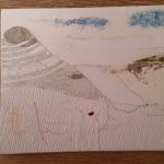
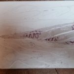
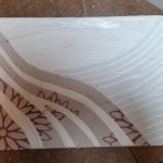
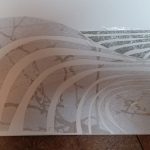
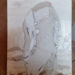
I have no prints as yet, but here are some rough sketches and photos of some plates in preparation.

With luck, I’ll have more over the next few weeks.

***

I’m not the only one finding inspiration in these themes. See the web pages for Irish artist Tommy Barr.

http://tbarrart.homestead.com/index.html

Posted on Leave a comment

Work in Progress

This is a proof print from a collagraph plate made some time ago, that I have just returned to. I made it after visiting the Kurt Schwitters exhibition at the Tate in London. I’ve made a couple of coloured versions, but nothing so far has worked out, and I still prefer the proof! One option might be to add collage elements, but I really wanted to interpret his work, not replicate it. I think I shall add some texture to the area surrounding the two main elements in order to increase the density of ink. I will probably do that with carborundum.

Collagraph after Kurt Schwitters