Posted on Leave a comment

Looking at other artists – John Hoyland

Why do we spend time looking at the work of others? I assume you do, but why? As importantly, who?

So, this is the first of an irregular series on artists, in no particular order. If possible I try to see the work in the flesh, but this isn’t always possible, so I tend to buy a lot of artist books – not how to’s, but monographs, exhibition catalogues, catalogue raisonee if I can afford them.

I recognised the name, John Hoyland, when I saw it somewhere but couldn’t picture the work, so I did a bit of online research. My first reaction was Patrick Heron on acid. The paintings boil with energy and colour. I haven’t had the chance to look much at his prints. The book I have is ‘Scatter the Devils‘ by Andrew Lambirth. There are also two books by the late Mel Gooding which I would like to get sometime. My first impression still stands, but not because of any direct link between the two. It is probably more a case of common ancestors in the Abstract Expressionists.

Looking at his work, what I think I got most of all from it was a vastly enlarged sense of what is possible in art. I do wonder if Hoyland would take quite the same view, for example, of the random marks I was talking about in this earlier post. Would he celebrate the accident that created them, or remove them as distractions? I’m not sure myself now…

A footnote: Why is there no wikipedia page on Mel Gooding? Surely he deserves it?
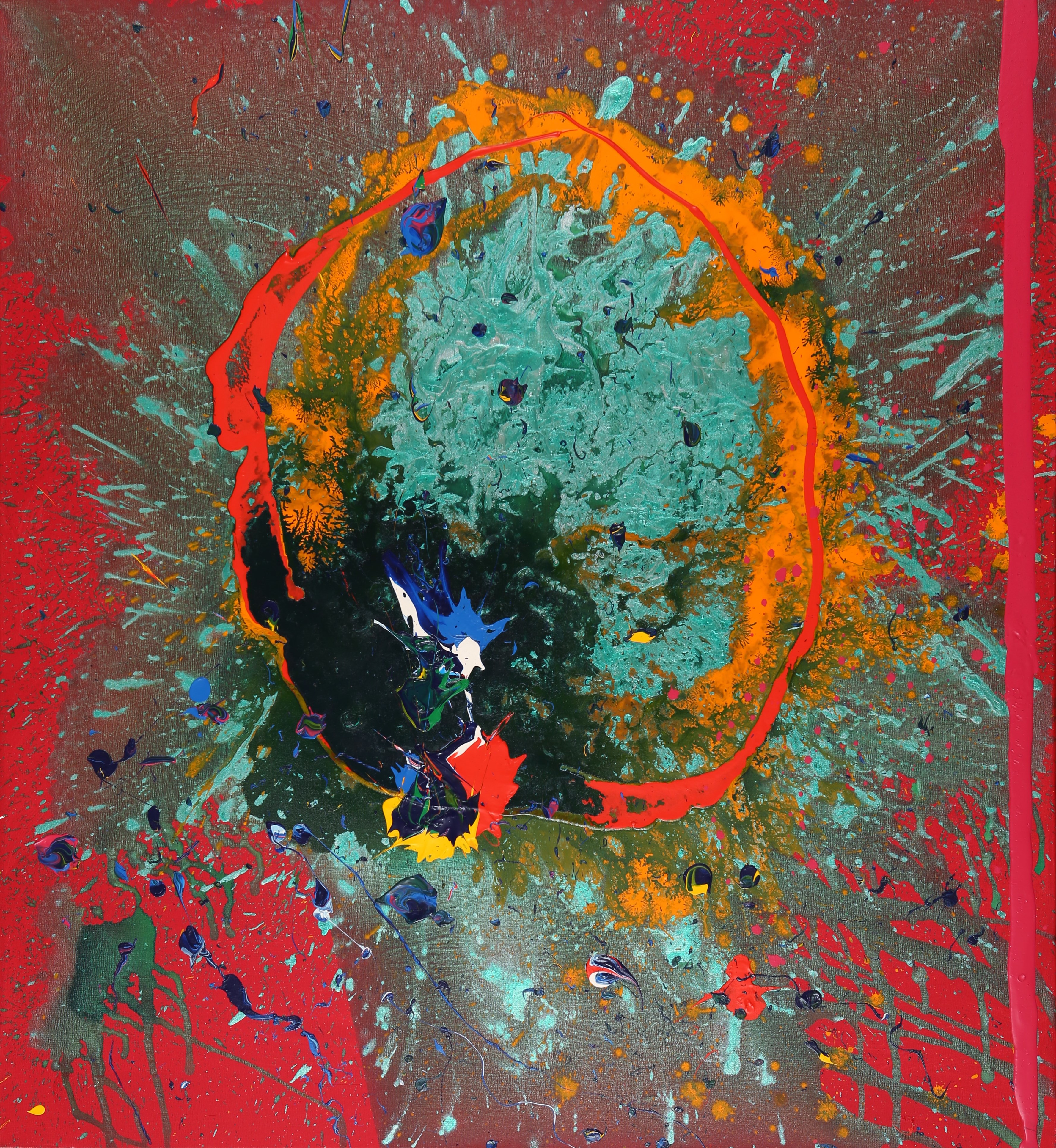
Posted on Leave a comment

Lessons learned

My last post, about using periodic reviews of old work as a mechanism for moving forward artistically, made me remember something I know in theory, but keep forgetting. Perhaps I need to review lessons learned too. I tend to describe myself as a printmaker. It is easy to forget – well, I find it easy anyway – that the print doesn’t have to be the end state. This is especially so with gel printing or screen printing, which use acrylic paint. Take this image, from that last post.

Pictogram - gel print
Pictogram – monotype print 30 cm x 30 cm

The initial inspiration was the idea of the pictograph (definition 1 in link) as developed by Adolph Gottlieb. The mark in yellow was also supposed to be redolent of Japanese or Chinese calligraphy. The problem I have with the image is the purple/white patches which break the mark are unrelated to it and to anything else in the image. I spent some time thinking about how to overprint them using gel printing without losing other aspects, which do work. Then it stuck me. Paint them out! That was lesson one…

I would be in good company doing this. Gillian Ayres, for example, used to set aside some prints from an edition, specifically to overpaint, an example being Springfield No 2 from 1999.

The second lesson learned, which seems even harder to remember, is that every blog post doesn’t have to be a dissertation! Just because I like writing long posts, doesn’t mean others want to read them! I’ll do my best, though, because if I can remember that lesson, I’m more likely to keep posting.

Posted on 3 Comments

Moving forward

I’m always scanning through the pile of unfinished pieces in my studio. Once enough time has passed from me to forget how they were made, they become objects in their own right. Moving forward by reviewing old work and thinking about the next steps becomes much easier. Looking at the work of others, as I have been doing over the past couple of days with John Hoyland for example, is often enough to shake your mind free. The image below is an example of such a review.

Pictogram - gel print
Pictogram – monotype print 30 cm x 30 cm

Less regularly, I review the pile of finished but unframed prints. When I do this, I typically change my mind about some of them. The last time I did this, I removed about 10% as no longer being acceptable quality. Some of these may benefit from additional work, and others may have elements that can be salvaged to make smaller pieces. Many of the Tiny series were made that way.

tiny collagraph print
Tiny collagraph print

I’m aiming to get back in the studio next week, probably starting some new prints from scratch, although for some reason, I’m getting the urge to paint and create some really heavy textures. Time to dig out the Polyfilla?

Posted on Leave a comment

Influences

What or who is the biggest influence on your work? I’m not sure if I can give a coherent answer to that question. I rarely try to deliberately emulate the work of another artist. If I do, it is largely for self-instruction. This one, for example, is called Shalimar. It was an examination of the Ocean Park paintings of Richard Diebenkorn.

Shalimar - monotype in blues and greys
Shalimar – monotype print made with acrylic on paper

Beyond that, it gets a bit more tenuous. I look at a lot of art books – and the real thing too when I get the chance. I don’t see explicit direct influences in my work, but I suppose others more distant from it might. There are many things I explicitly avoid, too. There’s a very strong generic look around at the moment. Look on Instagram or Pinterest to find many examples, with patches of colour against neutrals or greys, coupled with curved shapes in black or white.

Recently I came across a wonderfully eclectic list of influences, cited by the artist John Hoyland in a talk he gave at the Tate in 1980.

shields, masks, tools, Avebury Circle, swimming underwater, views from planes, volcanoes, mountains, waterfalls, graffiti, the cosmos inside the human body, food, drink, music, dancing, relenting rhythm, the Caribbean, the tropical light, the northern light, the oceanic light. Borges the metaphysical, dawn, sunsets, fish eyes, flowers, seas, atolls. The Book of Imaginary Beings, the Dictionary of Angels, heraldry, Rio de Janeiro, Montego Bay”.

John Hoyland 1980

That’s a great list. It is probably closer to the way most of us absorb influence in any field, not just art. One of the things that struck me is that there are no artists in the list. The sort of ‘copycat’ work that abounds on Instagram and Pinterest doesn’t stem from this sort of list.

Somewhere in one of my notebooks is a list I made, not of influences, but just headed as ‘Things I Like’. From memory, it included:

stone circles, standing stones, hill figures, neolithic carvings, NASA/Hubble photographs, collections of similar objects, cave paintings, Nazca lines, shadows, Native American art, city plans, layers, mid-century graphics, Miles Davis, Duke Ellington, Science Fiction, Martian landscapes, Misssissippi maps, valley sections, Northern landscapes.

shadows on the High Level Bridge
Shadow on the High Level Bridge

Do you have a list you are willing to share? Let me know in the comments.