I’ve just made a set of digital images built around stripes. Working digitally is my fallback position when I’m prevented from doing anything else, whether by time, health or anything else. I had no great expectations for these. I picked on stripes for the same reason I first picked on the cross, and recently the fuji-like peak silhouette. They were a recognisable starting point.
I’ve been adding some of my recent digital images to the shop. I’m not sure if these will make it though. The outcome was interesting, although not quite what I’d been expecting. That’s not a problem, of course. I like these on screen, but I think they might need some physical texture to really come alive.
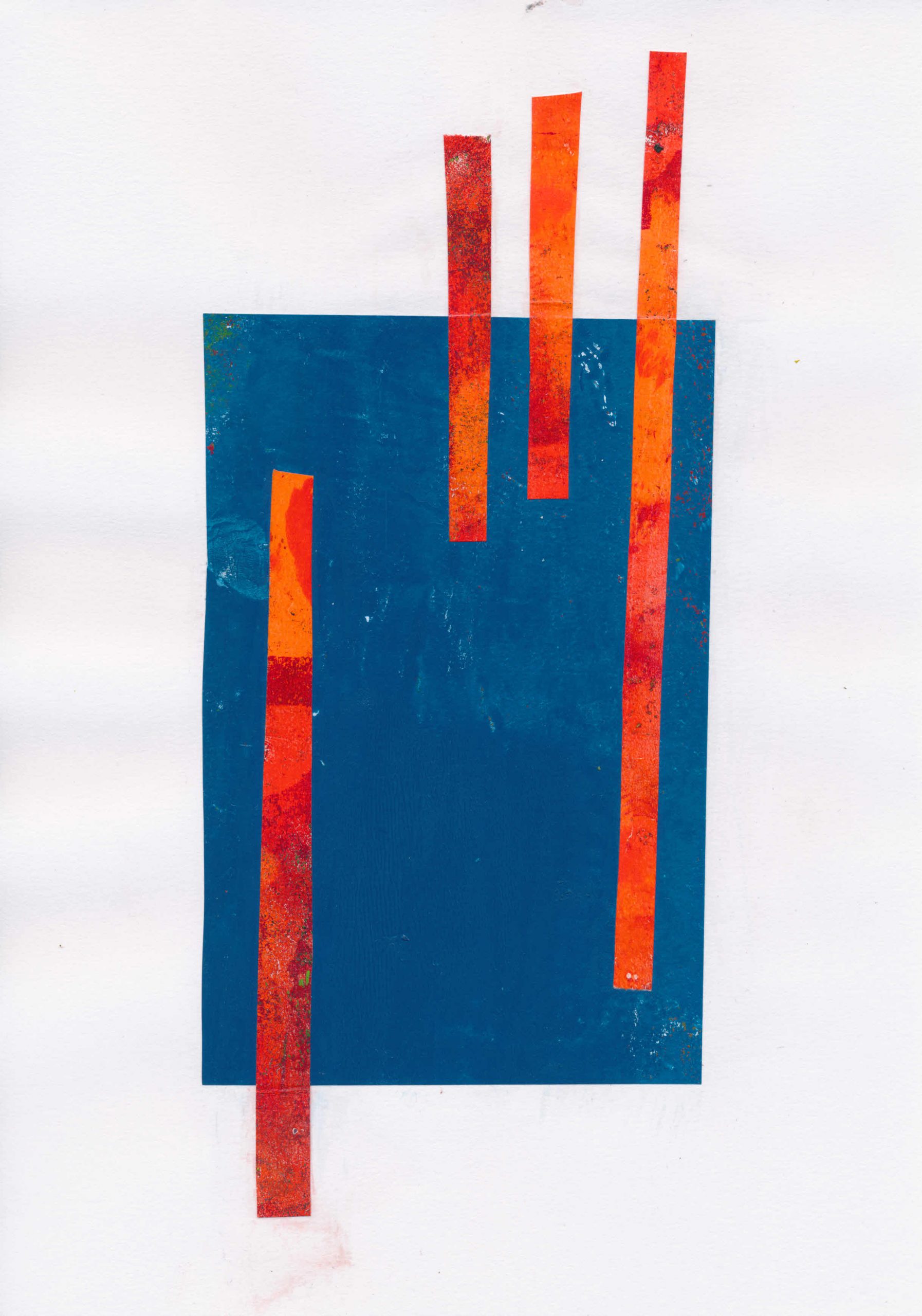
They started life as gel prints, which I cut up to make collage. You can see those here. To make the digital images, I used the scans of the collage made for the shop listings. I brought these back into Paint Shop Pro and then edited and recombined them in various ways.
I’m not sure of the next steps if I don’t offer them digitally. One option is going back to collage. The tissue I use to remove excess paint from the gel plate before printing would work well over solid blocks of colour, whether painted or collaged. It’s certainly a path worth exploring.
It also occurs to me that scans of the tissue could also be used in digital prints, taking the cycle round again.
I haven’t finished cutting the stencils from the previous post, so I’ve been playing with combining the files digitally. The results were quite interesting in themselves, but also triggered some ideas about combining these stencils with dry points also made from digitally cut plates. I will be parking those for now, but it is definitely something I want to explore at a later date. In this post, I want to concentrate on using these separation files in digital printmaking.
As I said in my previous post, Paint Shop Pro (PSP) can create colour separation files, but these are too ‘busy’ to use directly for cutting. Once cleaned up and simplified, the new files can be recombined in the same fashion as the originals. This is the start point for this post. I’m using images made by gel printing, but you can of course use any digital image, including photographs.
This is “Waterloo Sunrise”. Like those in my previous post, it is a monotype made with acrylic on paper. You can buy it here.
These are the grey scale images from the Cyan, Magenta, Yellow and blacK channels.
CyanMagentaYellowBlackCYMK channels
It is worth noting here that PSP can also make RGB separations, i.e. Red, Green, Blue, which can be cleaned up and simplified in the same way. This is what you get from those separations.
RedGreenBlueRGB channels
Creating combinations
These greyscale separation files can be used in various ways to extend your digital printmaking and allow you to try out ‘digital proofs’ before you start on the physical print. I’ve provided numerous examples below.
Here for example is the image made using the simplified CMYK files.
Image made from simplified CMYK files
Here is the image made from the simplified RGB files
Image made using simplified RGB files
Mixing things up
But what happens when you swap the Cyan file out for the Green?
Image from Green, Magenta, Yellow and Black
Or replace the Magenta with Red?
Image from Cyan, Red, Yellow and Black
Or indeed Blue with Magenta
Image made using Red, Green, Magenta
You don’t have to use the simplified files. The original separations can be recombined in this way too. It is off-topic for this post, but try doing this with photographs. The effect ranges from slightly ‘off’ to wildly surreal.
Other effects are possible if the colours are juggled around as say YCKM or KCMY.
Image made as YCKM
Image made from KCMY
You can of course combine the different separations and juggle them.
Image made as MCGR
It is possible to use the same file more than once
Image made using cyan twice as CMCK
The duplicated file can also be rotated (if square) or flipped/mirrored otherwise. In this one, Cyan is mirrored horizontally, with this version replacing Yellow. You can see that the green bar – a mixture of cyan and yellow on screen, is now shown as the two separate colours with a tiny slice of green where they overlap.
Image made using cyan twice but second copy mirrored.
Taking it further
By now, it should be obvious that the original content is irrelevant. We are using these files simply as abstract shapes. With the seven possible files from the original image, you have over 800 possible combination if you treat them as CMYK. (That’s 7x6x5x combinations.) It would be many more if you allow the same file to be used more than once. Throw in a second image and the number of permutations mushrooms to over 24000! (14x13x12x11)
There are obviously a lot of choices available, although as you try them out you will start to get a feel for what is likely to work best for you. While It is almost miraculous how colours appear as if from nowhere, the prosaic explanation is simply that whatever file is used in, for example the ‘C’ location, the computer thinks it represents Cyan and treats it accordingly when the file is displayed.
EDIT: Since I wrote this, we’ve seen the rise of AI art, which raises all sort of questions about originality, but also offers yet another way to edit and modify scanned gel prints, by for example taking them into the AI app, then exporting again to combine digitally with other image, to split into channels for silk screen printing or Risograph printing. I’m still mentally processing this, but you can read the first of a series of posts on AI and AI art here. The others in the series are linked from there.
‘Real World’ parallels
There are ‘real world’ parallels. In the later years of their lives, both Bert Irvin and Wilhelmina Barns-Graham made large numbers of screen prints. Independently they both seemed to create a ‘library’ of screens from painted marks which were then combined in various ways to produce their prints.
Even if you never print any of these digital recombinations, the process I’ve described can be used as a kind of digital proofing, to get a sense of how shapes work together before you ever apply ink or paint to paper or canvas. If you want to try digital printmaking, this approach gives you a useful entry point. Give it a try. I would love to see what you come up with. If I get enough responses, I’ll put them together in a post.