I’ve written before about some lessons I have learnt about selling online. This post is about the more concrete aspect of getting a consistent and attractive presentation of your work.
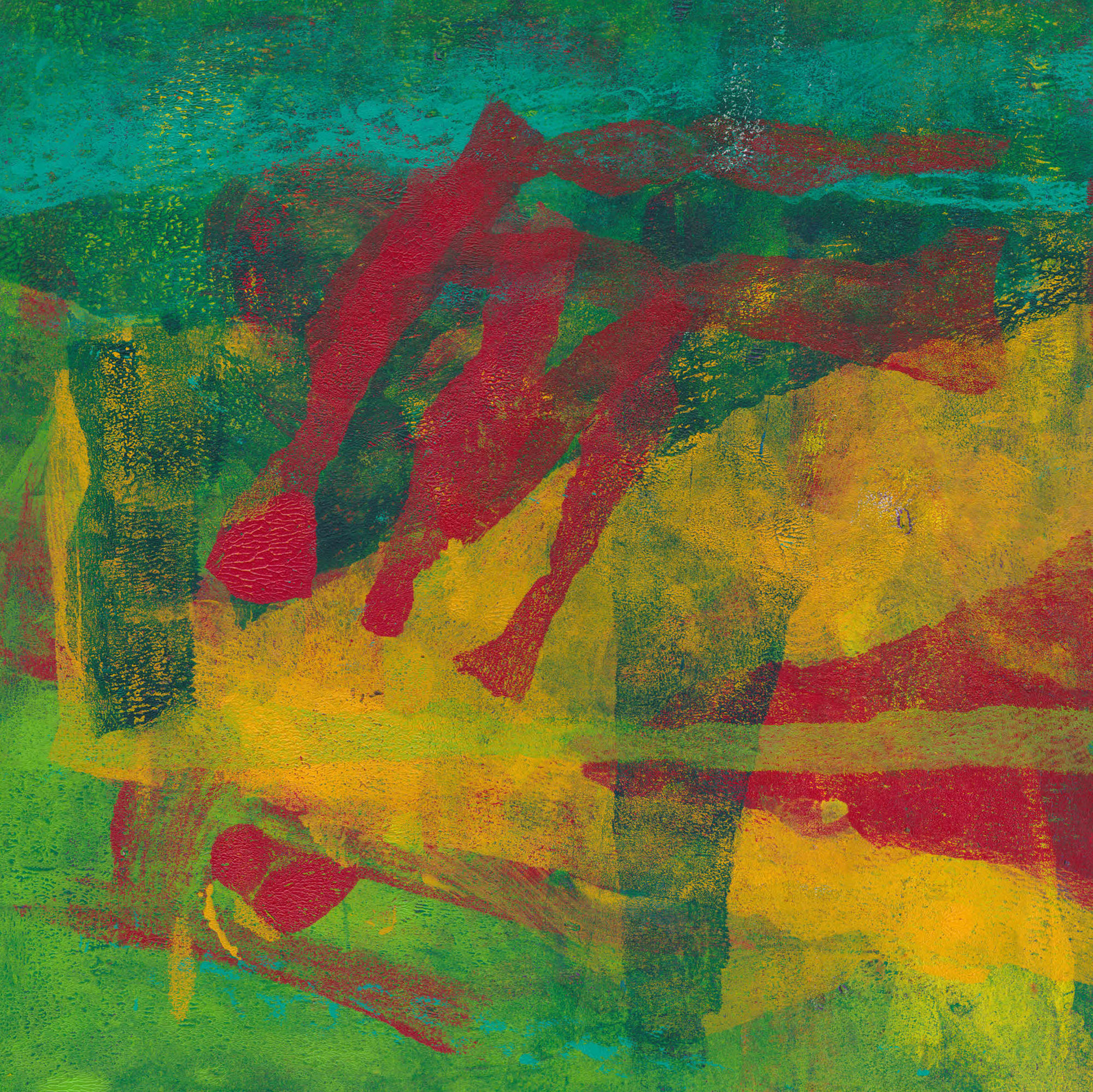
The monotypes I’ve been making during lockdown now number about 70 with more still in progress. I’m thinking of setting myself a final target of 100 for the series. Making them has taught me a lot about colour and composition and I want to try to use those lessons in other print forms, especially collagraph. With so much work though consistent presentation is critical, not least because it raises issues of up-front costs in framing etc. Like any small business, artists need to minimise overheads
The cheapest option is obviously to offer these prints unframed and unmounted. However, I have noticed that there is a difference in perception between what you might call the ‘raw’ and ‘presented’ images. The simple act of presentation seems to be key in transform your work from just a piece of paper into an object of value.
By their very nature, gel plates are stretchy, so it can be difficult to get them accurately squared up before printing. Consequently, most of the nominally square prints are slightly distorted. Mounting them conventionally, with the edge of the print showing doesn’t look good because the gap between the print edge and the aperture edge is variable. The mount aperture can of course be cut to fit just inside the image. This gives a clean square look, and if the mount’s external dimensions are a standard frame size, gives a lot of flexibility in framing.
The print can also be torn down to a clean edge and ‘float mounted’. This needs a box frame to keep the glass off the image, which may be slightly more expensive. Here’s a video showing several ways of achieving this.
Instead of framing the print can be mounted on canvas or on a cradled wooden panel. This video by artist Bob Burridge shows how to do that neatly. I have to say I think this works best for larger pieces. Smaller works treated this way somehow lack ‘presence’, at least on their own.
I haven’t made my mind up yet. The float mounting technique in the video looks wonderful, but takes time to do well and would therefore be more expensive. I think in the end I will probably go for mounts cut to mask the edges. That way I can buy the mounts in bulk with bags and a backing board and to fit a standard frame size. Most of the images I’m talking about are 30 cm square so would look good in a 50 cm, but square frame. That’s a bit on the large size for easy shipping but should be possible. I have in the past sent 20″ x 16″ (about 50 cm x 40 cm) without problems.
However you do it, having a consistent and attractive presentation of your work is an important factor in achieving sales. If you are at all serious about your work it deserves that effort.
Let me know in comments how you do this for your work.